
In February 1956 the president of IBM, Thomas Watson Jr., hired the industrial designer and architect Eliot F. Noyes, charging him with reinventing IBM’s corporate image, from stationery and curtains to products such as typewriters and computers and to laboratory and administration buildings. What followed—a story told in full for the first time in John Harwood’s The Interface—remade IBM in a way that would also transform the relationships between design, computer science, and corporate culture.
IBM’s program assembled a cast of leading figures in American design: Noyes, Charles Eames, Paul Rand, George Nelson, and Edgar Kaufmann Jr. The Interface offers a detailed account of the key role these designers played in shaping both the computer and the multinational corporation. Harwood describes a surprising inverse effect: the influence of computer and corporation on the theory and practice of design. Here we see how, in the period stretching from the “invention” of the computer during World War II to the appearance of the personal computer in the mid-1970s, disciplines once well outside the realm of architectural design—information and management theory, cybernetics, ergonomics, computer science—became integral aspects of design.
As the first critical history of the industrial design of the computer, of Eliot Noyes’s career, and of some of the most important work of the Office of Charles and Ray Eames, The Interface supplies a crucial chapter in the story of architecture and design in postwar America—and an invaluable perspective on the computer and corporate cultures of today.
The Original Text
By John Hardwood
Eliot Noyes, Paul Rand, and the Beginnings of the IBM Design Program
Particularly in the past fifty years the world has gradually been finding out something that architects have always known—that is—that everything is architecture.
— Charles Eames
Synthesis of Architecture and Industrial Design
In describing the genesis of the IBM Design Program, as Reyner Banham suggests, one is indeed dealing with both chickens and eggs. This “uncommon relationship” was, in the 1940s and early 1950s, still a rapidly changing one, and the establishment of the even more unusual relationship between Eliot Noyes and IBM marked yet another shift. One can do worse than to choose to begin with the chick, as it begins to emerge from its shell.
Eliot Noyes came from a reasonably well-to-do New England family, whose ancestors dated back to the first English settlers of North America, and he grew up steeped in the Puritanical ethos of Massachussetts. Modesty and a rigorous work ethic were the most admired traits in his family; his father, a professor of English literature at Harvard, referred to himself as a “teacher.” Noyes graduated from Harvard College in 1932 and immediately enrolled in the Harvard Graduate School of Architecture the following autumn. He clearly showed promise as an architect, and especially as a draftsman, and was awarded the Eugene Dodd Medal for a student project in 1935. However, Noyes found the curriculum, then still largely under the classicizing influence of the Ecole des Beaux-Arts, wholly stultifying. The novel theories of the European avant-gardes had been circulating among the students at Harvard and elsewhere for some time; along with many of his fellow students, he had surreptitiously picked up a copy of Le Corbusier’s Vers une architecture (by then available in English in Frederick Etchell’s 1927 translation Towards a New Architecture). He also seems to have begun to read the small number of publications in the United States at the time on architectural modernism; but the curriculum at Harvard contained nothing of the excitement and social import that the architecture of the European avant-gardes and Frank Lloyd Wright stimulated in him and his young colleagues. Frustrated, Noyes left the school, before completing his degree, in 1935. Putting the skills he had acquired in architecture school to use, he joined an archaeological expedition as a Tenderer and watercolorist, documenting the finds of an excavation at Persepolis. While there, the expedition surveyor taught Noyes to fly gliders over the desert, stimulating a life-long fascination with flight and an eventual expertise as a glider pilot.
When he returned from Persia in 1937, Noyes found the Harvard architectural curriculum entirely transformed. The founder of the Bauhaus, Walter Gropius, had been appointed to the faculty following his flight from Nazi Germany and a brief stint in England, and Gropius had brought modern design and the experimental pedagogy of the Bauhaus to the fore of the curriculum. Stimulated by the new approach, and by his interaction with one of Gropius’s key additions to the faculty, his partner and former fellow Bauhaiisler Marcel Breuer, Noyes became a star pupil, earning the Alpha Rho Chi Medal and another medal from the American Institute of Architects in 1938 for his efforts. After working as a draftsman in the offices of the venerable Boston firm Coolidge, Shepley, Bulfinch, and Abbott, Noyes entered Gropius and Breuer’s studio as a draftsman in their own firm.
Under Gropius and Breuer’s tutelage, both at Harvard and in the firm, Noyes certainly absorbed the Bauhaus ethic; however, he also participated in the translation of the ideas of the European avant-garde into the context of New England. As Barry Bergdoll, following H. R. Hitchcock, has convincingly argued, Breuer had already made an effort in Europe to incorporate ‘vernacular’ materials such as fieldstone and timber into his decidedly modernist aesthetic, notably in the Gane Pavilion in Bristol (with F. R. S. Yorke, 1936) and his unrealized design for a ski hotel in Tyrol, Austria (1937). Gropius and Breuer’s collaborations in Massachussetts, such as the Gropius House in Lincoln (1937), completed this synthesis. Noyes’s own first house design, for the Jackson family in Dover, Massachussets (1940-41), is in much the same vein, perfectly echoing the European modernist admiration for the informal flexibility of American farm houses as expressed eloquently in Siegfried Giedions influential survey Space, Time and Architecture.
Noyes sustained this hybrid approach to design, blending high modernism with traditional techniques, throughout his career. Many years later Noyes, characterizing both his own architecture and that which he had commissioned for IBM, identified himself, paradoxically, as being on the “conservative side of the avant-garde.” Yet despite this apparent conservatism, a certain understatedness that has in all likelihood contributed more than any other factor in his work being ignored by architectural historians, Noyes’s synthetic approach—both to architectural style and, eventually, to the integration of architecture with industrial design—was a form of radicalism all its own. The motivation for this synthesis was, in all probability, instilled in him during his later years at Harvard.
By the time Gropius arrived in Cambridge, he had long valorized the emerging profession of industrial design as a model for the transformation of the role of the architect in an increasingly industrialized economy and continued to do so well into the 1950s. This sustained interest was, Gropius readily acknowledged, the result of his formative years working in the office of a leading member of the Werkbund and pioneer in corporate design, the German architect Peter Behrens. Gropius appears to have saturated the young Noyes with the ideas he had gleaned while in Behrens’s office and with the ethos he had developed as the founding director of the Bauhaus.
Behrens’s work as the first true corporate design consultant and the concomitant theories he developed to justify and extend that work are very well documented and analyzed. But it is of the utmost importance to draw out the central tenets of Behrens’s theoretical approach if we are to understand how it influenced—via Gropius—Noyes and his contemporaries.
Despite his reputation as one of the first modern industrial designers, Behrens’s attitude toward technology was deeply ambivalent, occasionally even hostile. As his foremost biographers, Stanford Anderson and Tilmann Buddensieg, have argued, Behrens was both well versed in and stood in direct opposition to the long tradition of tectonic theory in German architecture and aesthetics. Accepting rather Alois Riegl’s concept of Kunst- wollen, Behrens held that if the industrial product was to attain a status as a defining element of Kultur, it required the intervention of the artist. As he lectured in 1910 (precisely when Gropius was working in his studio),
as the Viennese scholar Riegl has put it, ‘[Gottfried] Semper’s mechanistic view of the nature of the work of art should be replaced by a teleological view in which the work of art is seen as the result of a specific and intentional artistic volition that prevails in the battle against functional purpose, raw materials, and technology.” These three last-named factors lose, thereby, the positive role ascribed to them by the so-called Semper theory, and take on instead an inhibiting, negative role:’… they constitute, as it were, the co-efficient of friction within the overall product.’
The technological and material basis of the industrial product, Behrens argued, was a drag. It prevented the designer from realizing truth in form, rather than being the material basis for articulating that truth. This theoretical claim is in ready evidence in Behrens’s many designs for AEG, perhaps nowhere as clearly as in his famous design of 1910 for a turbine factory in Berlin. The temple-like articulation of the architecture, with its massive piers and pediment inscribed with the firm’s logo, is little more than show, meant to glorify the role of industry in leading toward the production of art. As Stanford Anderson and many others have argued, the building is an exercise in atectonic tensions, its outer form at odds with the technologically advanced steel hinges and trusses that hold it up.
In the very same year as Behrens completed this ambivalent masterpiece, however, another approach to the unity of industry and art emerged, from within the confines of Behrens’s own office. In the “Program for the Founding of a General House-Building Company with Uniform Artistic Principles’ (1910), written as a report to Emil Rathenau, the director of AEG, the young Gropius dreamt of “the happy union between art and technics” that would result when architects and artists acknowledged, as Tilmann Buddensieg has put it, that ‘the undoubted and unavoidable advantages of technology and the elimination of handcraftsmanship, when coupled with mass production, guaranteed ‘an exemplary standard’ and ‘superior quality.’” It would be several years before Gropius began to steer the Bauhaus in this direction, eliminating handcraft and celebrating the machine as the basis of a modern aesthetic; but nonetheless after 1910 the tide had turned away from the idealism of Behrens and toward that of Gropius. As is well known, Le Corbusier and Amedee Ozenfant’s influential theory of the objet type— the useful object formed directly from the requirements of its use, such as the wine bottle, the briarwood pipe, etc—and the sachlich theories of various European avant- gardists began to articulate the problem of design as one of deriving the form of an object from its particular functions.
Gropius’s initial Rieglian suppositions about the relationship of art to technology were yet further altered in the American context. There Gropius and his followers encountered a nascent, harder-edged theory, one that proposed a more direct relationship between the function of an object and its form. Closer to Semper than to Riegl in its inspiration, and more directly informed by nearly a century of “functionalist” aesthetic theory (dating back to the writings of Horatio Greenough in the 1820s and 1830s), American theory on industrial design eliminated the need for an artistic interpretation of the form of both the machine and its products almost entirely.
The term “industrial design” first appeared in America in 1919, but usually product designers referred to themselves as ‘artists in industry.” It was not until a generation of young designers—among them Raymond Loewy, Walter Dorwin Teague, Henry Dreyfuss, Norman Bel Geddes, and Egmont Arens—emerged as self-identified industrial designers that the discipline gained legitimacy through their numerous high-profile commissions for products ranging from kitchen appliances to steamships.
In these designers’ theoretical writings, every bit as much as in their streamlined designs, the drag of the industrial product was to be alleviated by changing the form of the product itself. At first glance, the theory is similar to Behrens’s, right down to the choice of metaphors (friction/drag/flow); however, this transformation was not, as per Behrens, to be effected through the intervention of Art, understood as an ideal form unencumbered by material concerns. Quite the opposite. Drawing heavily upon the metaphors of “experience,” ‘rhythm,” and “resistance and conflict” in the aesthetic theory of the American pragmatist philosopher John Dewey, these new industrial designers proposed that the pinnacle of art would be reached when it had assumed the form of the machine, translating that form into a powerful aesthetic experience. Thus images of ball bearings, airplane and ship propellers, animals, eugenically perfect human bodies, and so forth were meant to indicate an already extant functional and aesthetic ideal state that other products had not yet achieved.
Perhaps the pinnacle of this new “machine aesthetic’ was the exhibition, held at MoMA in 1934, Machine Art (Figure 1.1). Curated by the young architect Philip Johnson and Alfred Barr Jr., the MoMA show valorized these industrially produced objects as works of art in their own right (albeit carefully described throughout the exhibition and its catalog as a special category of art, “machine art”). As Barr wrote in his forward,
*a knowledge of function may be of considerable importance in the visual enjoyment of machine art…Mechanical function and utilitarian function—“how it works” and “what it does”—are distinct problems, the former requiring in many cases a certain understanding of mechanics, the latter, of practical use. Whoever understands the dynamics or pitch in propeller blades or the distribution of forces in a ball bearing so that he can participate imaginatively in the action of mechanical functions is likely to find that this knowledge enhances the beauty of the objects. *
Thus the door was opened for a new kind of expert, the designer with sophisticated knowledge of mechanical processes. Yet the exhibition also opened the museum to the corporations that had produced the hundreds of objects on display: Alcoa, U.S. Steel, Bingham Stamping and Tool, America Sheet and Tin Plating Company, and American Radiator, among others, were listed on the walls in the gallery, just as individual artists might have been for an exhibition of paintings.
Awash in this heady theory, Gropius continued to emphasize the need for a new kind of artist-technician to respond to the increasingly important role of industry in architecture and product design. In summing up the development of his views from the 1920s to the 1950s, Gropius prophesied that “the contemporary architect’ would fulfill the “historical mission” of architecture: “the complete co-ordination of all efforts in building up man’s physical environment. In announcing his agenda for transforming the curriculum of the Harvard Graduate School of Architecture in 1937, he demanded that the architect be trained to coordinate the application of various forms of scientific and technical knowledge; no longer a specialist, the architect would be a kind of professional visionary.
*Good architecture should be a projection of life itself and that implies an intimate knowledge of biological, social, technical and artistic problems. But then—even that is not enough. To make a unity out of all these different branches of human activity, a strong character is required and that is where the means of education partly come to an end. Still, it should be our highest aim to produce this type of men who are able to visualize an entity rather than let themselves get absorbed too early into the narrow channels of specialization. Our century has produced the expert type in millions; let us make way now for the men of vision. *
Noyes, who remained unrestricted by the “narrow channels of specialization” throughout his career, seems to have embodied Gropius’s call for a new kind of architect—and, moreover, he was one who could grasp the dynamics of the modern industrial corporation with a thoroughness and familiarity that continued to elude the older European.
Noyes and “Organic Design,” 1940
Noyes was the beneficiary of Gropius’s newfound influence upon the American scene when he was appointed as the first curator of Industrial Design at MoMA in 1940. It was in this position that Noyes made his first important efforts at articulating the design of the liminal space between human beings and machines. Just as importantly, it was also his first opportunity to collaborate with two designers, Eero Saarinen and Charles Eames, and with the design editor of New Directions, the architectural critic and patron Edgar Kaufmann Jr., all of whom would become lifelong friends and allies in a joint effort to redefine corporations through design over the ensuing three decades. Noyes’s first exhibition, the now-famous competition Organic Design in Home Furnishings, of the following year (Figure 1.2), fittingly served as his point of entry into, and a kind of prospectus for, the remainder of his career in architecture and industrial design. On the inside cover of the intensely polemical catalog documenting the results of the exhibition, Noyes set the terms of the competition with his definition of “organic design” by drawing an explicit connection between the quality of being “organic” and the “harmonious organization” of disparate parts in space.
A design may be called organic when there is an harmonious organization of the parts within the whole, according to structure, material, and purpose. Within this definition there can be no vain ornamentation or superfluity, but the part of beauty is none the less great—in ideal choice of material, in visual refinement, and in the rational elegance of things intended for use.
This last statement is telling, since the competition was as much a business deal as a museum exhibit; following Kaufmann’s plan for Organic Design and the annual exhibitions in a similar vein that would—Kaufmann hoped—follow, each of the winning designers was awarded a production deal with a large-scale manufacturer and a distribution contract with a major American department store. However, the concluding phrase—“rational elegance of things intended for use”—also carries within it an implied dynamic relationship between the industrially produced object and its subject (the user). The “purpose’ of the objects exhibited in Organic Design was not simply to be sold, but also to integrate themselves into a productive whole, a domestic space that includes in it furniture and the human beings who use that furniture. As John Hay Whitney put it at a luncheon in June 1941 honoring the winners of the competition,
There was a time in our Puritan background when to want to be comfortable, to care about, even to know about, the beauty of one’s surroundings was considered soft if not sinful; but todays sociologists, psychologists, and those engaged in the physical as well as the social sciences agree that efficiency and happiness result from an environment which is both comfortable and beautiful.
Noyes, as a product of this selfsame Puritan ethic, sought to redefine comfort on a scientific basis—it was not indulgence, but necessity. Thus Noyes stressed in Organic litany of “well-designed” household objects from lamps and radios to tableware were arrayed. Here, in true domestic comfort, the viewer would find a home in which her tools were suited to her body to an unprecedented degree. His point made, Noyes left his positions at Yale a year later, passing it on to the former Bauhausler Josef Albers, and returned to full-time private practice with Breuer, now in New Canaan, where his office would remain until his death in 1977.
With interventions such as these, the ground had been prepared for further work with IBM. At stake was the very transition staged in the Modern Design exhibition—that from product to architecture. In January 1952, Watson Jr. made a cautious first move in what would become a massive program to overhaul IBM’s corporate environment. He sent a letter to Noyes asking him to remodel a conference room on the sixteenth floor of IBM World Headquarters. Noyes obliged by reconfiguring the corner room into an office befitting the president of a major electronics corporation; while there was nothing particularly radical about Noyes’s design, it did—at least provisionally—provide a model for integrating IBM’s products into its architecture at a literal and symbolic level.
The furniture was taken from Knoll Associates’ brand-new 1952 line of office furniture: four types of chairs, two “executive” desks (one for Watson’s secretary Mr. Post), and storage cabinets, providing IBM with its ‘first slice of color and light.’ Of particular interest, however, was the way in which Noyes responded to Watson’s request for display areas. Two low-slung walnut cabinets with sliding doors, one in the secretary’s office and waiting room and the other behind Watson’s desk, were built into the walls to house IBM “electronic components.’ An IBM World Clock sat on Watson’s desk, and a closet in Watson’s private entrance housed easels that could be pulled out quickly and easily for presentations. Watson, seated or standing at his desk, was to be framed by the accoutrements of IBM technology and management, as his guests or employees lounged in crisp modern couches and armchairs.
Graphics: Communications and Design Logic
In the same years that he was redesigning his office on Madison Avenue, Thomas Watson Jr., about to assume his role as CEO and chairman of the board of IBM after the retirement of his father, Thomas Watson Sr., made a series of momentous decisions regarding the future of IBM. Following an emerging trend in management—reflected most famously in the reorganization strategies of General Electric and the U.S. government under Eisenhower—Watson determined to abandon IBM’s outdated pyramidal managerial hierarchy in favor of a more efficient, horizontal structure. When he was appointed president of the corporation by his father in 1950, he began considering reshuffling IBM’s various activities into a series of more or less autonomous divisions, coordinated by a new corporate managerial staff. This process culminated in 1956, when Watson called together all of IBM’s top executives at Williamsburg, Virginia, and issued a decree stating that none would leave the conference until an entirely new, fully articulated managerial structure had been invented for the corporation.
As he wrote in his memoirs, the young Watson “picked Williamsburg because it is a historic place and this meeting was meant to be a kind of constitutional convention for the new IBM.* Sweeping away most of the paternalism and evangelism of his father’s company—biographers of both father and son report company song books thrown out and oil portraits removed from executive offices—Watson aimed to replace the IBM cult of personality with a modern management system. With characteristic hyperbole he later wrote, “What we created was not so much a reorganization as the first top-to- bottom organization IBM ever had.’ The design of the management system, articulated by Watson’s hand-picked “organizational architect,” the recent business school graduate Dick Bullen, was based upon two metaphors. The first was familiar: IBM would consider itself as a body, with its various product divisions serving as its ‘arms and legs,” and at the ‘head’ would be a six-man corporate management committee led by Watson and staffed with IBM’s top executives (including Watson’s brother, Arthur K. ‘Dick’ Watson, and future IBM president T. Vincent Learson), each member responsible for a particular organ of the corporate body. Running from the head down into the body would be a newly organized corporate staff, “a kind of nervous system” for the “adolescent company.” The second metaphor, broadly accepted in management circles but not often openly discussed, was that a corporation should identify itself as an army. The “staff-and-line” structure of the more autonomous and horizontal management system was, as Watson freely admitted, based “on military organizations going back to the Prussian army in Napoleonic times.” This double metaphor would, it was hoped, give birth to an organic discipline, in which IBM’s various organs could operate harmoniously and automatically.
In the same years, Watson made a commitment to move the bulk of IBM’s massive resources into the research, development, and marketing of computers. Watson Sr. had always considered IBM’s work in computers before and during World War II largely a matter of prestige rather than of business. The production of computers had been a means to preserve working relationships with both universities and the U.S. government, bringing in increasingly large amounts of money in the way of research grants but relatively little sales revenue. Watson Jr. saw things differently. In order to win and maintain the numerous newly emerging and lucrative contracts from the U.S. military, with an eye to a prospective market for computers in the world of corporate business, and in competitive response to recent successes of the Remington Rand UNIVAC computer in the business market, Watson determined that IBM should, by the end of the 1950s, corner the entire computer market.
These two fundamental shifts in the structure and orientation of IBM were accompanied by a third change: Watson determined that IBM should adopt a new look. Following a pair of chance encounters with the sleek modern design of Olivetti’s Manhattan showroom and advertisements in 1954, Watson summoned Noyes and, through Noyes, the graphic designer Paul Rand—to whom Noyes had probably been introduced by Kaulmann, who had worked extensively with Rand in the 1940s in his capacity as editor ot New Directions—along with several IBM engineers and managers to his family’s vacation home at Buck Hill Falls in the Pocono Mountains. On a table, alongside photographs of the newly unveiled Olivetti showroom on Fifth Avenue in Manhattan, designed by BBPR in 1953 (Figure 1.7), Watson laid out a series of Olivetti ads and brochures he had been given by a manager from IBM Netheriands. He then insisted that IBM’s products and sales apparatus needed a makeover. As he recalled in his memoirs, “the Olivetti material was filled with color and excitement and fit together like a beautiful picture puzzle. Ours looked like directions on how to make bicarbonate of soda.*
After the meeting, Watson commissioned Rand to study IBM’s printed material (e.g., Plate 1) predating the Williamsburg meeting, Rand offered a scathing critique of the appearance of everything from advertising to stationery:
***The examination has of necessity been cursory but it is believed that a number of significant features can be noted. Of all these perhaps the most critical is the absence of a family resemblance. There are, to be sure, a number of well designed advertisements and house organs, but they are isolated pieces…. Typographic style is inconsistent even within individual campaigns; the IBM trademark is not sufficiently distinctive to be exploited with maximum effectiveness; and with a few exceptions, pictorial execution and layout incline to the commonplace. The fact that IBM’s printed pieces bear little family resemblance to one another makes it difficult satisfactorily to establish a “company personality.” ***
Such criticisms, to a company that had previously and forcefully identified itself as just such a “family,” with a rigorous dress code and cohesive corporate culture, would have wounded any IBMer deeply, and surely struck home with Watson Jr. Rand also made more specific criticisms, taking particular aim at the ads for IBM’s Data Processing Services arm: “The … ads are cluttered with text; this not only diminishes the pictorial impact but actually discourages reading. They are conceived and executed without imagination. It can even be argued that from a graphic standpoint some are in bad taste.” ***The ads used numerous, uncoordinated typefaces and often obscured pictures with text to confusing effect. By contrast, Rand claimed, IBM’s ads for electric typewriters were **“distinguished pieces of advertising.”_ The scattershot appearance of IBM’s printed material, Rand made plain, rendered it impossible for the “average buyer” to identify IBM as a coherent and concrete entity: _“The layouts and presentation of Electric Typewriter and certain Data Processing ads are so different it is difficult to recognize them as representative of the same company.*” The only means to achieving a “family resemblance” would be to fix “standards of quality” for graphic design throughout the corporation and to “integrate” the design efforts of the company under centralized control.
After demonstrating what he meant by effective advertising—which, in the main, involved showing IBM his own magazine advertisement designs for other companies—Rand proposed a “first step.” The IBM logo, in use since 1947 (Figure 1.2), would need to be redesigned. As he wrote in the penultimate section of his report on “The Trademark”:
IBM’s present mark is basically a good one both visually and verbally. It is simple, direct and euphonious. However it is believed that the mark could be considerably improved…. The style of letter—Beton Extra Bold—is a rather commonplace one. Furthermore the form of the letters lacks precision and definition. For a company such as IBM this is obviously undesirable. If the redesigning of the IBM trademark is undertaken the first step is clearly to reform the letters themselves. Furthermore some graphic feature, when possible, might be added to give the mark even more distinction and to increase its flexibility.
The logo therefore had to “express dignity, authority, efficiency and modernity.”Underscoring his point about the importance of continuity, or “family resemblance,” Rand thus proposed that “any change in IBM’s mark must not be so drastic as to negate the identifying and symbolic value of the present mark (nor the time and money expended on developing it).
In analyzing IBM’s logo, Rand did not ignore the substance to which it would need to lend its authority and clarity. Much as Noyes had insisted upon concealing the inner workings of the typewriters he had designed for the corporation in order to present a clearer image of the idea of typewriting, Rand made it clear that the logo had a similarly counterintuitive relationship to its putative referents, IBM’s products. Because “IBM’s products are too complex to be understood by the average buyer,’ he argued, “[the buyer] must rely on IBM’s reputable name.” The corporate name would be a symbol assuring the customer of the technological sophistication and reliability of its products. Yet how could so few letters do so much?
Rand answered this question unequivocally near the outset of one of his many later explications of the function and proper use of the IBM logo. According to the policy laid out in the IBM Design Guidelines, Rand reaches back to the etymological roots of the terms “logo” and “logotype’ in the Greek word logos. Exploiting the protean nature of the Greek source of the term—logos may be translated alternatively as “word,” “speech,” “concept,” “reason,” or “logic”—Rand emphasizes the diffuse metaphorical power invested in a trademark. A proper logo design, Rand suggests, may only emerge out of a proper understanding of its function—furthermore, a function that has only recently been established. The logo, as the etymology of the term suggests, derives its symbolic power not from a specification of meaning, but rather through its very emptiness of meaning—a capability to apply itself to any number of objects and in so doing, to name and organize them. It is, perforce, multivalent. Furthermore, the metaphorical and economic power that it possesses was, until World War II, not well understood and had uncertain legal standing. The introduction to the IBM Trademark Manual, designed by Rand and published just as he produced the first design guidelines manuals, began by quoting at length from the U.S. Supreme Court decision in the precedent-setting trademark case Mishawaka Rubber & Woolen Manufacturing Company v. S.S. Kresge Company of 1942:
*The protection of trademarks is the law’s recognition of the psychological function of symbols. If it is true that we live by symbols, it is no less true that we purchase goods by them. A trademark is a merchandising short-cut which induces a purchaser to select what he wants. The owner of a mark exploits this human propensity by making every effort to impregnate the atmosphere of the market with the drawing power of a congenial symbol. Whatever the means employed, the aim is the same—to convey through the mark in the minds of potential customers, the desirability of the commodity upon which it appears. Once this is attained, the trademark owner has something of value. If another poaches upon the commercial magnetism of the symbol he has created, the owner can obtain legal redress. *
The post-World War II corporate logo is thus, quite plainly, a metaphor—specifically, a metonym. However, it is a special kind of metonym, since it is a part that does not originally belong to the body of objects to which it lends meaning, but is nonetheless an indispensable organ within the whole that it engenders. The logo, by virtue not only of its design but of its legal status, became the red (or perhaps Pantone 2718, the blue color that Rand mixed in 1956 that earned IBM its nickname Big Blue) thread running through the entirety of IBM’s visual environment, stitching diverse objects together into a coherent pattern. This is made plain in the IBM Trademark Manual, which quotes again from the same Supreme Court case:
An abstract right in a symbol has no existence, but the symbol must be considered in association with the article it identifies. In this sense a trademark differs from a patent or copyright. The latter exists the instant either is issued or entered. The patentee or author, without use, remains the real or true owner…. Patent rights and copyright rest upon the view that the results of the original labor of the inventor and the author ought as a matter alike of justice and public policy to be secured against piracy, while as regards the proprietor of a trademark, the question of originality does not arise so long as the mark is sufficiently distinctive really to identify his goods and for the purpose of registration to satisfy the Trade-Mark Act.
The logo itself does not function as logo until it is firmly attached—physically and conceptually—to a particular, proprietary object or set of objects. While it may be said to exist without such an object, a logo does not attain its status as a symbol or value—that is, it does not have currency—until the system of objects to which it is affixed gives it meaning. As Rand put it, less legalistically, “It is only by association with a product, a service, a business, or a corporation that a logo takes on any real meaning. It derives its meaning and usefulness from the quality of that which it symbolizes.” It can neither pretend to being property nor serve as the vehicle of an “abstract right” until it is attached to a material referent.
Following this logic, one must conclude that in its originary moment, the design of a logo is a design of a second, representational order that, in a legal and instrumental sense, assumes its role in articulating the symbolic function of the primary object. After this originary moment, in which the logo is applied to the objects in question, it is clear that the logo’s power exists in establishing a pattern that replicates itself. Like another ubiquitous form of inconvertible value, money, it is an object that adheres to other objects and manufactures a topological equivalence; much as money grants objects exchange value through its putative status as both a universal “medium of exchange” and guarantor of absolute value, the logo grants objects identity with one another. However, the logo differs from money or other traditional media of capital insofar as it does not identify the state, but rather the individual owner of the mark, and is not (immediately) exchangeable with another logo. In this sense, the logo is the most fundamental act of designation at the beginning of the design program, a marking out that engenders a conceptual and spatial separation from that which does not bear it. This de- signing/designating capacity is, moreover, entirely contingent upon the quality or qualities of the logo’s form, its design; this is borne out in the history of the development of the IBM logo and its graphics program more broadly conceived.
With the redesign of the IBM logo, Rand embarked upon a new phase of his career. He became a prolific designer of corporate logos and a much sought after consultant in corporate image-making in general. Although he remained a recognizable name in the field of graphic design (through his writings as much as by the iconic quality of his designs), by the mid-1950s he was no longer the celebrated artist who proudly signed his bold collages, photograms, and layouts for magazine covers, such as those he did for Direction or as works of art in their own right. As Rand famously observed, “a trademark is the signature of a company as opposed to the signature of an individual.” The corporate logo will not admit of a human signature, because it is a signature in its own right; and Rand, it seems, went from signing designs to designing signatures.
The new logo (seen in context in Plate 2) was a dramatically simple reworking of the previous Beton Extra Bold typeface: the serifs were made more substantial, the “I” and the “M” made nearly symmetrical (Rand gave the “M” slightly longer serifs on the right- hand side to lend the logo a sense of dynamism), the loops of the “B” rounded into circular arcs. And, as Rand pointed out in his report-cum-design pitch, “it is also practical. The entire mark is composed of circles, squares and triangles and can therefore be easily duplicated. The sharper, more dramatic dip in the “M” broke the line established by the bottoms of the other letters, lending a dynamism and emphasis to its referent: machines; but when the entire logo was combined with a heavy underscore composed of a double-square rectangle, the logo became “an architectural or geometric form…. simple, stable and dignified.”
Rand concluded his report with a series of policy proposals that would ostensibly, along with the use of the new logo, resolve IBM’s “family resemblance” problem through the creation of a “comprehensive and integrated design program for IBM with respect to its printed material.” He proposed hiring a “single consultant director to coordinate all graphic output and to work in collaboration with the overall director of IBM’s design program.” These consultant directors—who would, of course, by 1956 be Rand and Noyes respectively—would then oversee art directors and design staffs appointed to each major IBM division, holding weekly meetings and issuing “periodical critiques of all promotional material.” Finally, “IBM might also consider the production of its own advertising in the manner of CBS, Look Magazine, Olivetti, Mutual Broadcasting and NBC.”
Noyes, for his part, was ready for the meeting in Buck Hill Falls. He brought with him a reel of film that would eventually convince Watson not only of the value of Rand’s later report, but of the fundamental, constitutive role that design would have to play in IBM’s future. The film was Charles and Ray Eames’s A Communications Primer (1953; Plates 3 and 4). An adaptation of Warren Weaver’s popularizing introduction to Claude Shannon’s The Mathematical Theory of Communication (1949), the film presented the basic tenets of communications and information theory to a lay audience. Using an innovative combination of animation, live action, and still photography, the Eameses illustrated, for example, the axiom that “the English language is about 50% redundant” by removing letters from commonn phrases and demonstrating that they remained legible. While overall the tone of the film was characterized by the Eameses’ perpetual whimsy, it remained rigorously faithful to the spirit (if not always the letter) of the original text. Most striking—and most relevant to Watson’s concerns about corporate organization and “personality”—were the portions of the film devoted to the mechanics of communication as described by Shannon.
Central to both Weaver’s and the Eameses’ account of communications theory was a diagram symbolically devised by Weaver to represent a communications system (Plate 3). As Weaver described his diagram:
The information source selects a desired message out of a set of possible messages— The selected message may consist of written or spoken words, or of pictures, music, etc.
The transmitter changes this message into the signal which is actually sent over the communication channel from the transmitter to the receiver. In the case of telephony, the channel is a wire, the signal a varying electrical current on this wire: the transmitter is the set of devices (telephone transmitter, etc.) which change the sound pressure of the voice into the varying electrical current. In telegraphy, the transmitter codes written words into sequences of interrupted currents of varying lengths (dots, dashes, spaces). In oral speech, the information source is the brain, the transmitter is the voice mechanism producing the varying sound pressure (the signal) which is transmitted through the air (the channel). In radio, the channel is simply space (or the aether, if any one still prefers that antiquated and misleading word), and the signal is the electromagnetic wave which is transmitted.
The receiver is a sort of inverse transmitter, changing the transmitted signal back into a message, and handing this message on to the destination. When I talk to you, my brain is the information source, yours the destination; my vocal system is the transmitter, and your ear and the associated eighth nerve is the receiver.
In the process of being transmitted, it is unfortunately characteristic that certain things are added to the signal which were not intended by the information source. These unwanted additions … are called noise.
A Communications Primer took up this description almost word for word, frequently quoting short bits of Weavers text; however, it also sought to remedy the tendency toward abstraction of which even so colorful a writer as Weaver was frequently guilty. The Eameses’ method for achieving this feat was a double homology. Communications, the film explains, does not simply lie at the heart of all cultural production, it is cultural production. Music, art, management, war—all of these were henceforth to be considered as communicative acts. Upon this first homology the Eameses artfully superimposed a second: communications and design were self-same. The film armed information theory to infiltrate design precisely by playacting its disarmament. Combining live-action footage with still photography and animation, it playfully demonstrated the basic concepts of information theory, such as coding and transmission, by careful juxtaposition and overlapping of abstract shapes (“symbols” or “bits”) and photographic images of people, and demonstrating how people “naturally” use machines to create and transmit “messages” (Plate 4). The abstractions of mathematics were mapped directly onto the ostensibly concrete form of the human body, all set to a whimsical score by Elmer Bernstein and Charles Eames’s own soothing narration.
The Eameses’ approach to communications science as a new foundational metaphor for design did not supplant their earlier reliance on organic or biological metaphors; rather, it augmented the earlier metaphor, transforming the biological referent from a simple, determinate form into something more closely resembling the feedback loops described by the emerging science of cybernetics. At stake in conceiving design as communication was the question of control—over form, over process, and, most important, over people—that, if answered, would bring people and machines into harmony with their environment. One of Charles Eames’s touchstones in this regard was Norbert Wiener’s self-popularizing treatise The Human Use of Human Beings (1950), which, Wener claimed, heralded the coming of an exciting (if also threatening) technological management of living things at both social and individual levels. “We now come,” Wiener wrote in the conclusion to his tract, “to another class of machines which possess some very sinister possibilities … the machine made in [man’s] own image”: the computer. By taking hold of the wheel, Eames extrapolated, designers could henceforth self consciously direct the process of evolution, preserving order in the face of disorder, “fit” in the face of disharmony. However, Eames admitted willingly and repeatedly, this omelet could not be made without breaking some eggs: many of the supposed truths underpinning architectural thought would have to be discarded.
The glorious futurology glossed by A Communications Primer was hardly lost on Watson, already a devout Keynesian deeply invested in the rational and centralized management of the future. The film held out the promise of a world in which “messages”— and the ordered, negentropic entities they sustained—could overcome the “noise” of the marketplace, provided that said messages were properly selected, coded, and disseminated. It was this promise that motivated Watson to endorse a series of tentative, provisional changes to IBM’s aesthetic presence—small but significant steps that would lead eventually to the formation of the IBM Design Program similar to that suggested by Rand’s report. One of Watson’s first moves, made in the wake of his initial design meeting with Noyes and Rand, was to hire Noyes to redesign the IBM lobby and showroom on the ground floor of the corporate headquarters in Manhattan, on the corner of Fifty-Seventh Street and Madison Avenue, finished in November 1954. Noyes, it appears, had already designed a room on an upper floor to house the first IBM 701 , and this new space was to be unveiled at the premiere of the IBM 702 computer. The announcement of this new machine, IBM’s first computer designed exclusively for business needs, prophetically signaled IBM’s dominance of the market for the next thirty-five years. Watson described the appearance of the original lobby in his autobiography:
Dad [Thomas Watson Sr.] had decorated it to suit his taste, and it was like the first-class salon on an ocean liner. It had the Oriental rugs he loved and black marble pillars trimmed with gold leaf. Lining the walls were punch-card machines and time clocks on display, cordoned off by velvet ropes hooked to burnished brass posts.
Noyes completely redecorated (Plate 5). The new floor was white, the walls painted red, the marble pillars covered over with smooth panels, and small silver signs reading “IBM 702” (or, in the later photo shown, “705”) in a sans-serif font set on the walls. Perhaps the most significant change was the way in which the computers were displayed. As Watson Jr. relates:
The Data Processing Center generated enormous excitement. Like the SSEC and the 701 that had preceded it in the window, the 702 was actually a working machine. Customers who wanted to rent computer time would simply bring their data in, and we kept the computer running around the clock. If you went by on Madison Avenue in the middle of the night you would see it behind the big plate-glass windows, tended by well-dressed technicians in its brightly lit room.
Noyes’s redecoration was not only an interior design, but also an exhibition staged in a shop window. Noyes and IBM were concerned at the outset with projecting an image of IBM as a provider of an essentially modern service: the handling of information. Interestingly, this was achieved by a “theatrically” staged transparency that allowed a glimpse into an interior space—from outside to inside—that offered “the first graphic statement of IBM’s integrated design policy.”This interior was specially designed to highlight the sound relationship between the computer and its operators, processes that occurred in a space entirely independent of the external environment: “brightly lit,” “in the middle of the night,” “around the clock.” Crowds gathered on the street to gaze at the unfamiliar, antiseptic drama of the computer.
Consultancy: Design Management and the IBM Design Guidelines
Following the popular success of this design (and IBM’s early financial successes in marketing computers), Watson offered Noyes a job as the director of design at IBM in February 1956, shortly before he assumed his role as CEO and chairman of the board. Noyes turned him down, saying: “I’ll work with you, not for you. The only way I can do this job right is to have full access to top management.” Watson was convinced, and Noyes thus accepted a position as consultant director of design, pledging a major portion of his time—in contracts and anecdotes it was stipulated alternately as “one third’ or “one half”—to IBM while retaining his own private practice. By remaining outside of the corporation, and thus outside of its hierarchies and autonomous divisions, Noyes considered himself better able to transform IBM on a structural level by linking its products, spaces, and managerial processes through design. He later recalled the four main conditions of his agreement with IBM:
*First, a title. I became Consultant Director of Design. Second, contact for reporting purposes with the top management of the company. Design must be a function of management, attentive to but not controlled by sales or engineering departments, or any divisional echelons. The program was put under the Director of Communication, a corporate staff office, for coordinating purposes. Third, an announcement within the company to establish my right to work freely on these problems, and to state partially the goals of the program. Fourth, an operating budget—not for design but for administering the program. *
From this ambiguous position as an administrator outside of the corporation proper, he was to coordinate the redesign of the entire environment of IBM on a telescoping scale— from stationery and curtains, to products such as typewriters and computers, to laboratory and administration buildings.
According to both Watson and Noyes, both taking their cue from Eames, redesigning the look of IBM was essential to the way it functioned. As Watson related in a 1963 lecture at Columbia University—significantly titled “The New Environment”—on the various techniques IBM used to restructure its management system and employee policies during the period:
*With all of these innovations we have introduced in company communication, the principal lesson we have learned, I believe, is that you must make use of a number of pipelines, upward as well as downward. Parallel communication paths may seem unnecessary to some. But we have found that any single path can be only partly successful, that certain information flows better over some paths than others, and that all employees do not react in the same way to a given medium. Management must have a wide selection of communication means at its disposal. *
Taking up the homological theory of A Communications Primer, Watson considered design to be one such “parallel communication path.” It was to be integrated into the dynamics of management so thoroughly that it could literally be considered a defining characteristic: management, as a process of communication, was to be inseparable from its environment.
Watson appointed an IBM sales executive, Gordon Smith, to the newly created position of director of communications, who, in addition to coordinating the efforts of Noyes’s office and those of IBM’s own in-house Design Department, would also be in charge of advancing the program throughout the corporation. The process of communication and management through design was made redundant, as information flowed along “parallel communication paths.”
This program, Watson, Noyes, and Smith recognized, could not be applied from the top down. “The way to make it effective,” Smith explained in an interview with Noyes in Industrial Design in 1957, “is not to send down a weighty memo from above, but to kindle spontaneous enthusiasm with a succession of good works.” Noyes finished his thought:
And this will happen only when good design— the awareness of it and the desire for it—begins to come out through their own skins. That is why this is not an outside movement. We are trying to start one within the company, using a variety of stimuli.
Teamwork and horizontality thus not only characterized the ideal management network, they characterized the intentions of the design program as well: design was a means of re-forming the corporate body, literally at the level of the individual member, from the inside out. Emerging from under the gray flannel suit, the design signal—communicating the organized unity of the corporate body, its spaces, and its machines—was to be borne along “parallel communication paths” with ultimate redundancy by the “awareness” and “desire” of every IBM engineer, salesperson, and manager.
This program of action had significant consequences for the mode of design authorship at IBM (and in the countless corporations in which similar programs were instituted, whether by Noyes or other designers). Unlike many contemporary American firms that combined architectural practice with industrial design and graphics—such as SOM (formerly Skidmore, Owings & Merrill), Caudill Rowlett Scott (CRS), and Walter Dorwin Teague and Associates—Eliot Noyes and Associates did not attempt to remake itself into a large-scale corporation in its own right. Instead, taking a cue from Harold Van Doren’s 1940 treatise Industrial Design: A Practical Guide, Noyes sought to extend what Van Doren called the designer’s ‘sphere of influence” over as many relevant aspects of IBM as possible. The (small) design firm could overlap with the corporation, becoming immanent to the corporation rather than becoming part of it.
At his best, the designer is an animator, a builder of enthusiasm in others…. He knows how to work with others, meeting executives on an equal footing and still gaining the confidence of the man on the bench.
He brings to his client a broader design point of view than a man can have when burdened with the responsibilities of everyday operation. He fully acknowledges the superior technical knowledge of the men in the clients organization. He cannot and does not presume, of course, to tell them how to do things which they have learned through years of research and experience.
Pithily, Van Doren quickly reduced this principle to an aphorism: “Industrial designers who take their work seriously cannot afford to play the prima donna.”
Although he never offered such a cogent and systematic theory of the relationship, Noyes still had a gift for articulating it, and he echoed Van Doren in precise terms.
[Design] often illuminates the nature of the company to itself and stimulates fresh internal courses of actionThe processes of sound industrial design touch the phases of product planning, ergonomics, engineering, economics, manufacturing, aesthetics, and marketing, and so must be an integral part of a company’s product development processes…. For such a role [the design consultant] must be some combination of designer, philosopher, historian, educator, lecturer, and business man.
To those unfamiliar with the unusual self-image of the corporate design consultant, this description may smack of pride; however, Noyes and his fellow industrial designers, humble in almost all cases, saw it quite the other way round. The idea was to serve as a medium to the corporation, a way of rendering it material, providing it with a character that could pervade the entire organization.
This new kind of teamwork did not appear spontaneously. Noyes and Rand began their consultancy with a handful of graphics, industrial design, and architectural commissions, but just as importantly, they visited nearly every IBM office, factory, and laboratory in the United States and Europe in the four years following their appointment as design consultants.’” What they found was haphazard, disorganized, and isolated teams of designers, many of them amateurs, constantly improvising responses to design problems without any oversight from corporate management or development engineers. At the suggestion of Rand, IBM vice president and career-long apologist for the IBM Design Program Dean R. McKay appointed Marion Swannie, a former IBM amateur designer herself who had originally worked in sales and advertising, to accompany Noyes and Rand and to serve as the head of a new Design and Display Department within the Corporate Division. From her vantage point, liaising between the consultants and IBMers, there was often initial enthusiasm for the program, but then disappointing results; often, there was even resistance. She recalled “a guy in Poughkeepsie who drew a little Indian character called Ogiwambi on plant posters,” and that Rand referred to many of the IBM designers and managers as “Philistines” Noyes, Rand, and Swannie concluded from their visits that IBM design would need to be more centralized, and they established a staff of designers under Swannie’s supervision in New York to produce the majority of the necessary graphics in conjunction with Rand, who worked from his house in nearby Harrison, New York, and later in Weston, Connecticut. Rand would host design critiques at his home or at a nearby diner.
Despite these efforts, and despite the existence of several talented designers within the company, the quality of the corporation’s design production remained erratic. In addition to laying out the corporation’s stationery and designing packaging, Rand was often forced to redesign posters and ads himself. It was clear that the authorship of the graphic design program would have to be an agent other than Rand. This agent needed to be ubiquitous, authoritative, and objective, not an individual designer but a system of rules around which all designers could rally: a pattern book, but also an ideological center to a vast and far-flung enterprise. This need, in time, generated what became known as The IBM Design Guide.
The first IBM Design Guide (Figure 1.8), dealing primarily with graphics, was, in comparison with the stated goals of the design program, rather modest in its ambition and primitive in its means. Even though Noyes and his team had been coordinating the new look of IBM in all media since 1956, it was issued to every division and department in the corporation only four years later, in July 1960, with a cover letter from McKay introducing many employees to a still unfamiliar program.
The guidelines cautioned that the “use of the logo with any other non-IBM identity (even when 100 percent owned by IBM) should be very limited,” and that, if IBM’s name had to be mentioned as the owner of said company for legal reasons, the logo should not be used at all (appearing instead in a standard typeface like Bodoni). On the printed page itself, Rand made clear, the logo was to be distant from any other text, especially from product names or advertising copy, to preserve the idea that the logo “speaks for the breadth and capabilities of the entire company” rather than for a single product, service, or concept. Further, Rand stressed that overambitious attempts at graphic design risked endangering the entire program: “Multiple versions of a logo, like multiple versions of a signature, confuse its meaning and dilute its power. Don’t alter the IBM logo … even in humor.”
Rand continued to teach graphic design to IBMers in New York until at least 1965, but he gradually scaled back his and Noyes’s ambitions for the graphic design program. For instance, the adoption of City Medium as a signature font style for IBM did not last long; according to Rand, “because of widespread distribution and exposure, the typeface was quickly taken up by others” and thus “no longer served its original function.” Rand thus concluded that “a distinctive, all purpose typeface [was] impractical”; instead, he replaced City Medium with a new, specially designed typeface derived from his redesigned Beton Extra Bold face and stipulated that it only be used in special circumstances, such as for manual covers: “unless there is sufficient time, money and talent available to do a proper job of designing graphic material, the information should be issued in simple typewritten form, which always looks decent.”
Where IBM’s own designers could not be trusted to develop their own graphics for applications that would need to be used throughout the corporation, Rand simply did the design himself. From 1956 to the early 1990s, he remained responsible for designing much of IBM’s stationery, packaging for computer parts and accessories (Figure 1.9), and nameplates for IBM’s diverse array of office machines.
In addition to giving detailed instructions on the design and use of various graphics, thus establishing the means by which the IBM signature would assert its organizational power, the 1960 Design Guide sought to develop other means for easing communication throughout the corporation. One method was to assign a color to each division of IBM—Corporate would be beige, Data Processing blue, Data Systems grey, Advanced Systems Development red, etc.—that would identify it in “letterheads … architecture, packaging, interiors, displays, printed material, advertisements, etc.” While it was “not mandatory,’ especially since “flexibility” was the watchword of the guide, these colors were to be used whenever “appropriate.” The color code would provide readers inside IBM with a “quick flag.” With each of these colors, ad hoc designers using the guide were encouraged is neutral and dignified, does not conflict with any of the divisional colors—on the contrary, makes the other divisional colors come to life. The Corporate color is this same gray,
Rand continued to experiment with all aspects of the graphics program, even daring, in 1962, to break his own rule against altering the logo. Never one to abandon the recognizability of a trademark (which would deprive it of its organizational and value-producing power), Rand used his first redesign of the company’s logo in 1955 as the basis for its further elaboration.
As the design program gathered momentum in the early 1960s, and as the first coherent sets of design guidelines were established in graphics and industrial design, Rand redesigned the logo once again into the now familiar eight-striped “IBM” that remains the corporation’s signature today (Figure 1.4). In this later design, the marks that form the logo are reorganized entirely, corresponding not in the first place to the a priori forms of the letters in their specificity as individual members of a typographical system known as a font but rather to a geometry that traverses the set of letters in the form of horizontal lines. Rand claimed little or no representational intent in his redesign, asserting that the horizontal lines simply helped to overcome the awkwardness of the differing widths of the three letters, creating a visual “rhythm” while keeping the initial form of the logo consistent. However, he did concede his original inspiration (one perhaps born of his frustrations in implementing the design program in the previous four years): since IBM and its logo were a ‘symbol of authority,” he decided to give the logo a “legal sense, like scan lines on a bank note.” These “scan lines,” used on signature forms to deter counterfeiting, quite literally underscored Rand’s understanding of a logo as “the signature of a company.” In a kind of metaphorical pun, Rand transformed the signature of a corporation, an entity comparable to an individual only in a legal sense, into a legal form. However, an important caveat is necessary, one that Rand, being accustomed to his status as an individual author at the same time as he upset this state of affairs, quite naturally did not make: the striped logo did not serve as a field on to which some individual entity would sign its name; instead, the field became the signature itself. This transformation answered to the very nature of IBM’s business, as a business that managed other businesses through information technology and management consulting.
As a logo is by its very nature multivalent, it is often pregnant with other suggestive formal tropes. The IBM logo’s horizontal lines are set apart at regular vertical intervals like the alternating crests and valleys of a communications signal; the discrete quality of the lines even within a single register evokes the dashes and spaces of telegraphy (save for the dots). As Rand later complained, the design was almost too successful in its literal evocation of the aesthetics of communication: ‘Every logo that some designers do has stripes . . . stripes have become symbolic of the latest in technology.’ Nonetheless, the pattern that the alternating stripes and open spaces established echoed the two states of Boolean logic that formed the basis of computing technology, and the insistent repetition of the marks evoked the redundancy that is the fundamental structure of communication as formulated by Shannon and Weaver. The logo thus partook of what Rand had long called “the magical, almost hypnotic effects of repetition … the thrilling spectacle of marching soldiers, all in the same dress, same step, and same attitude.”
Thus the logo, along with the graphics program as a whole, was a call to order. It related to one another not only the various objects produced by the corporation, but also the bodies of its corporate employees. In this sense, it is of equal importance that the form of the logo is constructed as much by the marks themselves as it is by the gaps between the marks, which are of the same quality as the space around the marks. The logo is formed and forms the empty space around it, prompting a visual oscillation between logo and its referent—an environmental tension characterized by a strategic occupation of space, in which the signature mark of IBM serves to control its surroundings but is nonetheless brought into a rigid form by them. In short, one could say that the gaps and surrounds are composed of space, whereas the marks themselves correspond to an idea of placement. Thus, built into Rand’s striped IBM logo is a structural consonance with the phenomenon of IBM as a multinational corporation. It is an apparatus and an installation or emplacement (Gestell), its marks coming into presence in a specific place, in a wider space or territory, placing in order the space surrounding it. (This phenomenon will be treated in greater detail in the discussion of IBM’s architecture in chapter 3 below.)
Thus Rand stipulated that, in almost every case, the logo be placed at a distance of at least the logo’s own height from the nearest text; this ensured that the logo ordered and visually dominated any subordinate text or graphic. In a later iteration of the logo, designed for the IBM Annual Report in 1974 and subsequently used in numerous packaging designs, Rand tilted the logo at thirty-seven degrees and allowed the marks of the logo to wrap around the edges of the binding or box. This gave a sense of extension into space even as it figured the process of encompassing an ever-wider territory.
In the event, Rand’s striped IBM logo was not employed until 1970, and it was used alternatively with the original Rand logo until 1972, when previous objections by IBM executives that it evoked an image of incarceration were dismissed in the face of the designs evident symbolic richness. In that year, he also designed an additional version of the striped logo with thirteen stripes, which heightened the visual impression of vibration, speed, and redundancy.
In conjunction with the imperative to standardize graphics through the organ of the Design Guide and oversight by the director of communications (now Dean R. McKay), Rand trained a group of designers to offer a “graphic arts education program” at IBM offices and production facilities in Poughkeepsie, Kingston, and New York. According to Rand, these received “exceedingly favorable comments” from IBM employees; “constantly noted, however, were comments that those of the managerial level above them need to be informed that this is the company’s wish and that personal objectives of the various locations should not be uppermost in their minds.” This was not the only evidence of a stubborn resistance to, or simple ignorance of, the goals of the design program within IBM.
As late as 1965, chaos in corporate design was still evident. It was still necessary for Noyes, Swannie, and other members of the American arm of the corporation to travel abroad to ensure regularity of the designs (Figure 1.10). Despite these efforts, a communications manager from IBM Netherlands named W. J. van Hoek could submit a report to Swannie, Noyes, Rand, and IBM World Trade executives on “Communications Design in Europe’ that pointed out widely divergent design practices, from the details of industrial design and graphics to the basic organization of design departments. According to van Hoek, oversight by the consultants, limited by distance to yearly visits by Rand, Noyes, and a display designer for IBM World Trade named J. A. Healion, was “absolutely insufficient. These visits are too short, people hardly get to know each other, and there often is a communication and language problem.” A new, more aggressive means of coordinating the efforts of so many thousands of designers was needed.
As heated internal debates erupted in the 1960s among executives and engineers alike over the best means of maintaining IBM’s growing dominance over the computer market, the various design departments underwent dramatic turmoil. Just as IBM executives realized that continuing to produce six wholly incompatible product lines would eventually lead to massive problems in terms of manufacturing and sales, major shortcomings in industrial design were everywhere evident: inconsistencies in dimensions, materials, and even graphics standards between designers at various IBM installations working on the same products; widely disparate organizational charts, in which engineers or industrial designers in different departments held varying degrees of authority relative to one another; and, most important, insufficient transparency in terms of that key concept underpinning the entire design effort—communication. In the years between 1961 and 1964, IBM management decided to stake its entire future on the success of a new integrated, intermachine-compatible line of computers—known to IBM engineers and the “NPL” (standing, in an indication of the confusion inside the company, for both “New Programming Language” and “New Product Line”), but soon to be known the world over as System/360. Memos few between Noyes, his fellow consultants, and IBM industrial designers, all offering solutions to the problems at hand and frequently picking over territorial matters. In some cases, the industrial designers sough to subsume other specialists into their own departments, and in others arguments between the industrial designers and the hardware engineers broke out, with various managers attempting to keep the peace.
As under Watson Sr., IBM’s policy of competition between engineers working on the same project remained critical to IBM’s success; however, the competitive atmosphere that IBM had long fostered was becoming self-defeating. Work on designing System/ 360 demanded a new model. As then director of research at the Thomas J. Watson Jr. IBM Research Laboratory in Yorktown Heights. Emerson W. Pugh, described it in one of his many histories of the period: “Competition was no longer ‘blind.’ Now information on engineering plans, assignments, and requirements was broadly available [within the corporation). Individual engineers could readily learn what approaches were being tried and what opportunities there might be for improvement.” This new policy, combined with a renewed emphasis on the autonomy of various departments under the direction of strong leaders, allowed IBM to achieve the remarkable commercial, technological, and aesthetic success of System/360.
The design departments underwent a similar change in policy and management structure. As the debates reached a fever pitch in the boiler room days of early 1964 (IBM was about to announce the System/360 to the public in April), McKay sprung into action. He created a new Design Center, to be located in Poughkeepsie and headed by the IBM industrial designer Walter Furlani, that would spearhead “an overall program in support of the objectives of the IBM Design Program” and produce a single set of guidelines for industrial design (Figure 1.11). As a memo sent to “All Laboratory Managers” declared, “Mr. Furlani will coordinate the work of outside consultants and provide guidance to laboratory personnel whose work falls within the range of his new responsibilities. All matters regarding aesthetic design are to be brought to his attention for concurrence prior to implementation. This includes Graphics design, exhibits, building interiors, and photography, as well as industrial design.” Every design save for architectural structures, in short, would now pass across Furlani’s desk, and Furlani himself would be vested with the power not only to enforce the will of the consultant director (Noyes) within the corporation, but also to resolve organizational or design disputes. With his recentralization, IBM ensured that its industrial designers would endow its new line of universally compatible machines with an appropriately unified aesthetic.
It was out of the integrated Design Center, which responded to the new imperative of compatibility, that a set of guidelines for computers and their peripherals at last emerged. As the introduction to the IBM Industrial Design Practices—General Design Guidelines stated:
The IBM product line consists of many products used separately, or, more often, in virtually unlimited system combinations. This constant intermix of our products requires two levels of design guidelines—conceptual and detail—to ensure a consistent design statement across the product line.
Conceptual guidelines reflect our basic design attitude toward the product line as a whole and relate all units of the line to each other. These guidelines are broad enough to permit many possible design solutions.
Detail guidelines summarize the currently agreed-to solutions which implement the conceptual guidelines into the design of our individual products.
The guidelines provided thus mimicked the ascendant form of management within the corporation: an open, organic model, in which the designers at work in one part of the corporation could be seen and responded to by others elsewhere. With a guiding conceptual rubric in place, designers could collaborate on meshing their detailed designs into a coherent whole. However, this was hardly a one-way process, with technological demands wholly determining the designers’ response; the designers, from Paul Rand to the often anonymous engineering teams working in various IBM industrial design departments, demonstrated the value of conceptual unity and organization through their struggle to coordinate their efforts.
Initially, the applicability of the guidelines to IBM’s products and spaces appear to have been contingent upon the scale of the project in question. Graphic design techniques could be prescribed to the smallest serif and layout modules; computers and other office machines were less tautly defined, but patterns were, in time, provided for all manner of details. For architecture, in keeping with Watson’s and Noyes’s shared dictum that IBM should be “simply the best in modern design,” no pattern book was produced at all for some time. Management, and later a separate Real Estate and Construction Division solely devoted to the development and production of IBM’s facilities, established in 1962, eventually provided guidelines in terms of building modules, lighting standards, and even a series of more-or-less flexible rules about art installations.’In all facets of IBM’s ever-growing design program, a period of experimentation presided over and even dominated by Noyes and his fellow leading consultants preceded a reorganization around a consolidated organizational structure and a more diffuse mode of design authorship. The chapters that follow trace this process in a staggered, overlapping chronological order, mirroring this process of experiment, organization, and finally, reconsideration.


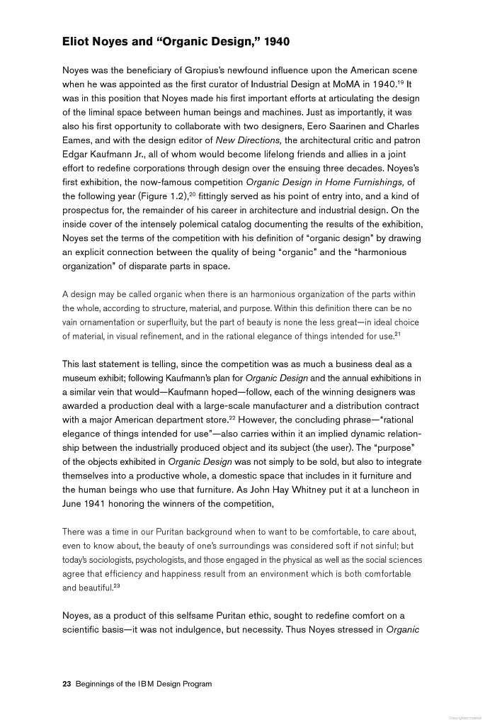


