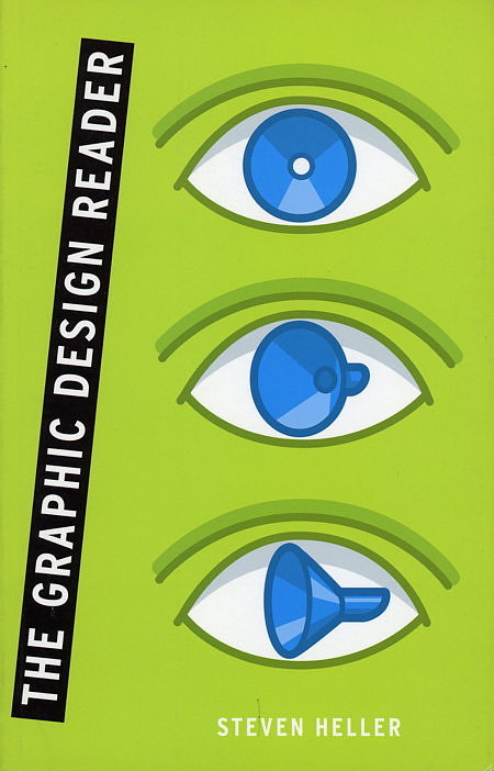
From the lost art of show-card writing and the tumultuous days of guerrilla magazine publishing to the latest in electronic leaflet design and hot magazine covers, acclaimed graphic designer and author Steven Heller provides dozens of stunning examples of how graphic design has transformed from a subset of pop culture to a cultural driving force on its own.
The Original Text
By Steven Heller
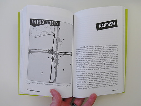
To call Paul Rand shy is to challenge the perception of the man as outspoken and authoritative. Yet shy was indeed on of his most perplexing traits. For much of his career, Rand refused to speak in front of audiences that exceeded three people. Other designers routinely stood before assembled multitudes, flipping through endless trays of personal slides, but Rand suffered from severe stage fright. The few times that he took to the podium the results were not satisfying, especially for him. However, in his mid-seventies, he made a curious reversal. Spurred by the need to publicize his book, Paul Rand: A Designer’s Art, he agree to do public speaking with the help of interlocutors, like myself, who peppered him with questions. He found his comfort level and self-confidence, and to his surprise, he also garnered large audiences who were disarmed by the candor, insight, and anecdote of what I call Randism.
Design as practiced by Rand, although rooted in European Modernism, was decidedly Randism. Unlike other contemporary American exponents of Cubism, Dad, Constructivism, DeStijl, and the Bauhaus, who mimicked these methods, Rand incorporated a Modern essence, or spirit, into his work. He was American, not German, Russian French, or Dutch. His distinctive elocution made it quite clear that he was a Brooklyn-American—indeed a Jewish-Brooklyn-American. He was not born into the culture that give birth to Futurism or die Neue Typographie. He was not schooled in the European ways. He practiced drawing in the back of his father’s small grocery store and was influenced by comic strips, advertisements, and the Saturday Evening Post. Emerging from a hermetic early childhood, he found enlightenment at Macy’s department store, where in the bookshop he found two European graphic design magazines, England’s Commercial Art and Germany’s Gebrauchgraphik. In these pages he learned about contemporary commercial design and its kinship to the arts and was introduced to the Bauhaus notion that good design was an integral part of everyday life.
Once he decided to become an artist-designer, he could have fallen into conventional American methods of practice. In fact, his teachers at Pratt did not offer much guidance other than rote methods of letting and composition. So Rand absorbed the lessons of Modernism in his own way, at his own pace, often by trial, error, and luck.
“I was apprenticed to George Switzer [ a progressive industrial designer in New York], who was influenced by French and German typographers,” Rand said about his earliest exposure to avant-garde design. “Among others I was directly influenced by Piet Zwart, the Dutchman; El Lissitzky, the Russian; [Laszlo] Moholy-Nagy, the Hungarian; Jan Tschichold, the Czech; and [Guillaume] Apollinaire, the Pole; not to mention the Chinese and Persians.” In Rand’s early work his inspirations were obvious—that is, to anyone in America who knew of these relatively unknown European masters. But before long, he found his voice, synthesizing European notions of typography and composition with a uniquely individual, Brooklyn way of conceptualizing.
As a young man, Rand was as nervous about the correctness of his words as he was convinced about the rightness of his design. A desire to be fluent in language caused him to read and reread critics and philosophers like John Dewey, Alfred North Whitehead, and Roger Fry, among others. He matched his intuitive methods to their reasoned insights, and by quoting them in his later writing on themes such as beauty, aesthetics, function, simplicity, and play, he found a means to articulate his on philosophical underpinnings. Ultimately, he used their ideas as armatures on which he built Randism.
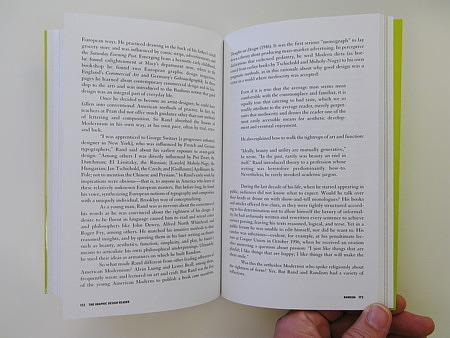
So what made Rand different from other leading adherents of American Modernism? Alving Lustig and Lester Beall, among them, frequently wrote and lecutred on art and craft. But Rand was the first of the young American Moderns to publish a book cum manifesto, Thoughts on Design (1946). It was the first serious “monograh” to lay down a theory about producing mass-market advertising. In perspective declarations that eshewed pedantry, he wed Modern dicta (as borrowed from earlier book s by Tschichold and Moholy-Nagy) to his own pragmatic methods, as in this rational about why good design was a virtue in a world where mediocrity was accepted:
Even if it is true that the average man seems most comfortable with the commonplace and familiar, it is equally true that catering to bad taste, which we so readily attribute to the average reader, merely perpetuates that mediocrity and denies the reader one of the most easily accessible means for aesthetic development and eventual enjoyment.
He also explained how to walk the tightrope of art and function:
Ideally, beauty and utility are mutually generative,” he wrote. “In the past, rarely was beauty an end in itself.
Rand introduced theory to a profession whose writing was heretofore predominantly how-to. Nevertheless, he rarely invoked academic jargon.
During the last decade of his life, when he started appearing in public, audiences did not know what to expect. Would he talk over their heads or drone on with show-and-tell monologues? His books and articles offered few clues, as they were tightly structured according to his determination not to allow himself the luxury of informality; he had arduously written and rewritten every sentence to achieve correct parsing, leaving his texts reasoned, logical, and terse. Yet in a public forum he was unable to edit himself, nor did he want to. His candor was infectious—evident, for example, at his penultimate lecture at Cooper Union in October 1996, when he received an ovation after answering a question about passion:
I just like things that are playful; I like things that are happy; I like things that will make the client smile.
Was this the orthodox Modernist who spoke religiously about the rightness of form? Yes. But Rand and Randism had a variety of inflections.
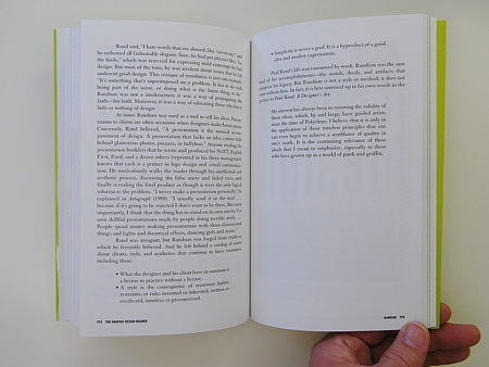
Rand said, “I hate words that are abused, like ‘creative’ “, and he eschewed all fashionable slogans. Sure, he had pet phrases like, “for the birds,” which was reserved for expressing mild contempt for bad design. But most of the time, he was strident about issues that he felt undercut good design. This critique of trendiness is just one example: “It’s something that’s superimposed on a problem. It has to do with being part of the scene, or doing what is the latest thing to do.” Randism was not a smokescreen; it was a way of propagating the faith—his faith. Moreover, it was a way of educating those who knew little or nothing about design.
At times Randism was used as a tool to sell his ideas. Presentations to clients are often occasions when designers make hocus-pocus. Conversely, Rand believed, “A presentation is the musical accompaniment of design. A presentation that lacks an idea cannot his behind glamorous photos, pizzazz, or ballyhoo.” Anyone reading the presentation booklets that he wrote and produced for NeXT, English Fist, Ford, and a dozen others (reprinted in his three monographs) knows that each is a primer in logo design and visual communication. He meticulous walks the reader through his intellectual and aesthetic process, discussing the false starts and failed tries, until finally revealing the final product as though it were the only logical solution to the problem. “I never make a presentation personally,” he explained in Artograph (1988). “I usually send it in the mail… because if it’s going to be rejected I don’t want to be there. But more importantly, I think that the thing has to stand on its own merits. I’ve seen skillful presentations made by people doing terrible work… . People spend money making presentations with three-dimensional things and lights and theatrical effects, dancing girls and music.”
Rand was arrogant, but Randism was forged from truths in which he fervently believed. And he left behind a catalog of tenets about clients, style, and aesthetics that continue to have resonance, including these:
- What the designers and his client have in common is a license to practice without a license.
- A style is the consequence of recurrent habits, restraints, or rules invented or inherited, written or overheard, intuitive or preconceived.
- Simplicity is never a goal: It is a byproduct of a good idea and modest expectations. Paul Rand’s life was consumed by work. Randism was the sum total of his accomplishments—the words, deeds, and artifacts that comprise his legacy. But Randism is not a style or method; it does not exist without him. In fact, it is best summed up in his own words in the preface to Paul Rand: A Designer’s Art:
My interest has always been in restating the validity of those ideas, which, by and large, have guided artists since the time of Polyclitus. I believe that it is only in the application of those timeless principles that one can even begin to achieve a semblance of quality on one’s work. It is the continuing relevance of these ideals that I mean to emphasize, especially to those who have grown up in a world of punk and graffiti.

