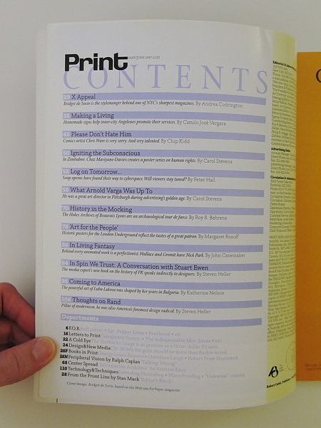
Print, A Quarterly Journal of the Graphic Arts was a limited edition quarterly periodical begun in 1940 and continued under different names up to the present day as Print, a bimonthly American magazine about visual culture and design.
The Original Text
By Steven Heller
Pilar of the modernist esthetic, he was also America’s foremost design radical.
“Modernism was a faith, a religion, a mission to which we committed ourselves with passion and zeal. Paul was our leader and inspiration.”—Louis Danziger
When Paul Rand died at age 82 last November, his career had spanned six decades and numerous chapters of design history. His efforts to elevate graphic design from craft to profession began as early as 1932, when he was still in his teens. By the early 1940s, he had profoundly influenced the practice of advertising, book, magazine, and package design. By the late 1940s, he had developed a graphic language based purely on form where once only style and technique prevailed. He was the channel through which the radical ideas of Russian Constructivism, Dutch De Stijl, and the Bauhaus were introduced to American commercial art, and he wed these formal principles to native wit and humor. At age 32, he wrote Thoughts on Design, the bible of modern practice that replaced old technical handbooks with new approaches to form and content. Later, he became a teacher, theorist, and philosopher of design.
Toward the end of his life, Rand was accused of being reactionary and hostile to new ideas about design. But he ended his career as he had begun it, as an enemy of mediocrity, a radical modernist who imposed changes on a field that had languished in moribund conventions.
Rand did not set out to be a radical. Trained in the commercial art bullpens of New York City, he thoroughly understood the needs of the marketplace, while at the same time frowning on esthetic standards that impeded functionality. He intuitively modeled himself on Paul Klee, El Lissitzky, and Le Corbusier, each of whom advocated a timeless spirit in design, and he adhered to Le Corbusier’s dictum that
to be modern is not a fashion, it is a state.
In 1938, when Rand was only 24, he was hailed by PM, the leading graphics trade magazine of the day, as a major influence on American design. From a large field of veterans, including European emigres, he was singled out for editorial, advertising, and promotion design that was revolutionary for its asymmetric compositions and clever montages. “Rand is unhampered by traditions,” the magazine stated. “He has no stereo-typed style because every task is something new and demands its own solution. Consequently, there is nothing labored or forced about his work.” In a remarkably brief time, he had established a presence that never diminished.
Rand was born Paul Rosenbaum in 1914 in the Brownsville section of Brooklyn, and grew up in a family that strictly adhered to the Orthodox Jewish law that prohibited making images. At the precocious age of three, he showed his rebellious nature by drawing pictures of the models on signs in his father’s grocery store. His artistic interest was later piqued by comic strips like George Herriman’s “Krazy Kat” and Nell Brinkley’s comic women in the New York World. He painted signs at P.S. 109 for school events, assignments that allowed him to be excused from “not-so-interesting classes, like gym, math, social studies, and English.” Religious issues aside, his father argued that art was no way to make a living, and though he resigned himself to paying the $25 entrance fee for his son’s night school classes at Pratt Institute, he did so only on condition that Paul attend Harren High in Manhattan during the day.
Neither of these schools offered Rand much stimulation. In later years, he particularly criticized the teachers at Pratt who made a point of ignoring Matisse, Gris, and Picasso. It was in Room 313 of the New York Public Library where the young Rand educated himself by exploring the stacks of art books. He also credited Gebrausgraphik, the German advertising arts magazine, and Commercial Art, the British counterpart, for introducing him to A.M. Cassandre, Laszlo Moholy-Nagy, and the Bauhaus.
In the early 1930s, Rand got a part-time job doing stock graphics for a syndicate that supplied maps, advertising cuts, and lettering to newspapers and magazines. He also enrolled in Georg Grosz’s drawing class at the Art Students League in Manhattan. Although Grosz, who had recently emigrated from Germany, barely spoke English, Rand remembered that just being in his presence had an energizing effect. From his job and school assignments, Rand was able to build a hefty portfolio to show potential employers. But the quality of the work, he felt, would not in itself assure a position. Convinced that being Jewish was an impediment, he changed his name from Rosenbaum to Rand.
As a student, Rand borrowed his style from reductive German advertising known as Sachplakat, or object poster. He also admired Gustav Jensen, one of the leading designers of the day, whose elegant, ornamental design contributed a degree of civility to mostly crass American graphics. Some of Rand’s early, more illustrative work was influenced by Jensen. He even offered to work for Jensen for free, but was turned down. Ultimately, a chance meeting with typographer/designer Ervin Metzl resulted in an introduction to Joe Switzer, an advertising and package designer with offices on Madison Avenue. Switzer hired Rand for $10 a week doing daily newspaper ads for Squibb, the pharmaceutical company, and packages for Hormel meats. In 1935, Rand opened a closet-sized studio on East 38th Street and garnered freelance layout work from Glass Packer magazine, as well as additional ads for $2 to $4 each. “It was terrible stuff, but I managed,” he recalled.
In 1936, at just 21 years of age, Rand was hired to lay out an anniversary issue of Apparel Arts, a men’s fashion magazine published by the Esquire-Coronet company. His remarkable talent for transforming mundane photographs into dynamic compositions, which did not merely decorate but gave editorial weight to the page, earned him a full-time position. Of course, there was no distinctive Paul Rand look at that time, but a unique sensibility started to emerge with the covers he designed for Apparel Arts. The witty collages and humorously cropped photographs, unburdened by cover lines, were unlike anything on the newsstand. A year later, he was offered the job as art director of the New York office of Esquire-Coronet. He refused, insisting that he was not yet ready. A year later, however, he accepted the assignment and was given responsibility for special sections in Esquire—primarily fashion.
Rand also freelanced for a variety of clients, usually accepting meager fees in order to realize his ideas. He did numerous ads for, among others, Abe Spinell, the eccentric owner of Playtex and inventor of its latex products, who would call Rand into his office in the Empire State Building, seat him in a chair in front of his desk, and have him sketch ideas on the spot. For each ad he was paid $5 to $10 and a sandwich from Longchamps. While his solutions departed from the mainstream, they never compromised the product being advertised.
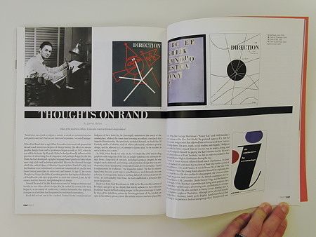
In 1938, Marguerite Tjader Harris, publisher of Direction, a cultural magazine with an antifascist bias, asked Rand to design some covers. Instead of money, he was offered creative freedom (and eventually a few original Le Corbusier drawings). The Direction covers he produced from 1938 to 1941 expanded on the method begun with Apparel Arts into uncharted areas of graphic design. The first cover, symbolizing Nazi Germany’s dismemberment of Czechoslovakia, was a cutout of a map of Czechoslovakia photographed on a copy camera against a white background and lit so that the shadow gives a three-dimensional effect. Two intersecting bars carve the map apart to suggest the lines of German annexation. Describing this cover, Rand said:
It pinpoints the distinction between abstract design without content and abstract design with content. You can be a great manipulator of form, but if the solution is not apt, it’s for the birds.
The 1940 Christmas cover, a piece of barbed wire crisscrossing the image area like gift ribbon, was an acid comment on Nazi-occupied Europe.
Rand did his photography on the copy camera at the engraver’s plant and used handwriting instead of type to save money. The ad hoc execution of his ideas makes these Direction covers look as fresh today as when they were published over 50 years ago. Yet Rand downplayed their originality, saying that they were influenced by Picasso and Surrealism and were homages to the arts magazines Verve and Minotaur. Despite this admission, the Direction covers are a milestone in Rand’s development as an innovative artist/designer.
Three years after Rand was the subject of a cover story in PM, he appeared in the February/March issue of the magazine, now titled AD. By this time he had so thoroughly synthesized the European avant-garde vocabulary that the article offered no hint of derivation. The visual language that would later underpin his approach to corporate design was developed during this period. Its unique and striking character was recognized by Laszlo Moholy-Nagy in his introduction to the AD article:
When I came to this country I was greatly surprised to find that we Europeans were, to a certain extent, more American than the Americans. I found that our imagination went too far. It is true all this technological progress was developed on the highest level in this country but the Americans did not care too much for it. They created their high civilization by instinct, introducing invention after invention into their daily routine. However, they did not attach any philosophy to it as we did in Europe. For them, the nostalgia remained for the “good old” traditional art.
This was a strange experience for me, as I felt that our efforts in Europe to live up to the contemporary status of the Americans proved to be without a real background. It took me a long time to understand the Victorian dwellings, the imitations of colonial architecture or the old fashioned advertising. Fortunately, I soon saw that a new generation was rising with the potentiality and discipline of that America imagined by us in Europe.
Among these young Americans it seems to me that Paul Rand is one of the best and most capable He is a painter, lecturer, industrial designer, [and] advertising artist who draws his knowledge and creativeness from the resources of this country. He is an idealist and a realist, using the language of the poet and business man. He thinks in terms of need and function. He is able to analyze his problems but his fantasy is boundless.
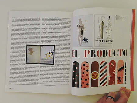
In 1941, William Weintraub, an Esquire-Coronet partner, left the company to start an advertising agency. At 27, Rand became art director of the Weintraub Agency. With offices in Rockefeller Center, Weintraub was the first “Jewish agency” in a field dominated by WASPs to acquire a national client list, including Dubonnet, Schenley, Lee Hats, Disney Hats, Revlon, Hilbros watches, El Producto cigars, Stafford Fabrics, Emerson Radios, Kaiser Corporation, and Autocar Corporation. Within a year, Rand had hired a fairly large staff, but by his own admission, he rarely delegated, preferring to design virtually everything himself.
Rand proceeded to modernize the field of advertising design. Before the 1940s, very little American advertising was really designed; it was composed by a printer or laid out by a bullpen boardman. Layouts were invariably dictated by copy, and copywriters would give rough sketches to the layout artists to refine. Rand believed that advertising composition was a design problem that required intelligent solutions. To the consternation of the copywriters, he took pleasure in tearing up their layouts, particularly the ones he called “really lousy.” He had little patience and was often quite rude. But, as he explained, “I was not going to let myself be treated like a job printer on Pitkin Avenue.”
It was Rand who influenced his colleague at Weintraub, William Bernbach—later a founder of the Doyle Dane Bernbach agency and spearhead of the creative revolution in advertising—to develop “creative teams” that paired copywriters and art directors.
In an essay written in 1946 entitled “The Designer’s Role,” Rand offered this definition:
The designer does not, as a rule, begin with a preconceived idea. His idea is the result of subjective and objective thought, and the design a product of the idea. In order, therefore, to achieve an honest and effective solution he necessarily passes through some sort of mental process. … Consciously or not, he analyzes, interprets, translates. … He improvises, invents new techniques and combinations. He coordinates and integrates his material so that he may restate his problem in terms of ideas, pictures, forms, and shapes. He unifies, simplifies, eliminates superfluities. He symbolizes … abstracting from his material by association and analogy. He intensifies and reinforces his symbol with appropriate accessories to achieve clarity and interest. He draws upon instinct and intuition. He considers the spectator, his feelings and predilections.
Rand soon became known not only for his design, but for his philosophy of design. In 1946, he wrote the first of four books about his work, Thoughts on Design, published by Wittenborn Books. Sharing insight with students and professionals was not, however, his primary purpose. “God forbid, there would ever be a fire, at least I’d have all my samples in one place,” he once admitted. Yet as the book took shape, it became more than a monograph; it aimed to teach. In the preface, he wrote: “This book attempts to arrange in some logical order certain principles governing advertising design. The pictorial examples used to illustrate these principles are taken from work in which I was directly engaged. This choice was made deliberately, and with no intention to imply that it represents the best translation of those principles into visual terms. There are artists and designers of great talent whose work would be perhaps more suitable. But I do not feel justified in speaking for them, nor secure in attempting to explain their work without any possibility of misrepresentation.”
Thoughts on Design combined Bauhaus analysis, Jungian psychology, and homespun candor. Rand succinctly, often poetically, described such heretofore ignored issues as “The Role of Humor,” “Reader Participation,” and “The Symbol in Advertising.” While other influential texts, including Jan Tschichold’s The New Typography, W.A. Dwiggins’s Layout in Advertising, and various Bauhaus, Futurist, and Constructivist manifestoes, had been written on the practice and role of graphic design, Thoughts on Design was the first to examine the inner workings of American modernism.
Rand used the tenets of modernism as an armature on which to hang his bold, often witty ideas. “I took what people like Tschichold said literally. You don’t do illustration, you use photography. You don’t do handmade things, you do it by machine.” But Rand being Rand, he took many liberties with these precepts. While he never studied calligraphy, believing it was “unnatural and stuck in time,” he used his own informal handwriting in place of type. For Rand, handwriting was the most natural form of communication. Of his work, he said:
You don’t imitate anything. Collages are important because they are not imitations of reality, but rather juxtaposed pieces of different realities.
In the late 1940s, though Rand was busy codifying modernist ideas, his education was far from complete. At their first meeting in Chicago, Moholy-Nagy asked Rand if he read any art criticism. When Rand said no, Moholy replied, “Pity.” From that moment on, Rand devoured books by the leading philosophers on art, including Roger Fry, Alfred North Whitehead, and John Dewey. Although Rand practiced Whitehead’s dictum that the best education is personal experience, he became a voracious reader. In his personal library only some very rare editions have not been extensively underlined. And many of the ideas from these texts, such as the principles of design drawn from European modernism, have been quoted and synthesized in his own extensive writings. Today, design theory permeates the design academies; Rand introduced it to his own classes at Yale in the mid-1950s.
By 1956, with his appointment as design consultant for IBM, Rand was firmly established as this country’s foremost proponent of modern design. “He almost singlehandedly convinced business that design was an effective tool,” says design veteran Louis Danziger.
Anyone designing in the ’50s and ’60s owed much to Rand, who largely made it possible for us to work. He more than anyone else made the profession reputable. We went from being commercial artists to being graphic designers largely on his merits.
From the late ’50s until his death, Rand was best known for his corporate trademarks. His logos for IBM, UPS, ABC, Westinghouse, Next, and most recently USSB, the satellite television service, are recognized the world over, even if most people are unaware he designed them.
Rand left behind a huge legacy for professionals. During the final decade of his life he published three important books, Paul Rand: A Designer’s Art, (1985), Design Form and Chaos (1994), and From Lascaux to Brooklyn (1996). Not just retrospectives, these books codified the principles he adhered to in his professional life.
Through his own radical alteration of design practice, Rand transformed the field for thousands of others. Despite ebbs and flows in the field, he never faltered, never changed, never questioned the rightness of his mission. During ceremonies at his retrospective at Cooper Union last October, he was asked whether modernism was dead. Rand replied:
I’m still alive.

