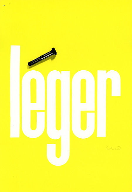
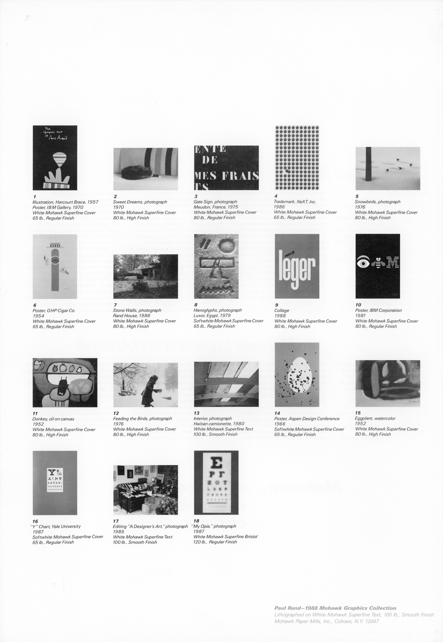
One of Mohawk’s Graphics Collection, this is a collection of 18 images (16”x 11”) by and about Paul Rand, each lithographed on different weights of Mohawk Superfine paper, with an additional smaller leaf of production notes.
Very fine in a grey paper sleeve and mailing envelope, as issued.
The Original Text
By Mohawk Paper Mills
Paul Rand, designer.
In its simplicity the phrase is a powerfully complete way of describing a man who has defined both the form and standards of his trade. His innovations and contributions to graphic design are legend, and his achievements fill volumes.
A native of Brooklyn, Rand studied at Pratt Institute, Parsons School of Design and the Arts Students League, under George Grosz. At the early age of 23 he became art director of Esquire and Apparel Arts magazines, producing a series of covers now recognized as classics.
He left publisnihg for the advertising business, and in 1941 began a 13 year career as creative director at a New York City advertising agency. There, through campaigns for Coronet brandy, Dubonnet aperitif, El Producto cigars and Orbach’s stores he planted the idea that the principles of the painting masters could be combined with American Design to form effective business communications. His ads anticipated the trend toward integration of art and copy: a development that changed advertising in the postwar years.
In 1954 Rand formed his own design company specializing in corporate communications. Among the firms that have sought his services are IBM, Westinghouse Cummins Engine, ABC and UPS.
Besides emulation, Rand’s accomplishments have brought formal recognition from colleagues and the design community around the world. He has received honorary doctor of fine arts degrees from the Philadelphia College of Art, Parsons School of Design, and the University of Hartford; a doctor of letters degree from Kutztown University; a master of arts degree from Yale University; and was named honorary professor of Tama University Tokyo. His design of advertisements, brochures, annual reports, books, trademarks, packaging, fabrics, interior architecture and illustrations for children’s books have generated awards such as Royal Designer for Industry, from the Royal Society of Arts in London; the gold medal of the American Institure of Graphic Arts; membership in the Hall of Fame of the New York Art Directors Club; and the 1987 Florence (Italy) Prize for Visual Communication - a first in the field of graphic design.
Rand’s work is in the permanent collections of museums in the United States, Europe and Japan. Through his writings and teaching he has educated and inspired generations of graphic designers in books like _The Trademarks of Paul Rand; Design and the Play instinct; Thougnts on Design; _and Paul Rand: A Designer’s Art. The last two in particular are regarded as among the most influential works of their type ever published. He has also authored numerous papers on design are and typography.
Since 1956 Rand has taught at the Yale University School of Art, where he is now professor emeritus of graphic design. He also teaches in the Brissago, Switzerland Yale summer school program.
Paul Rand. In this special collection of his art, most of which has never before been published, Mohawk Paper invites you to discover why many consider him to be the most important and influential American designer of all time.
Mohawk Superfine and Artemis
Exclusive. Elegant. Luxurious. No matter how you describe it, Mohawk Superfine lives up to its reputation as the “finest of the texts.” Therefore it was the logical choice as the paper for this exceptional portfolio of Paul Rand art.
In fact, Mohawk Superfine is the favorite of Rand himself. Made from the purest high alpha fibers it offers the most spotlessly clean surface available for a look and feel befitting your own very special communications.
The culmination of years of research in papermaking, Superfine is free of acid, alum and rosin, and has a pH of above 7.5 with an alkaline buffer to neutralize any acidity that might develop in handling or storage. Artificial aging tests indicate permanence of more than 300 years.
Mohawk Superfine is available in various finishes: Eggshell, Smooth and High Finish Text, and Regular and High Finish Cover. A Regular Finish Bristol is also offered. What’s more, you can select weights from 70, 80 and 100 lb. Text; 65 and 80 lb. Cover; and 120 lb. Bristol. You can also choose from three subtle shades — White, Softwhite and Ivory.
Of course, a Paul Rand portfolio calls for superior packaging too. So we’ve called on Mohawk Artemis for our cover and envelope. Artemis rises to the occasion giving both the look of distinction and durability that this special event demands.
Fourteen inviting colors including Berry, Cordovan, Slate, Powder Blue, Pearl, Forest Green, and Navy Blue make Artemis a delightful visual experience.
It’s available in 70 or 80 lb. Text and 80 lb. Cover. And the classic genuine felt-marked surface of Artemis comes in a broad feather deckle edge or plain edge. Simply put, Mohawk Artemis is printable and prestigious.
Paul Rand demands peerless quality. So can you. Ask your Mohawk Merchant for Superfine and Artemis. Experience for yourself how Mohawk brings you the very best in the business.
Mohawk… when you want to look good on paper


