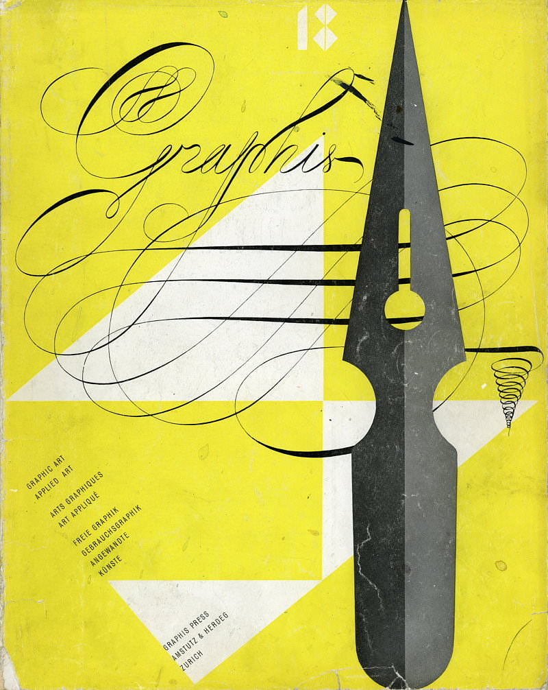
9.25 x 11.75 magazine with 102 pages of b/w and color examples of modern graphic design, circa 1947. Text in in English, French and German.Graphis was (and still is) one of the most important and influential European graphic design publication. Each issue always showcased the best graphic and applied art, including advertising, typography, posters, printmaking, illustrators, book arts, ethnic art, etc, with a focus on modern European designers. Graphis is still being published, but the most influential and groundbreaking years are from the 1940s to the early 1960s.
Excellent original edition of Graphis with a very strong editorial content:
Contents:
- Paul Rand by Georgine Oeri: 14 pages and 38 color and b/w examples. Rand included this GRAPHIS + appearance in his bibliography in the second edition of THOUGHTS ON DESIGN (1951).
- Salvador Dali 1946.
- State and Industrial Design in Britain
- New Swiss Posters
- Advertising Art in Post-war Italy
- and much more.
These periodicals are much harder to find than the well known Graphis Annuals, which are essentially pictorial “best of” collections and lack the depth and text of the originals. These publications are also more valuable as they are the original documents. Many of the articles are written by important artists, critics and scholars.
The Original Text
By Georgina Oeri
Every specimen of this American artists’ work is perfect when considered as a formal structure and exemplifies his flair for the values of the individual form. To him the space represented by the given surface of the paper—an advertisement page, for instance—is never a matter of chance, but is a quantity that has to be reckoned with in the formal solution of the task. This surface is for him a field of energy and has to be vitalized to its very margins. The “empty” spaces are just as important as those which are explicitly filled. They both attain their efficacy by means of the tension of their inter-relation. The composition alone as a self-contained, formal organism is something that is felt to be beautiful and gratifying even before any representational determination of a single precise object has been realized or the trigger of association leading to its publicity effect has been found and pulled.
The sense of the self-contained life of a shape, of its abstract structure and its specific expressiveness which Paul Rand has developed and schooled by contact with modern artists (Kandisnsky, Klee, Picasso and others) is what he uses for solving that artistic part of his problem. His fresh vision in the world of experience and his gift of observation on that basis of a love of reality help Paul Rand to achieve a sound synthesis of abstraction and concreteness and thus attain the shock effects which are so eminently important in advertising.
The animals on the pages of the review THE ARCHITECTURAL FORUM are instances of his feeling for natural form, as is also the trademark with the horse (Stafford Fabrics). On one hand the latter shows a suggestion coming from oriental miniatures, on the other the subtely decorative disposition of the three patterns over the animal’s body exhibits well-founded experience of form, that is to say of the world of objects. In the way the horse ceases to be a mere horse but has become a formalized element coordinate with the letters of the set-square name. A sign has been created.
However necessary empirical reality is to the graphic artists, since it provides him with the spark that fires his imagination, he yet sees this reality as something already formed when he sets about transposing its validity, rendering it general, free from chance and formally mastered. Out of the union between empirical reality and formal vision a kind of crystallization gives rise to what we have called a sign, what Paul Rand, in a more restricted sense calls a symbol. This elevation of reality to an abstract shape, embracing a number of significant values, seems of such decisive importance to him that he has devoted a whole chapter to The Symbol in Advertising in his book THOUGHTS ON DESIGN. The way in which he employs a circle, a cross, a number, a letter, illustrates his endeavour to penetrate to the significant content of a form, to win from is a self-evident, legible language.
The symbolic power of a shape is in itself still indeterminate. Its meaning fluctuates according to its combinations with determining elements. But every time the object of Rand’s endeavour is to grasp the pictorial content of a communication so exhaustively that is becomes generally comprehensible and universal. Applied graphic art is one of the present day forms of expression of this century-old tendency in man. In its own field it seeks to employ the results of enormous contemporary efforts to create a comprehensible language for modern life.


