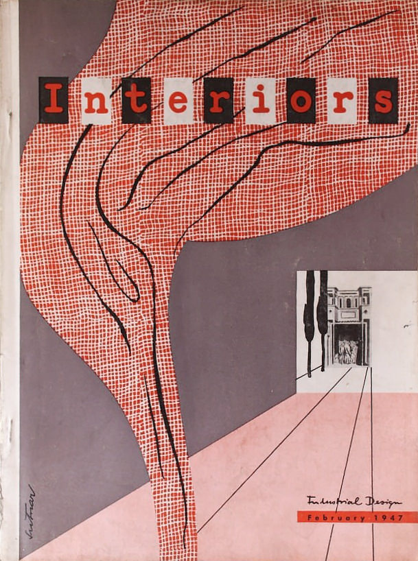
Francis de N. Schroeder [Editor]: INTERIORS + INDUSTRIAL DESIGN. New York: Whitney Publications [Volume 106, no. 7] February 1947. Original edition. Quarto. Perfect bound and sewn printed illustrated wrappers. 156 pp. Illustrated articles and trade advertisements. Wrappers lightly worn and soiled with splitting spine ends. Faint corner crease to front panel. Lower corner of last few advertising leaves tacky. Interior unmarked and clean. Cover by Ladislav Sutnar. A very good copy.
9 x 12 magazine with 156 pages of color and black and white examples of the best modern American interior and industrial design, circa 1947 — offering a magnificent snapshot of the blossoming modern movement after World War II. A very desirable, vintage publication in terms of form and content: high quality printing and clean, functional design and typography and excellent photographic reproduction make this a spectacular addition to a midcentury design collection. Highly recommended.
- The first installment of the Series “Designing Information” by Ladislav Sutnar and and K. Lönberg-Holm: 15 pages of elaborate design printed in two colors. The “Designing Information” Series was commissioned by Interiors magazine and originally appeared in three parts during February, March and April of 1947. “In emphasizing the importance of information today, the authors stress the increasing need for developing the most advanced techniques of visual ization to devise information tools of wider comprehension. This need itself makes greater demands upon design in information and requires dissemination of information on design to a vaster audience.” — Francis d. N. Schroeder
- New Furniture by Marcel Breuer: 5 pages.
- Paul Rand, Industrial Designer: 4 pages devoted to Rand’s packaging design.
- Interiors Contributors: illustrated profiles of Marcel Breuer, Paul Rand, and K. Lönberg-Holm.
- Interiors Bookshelf: review of Paul Rand’s Thoughts on Design.
- Architects Studio By Conrad Wachsmann and Serge Chermayeff [with fold-out].
- Modern Rooms Of The Last Fifty Years by Edgar Kaufmann: Includes work by Charles Eames, Marcel Breuer, Frank Lloyd Wright, Richard Neutra, Edward D. Stone, Walter Bogner, George Fred Keck, Walter Gropius, G. A. Berg, Erwin Gutkind, Ludwig Mies Van Der Rohe, Le Corbusier And Pierre Jeanerret, Josef Frank, Josef Hoffman, Charles Rennie Macintosh and others.
- Furniture News From France by Saul Steinberg [with fold-out].
- And much more.
The Original Text
Paul Rand, industrial designer
We hope sincerely that Rand’s slim book Thoughts on Design, published only some weeks ago, will be read and mulled over even by people only remotely connected with design. In spite of his long and singularly successful career, Rand is still young enough to be referred to as a youthful prodigy; his thoughts — almost too sparingly administered — reflect age-old wisdom, his work maturity. The only recipe for his success is, we understand, self-criticism.
Here we are concerned with Rand as a designer. His packaging, though less numerous than his advertising designs, contains the same elements of gaiety, grace, and surprise. Of course, few have had the good fortune to be asked to contrive containers for essences with so strong a sensorial or sensual appeal as gin or perfume. Still, a scrutiny of the colorful pages of national magazines evidences the inexorable boredom of the professional prettifiers and stylists. Rand’s perfume bottle shown on the facing page is as fresh and ageless as any pedigreed object d’art of merited museum fame.
Only little more than ten years ago, in a Mid-Manhattan liquor shop, we came across a bottle labeled candidly WINE. We never forgot the shock of the discovery that wine could be sold simply as a liquid to be taken internally.
Things have changed since then, thank God, but the bottles for American alcoholic beverages, and especially the affixed labels, have, we believe, something to do with the popular heresy that wine is a devil’s gift, rather than a godsend to be accepted humbly and respectfully. The labels of classical vintages wines are so often typographical poems that it appears difficult to approximate their suggestive quality with names of domestic products which, more often than not, have a false ring.
There is nothing equivocal about the gin bottles shown below; their character is as American as the grains from which the gin is distilled. The lettering is bold, spirited and—superbly legible.
At left, perfume bottle, gold cap and crystal base, Jacqueline Cochran, 1944.
Below, four crystal perfume bottles. The one at lower left has ebony top.
In the above design Rand incorporated a feature known only from display windows — a concave glass wall which, much like the invisible shop window, afford a reflectionless glimpse at the liquid insides.


