The Original Text
“This book attempts to arrange in some logical order certain principles governing contemporary advertising design.”
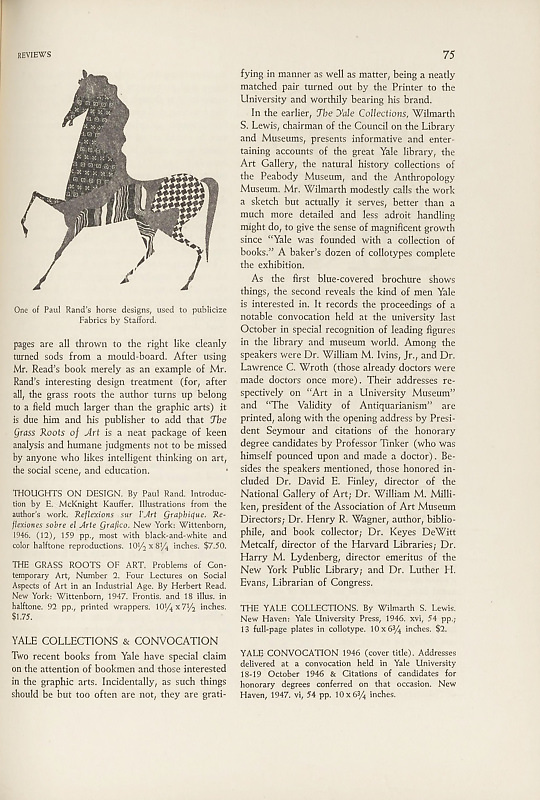
So Paul Rand begins his book. The principles are sententiously stated in widely leaded flush-left lines under such rubrics as “The Beautiful and the Useful” (about forty lines), “The Designer’s Problem” (about fifty lines), “The Symbol in Advertising” — but here at page 9, just as the author seems to be involving himself inextricably in a discussion of the perfect maleness-femaleness of the crucifix, the pictures of his actual work as designer come to save the day.
The rest of the book is nearly all devoted to illustrations of Mr. Rand’s thoughts on design as made manifest in his booklet and magazine covers, periodical advertising, product packaging, and work for publishers. And the thoughts come through clear, cogent, and lively, so the pages spent on text — above all the vainglorious pages spent repeating the text in French and Spanish! — might better have been turned into more pictures, or into a credit on the price of an expensive book.
The thoughtful advertising designer’s way with a book is demonstrated in Mr. Rand’s handling of the excellent lectures given at Yale by Herbert Read last year and now published with a new introduction as The Grass Roots of Art. As in his own book, Mr. Rand uses 11-point slug-cast Baskerville set thirty picas wide, but justified lines and reduced interlinear spacing demand closer reading attention here, just missing the point of strain by virtue of antique book paper replacing the dull coated used for the Thoughts.
As usual in his typography, Mr. Rand has most fun with the imposition of Grass Roots. There is no discernible “aesthetic message which in turn complements the message conveyed by the words” resulting from the exaggerated and shifted margins. As a matter of fact the verso pages crowd uncomfortably into the gutter, beyond which is a broad band of white space effectually undoing the unity of the two-page spread that most printers think worth preserving. But Mr. Read plows deep to get at the grass roots of art and it is not inappropriate, perhaps, that his pages are all thrown to the right like cleanly turned sods from a mould-board. After using Mr. Read’s book merely as an example of Mr. Rand’s interesting design treatment (for, after all, the grass roots the author turns up belong to a field much larger than the graphic arts) it is due him and his publisher to add that The Grass Roots of Art is a neat package of keen analysis and humane judgments not to be missed by anyone who likes intelligent thinking on art, the social scene, and education.
THOUGHTS ON DESIGN. By Paul Rand. Introduction by E. McKnight Kauffer. Illustrations from the author’s work. Reflexions sur l’Art Graphique. Reflexiones sobre el Arte Grafico. New York: Wittenborn, 1946. (12), 159 pp., most with black-and-white and color halftone reproductions. 10½ x 8¼ inches. $7.50.
THE GRASS ROOTS OF ART. Problems of Contemporary Art, Number 2. Four Lectures on Social Aspects of Art in an Industrial Age. By Herbert Read. New York: Wittenborn, 1947. Frontis. and 18 illus. in halftone. 92 pp., printed wrappers. 10¼ x 7½ inches. $1.75.


