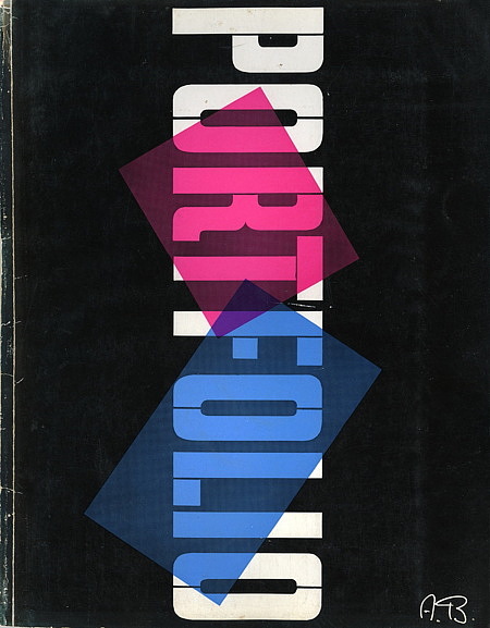
10 x 13 edition with over 100 pages of the finest editorial graphic design of all time. Portfolio is generally regarded as the high-water mark for American Editorial Graphic Design, and this issue spotlighting the work of E. McKnight Kauffer, Richard Avedon and Paul Rand shows you exactly why.
The first issue includes 6 bound-in giftwrap paper samples, a Paul Rand trademark insert and a tipped-in Bodoni type specimen sheet, and the highest quality printing available in the early 1950s. Brodovitch’s refusal to allow advertising to mar the flow of this magazine led to its quick demise: only three issues were published from 1950 to 1951. These magazines are extremely rare and seldomly surface in today’s market. Truly a high point of American Graphic Design.
Alexey Brodovitch (1898-1971) is a legend in graphic design: during his 25-year tenure as art director of Harper’s Bazaar, he exerted tremendous influence on the direction of design and photography. A passionate teacher of graphic design, advocate of photography and collaborator with many prominent photographers, Brodovitch is often credited with having a major influence on the acceptance of European modernism in America. His use of assymetrical layouts, white space, & dynamic imagery changed the nature of magazine design. He was responsible for exposing everyday Americans to avant-garde artists by commissioning work from cutting-edge artists such as Cassandre, Dali, Cartier-Bresson, Man Ray, etc.
‘Portfolio’ is considered Brodovitch’s greatest achievement– although short-lived, the magazine captured the dynamic work of some of his emerging star students from his famous Design Laboratory, including Irving Penn, Richard Avedon, Art Kane.
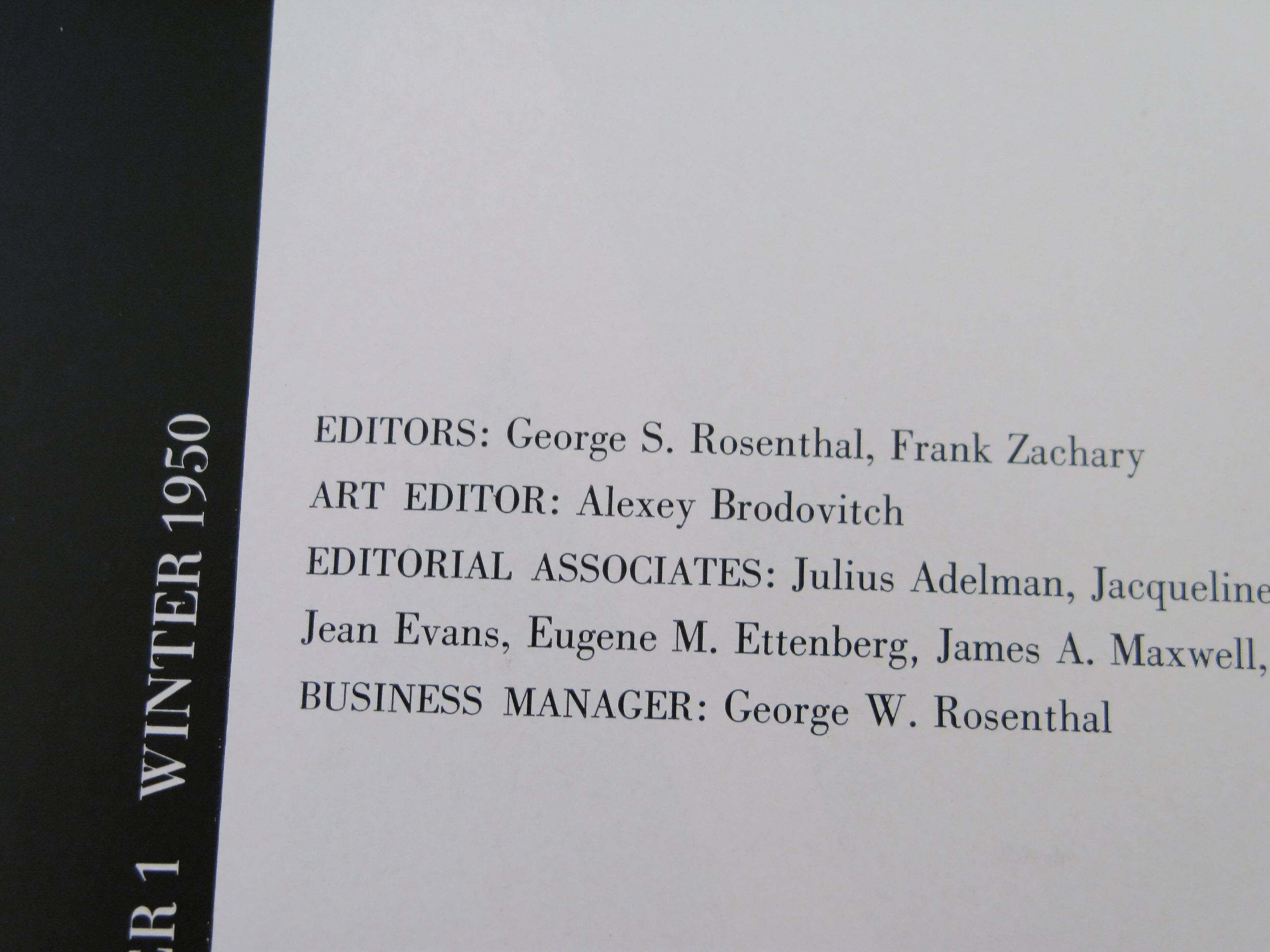
The list of contents and contributors for Portfolio magazine reads like a guest list at some great event hosted by an enlightened art patron. “Producing a magazine is not unlike giving a party – the editor-in-chief has to be a good master of ceremonies.” according to Frank Zachary.
Like Brodovitch, Zachary likened publication design to cinematography, where the pacing of visual sequences plays an important role. Art directing and editing are one and the same thing – you have to keep your eye on both the visual and verbal narration line. “You have to tell two stories, one in words, one in pictures, completely separate — but like railroad track, leading to the same place.” Zachary recounted to Martin Pedersen in Graphis Publications (Zurich, Graphis Press Corp., 1992).
“Astonish me!” was Brodovitch’s often quoted exhortation to students attending his “Design Laboratory” classes over the years. Though borrowing “etonnez-moi!” from the Russian ballet master Sergei Diaghilev, with this charge, Brodovitch indeed set in motion the application of the modernist ethos to American graphic design and photography.
Brodovitch’s legacy was given a boost by the publication of a major monograph on his work in 2002 by Phaidon. The Phaidon book reproduces every single page of each issue of Portfolio— a very unusual tribute.
Contents:
- Giambattista Bodoni
- Design From the Mathematicians
- E. McKnight Kauffer: Poster Designer: includes many poster and sketchbook designs
- Xerography: New Visual Effects with Powder and Electricity
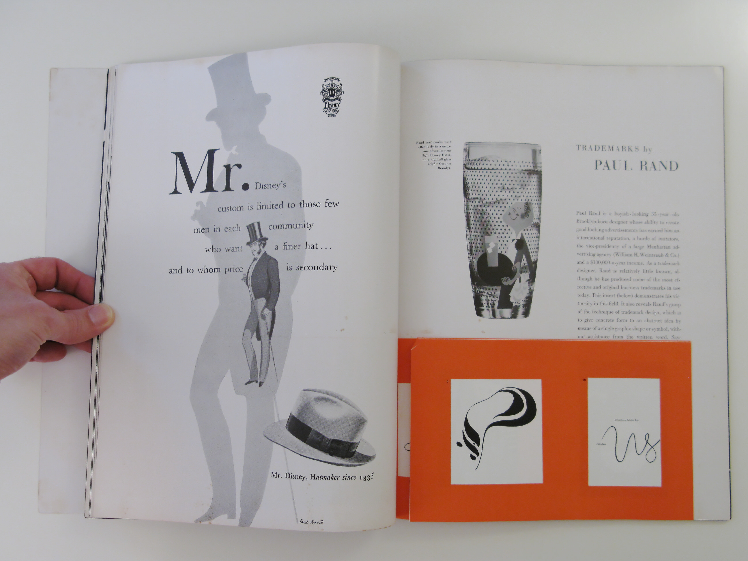
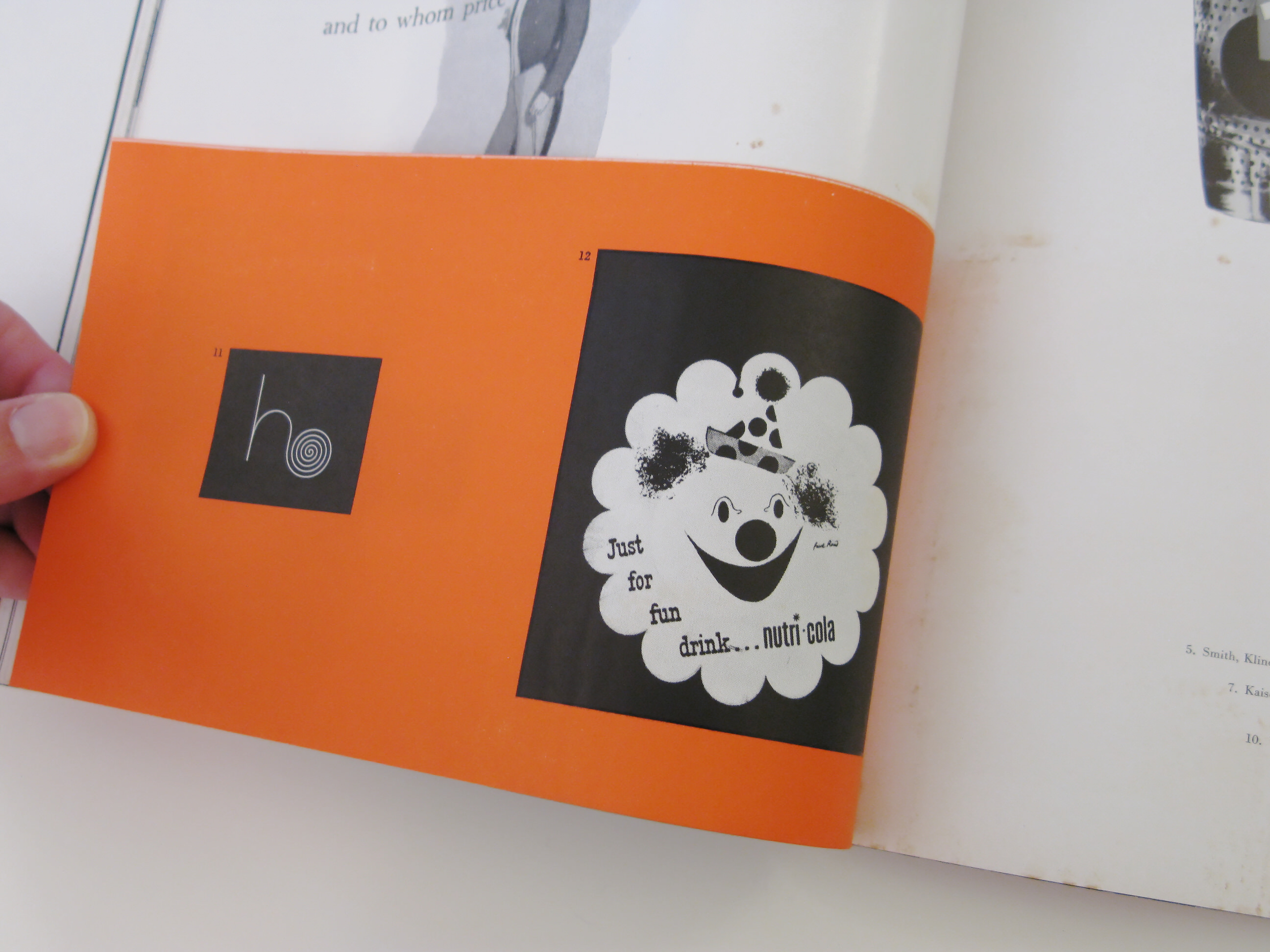
- Trademarks by Paul Rand: short article with bound-in booklet featuring 12 trademarks
- Giantism: USA
- The Good Looking Package: includes 6 bound-in giftwrap paper samples
- The Gift to Be Simple: Shaker design
- Saul Steinberg
- Photography in Fashion: Portfolios by Irving Penn and Richard Avedon
- News Portfolio: Record album cover art by David Stone Martin; designs by Bradbury Thompson, Paul Rand, Alvin Lustig; Knoll Furniture sales brochure by Herbert Matter; miscellaneous designs by A. M. Cassandre, Jean Carlu, Raymond Loewy, Le Corbusier, Ben Nicholson, Kasimir Malevich and others.
The Original Text
By Unknown
Paul Rand is a boyish-looking 35-year old Brooklyn-born designer whose ability to create good-looking advertisements has earned him an international reputation, a horde of imitators, the vice-presidency of a large Manhattan advertising agency (William H. Weintraub & Co.) and a $100,000-a-year income. As a trademark designer, Rand is relatively little known, although he has produced some of the most effective and original business trademarks in use today. The insert (below) demonstrates his virtuosity in this field. It also reveals Rand’s grasp of the technique of trademark design, which is to give concrete form to an abstract idea by means of a single graphic shape or symbol, without assistance from the written word. Says Rand:
A trademark is the signature of a company as opposed to the signature of an individual. It should as closely as possible embody in the simplest forms the essential characteristics of the product or institution being advertised. It should be easy to identify, and it should serve to glorify the merchandise in question, which is often dull and utilitarian by nature. A trademark is a miniature poster, which should sell in a nutshell.
Rand’s best trademarks bear out his theory in practice, deriving their appearance and visual impact from the form and function of the product involved, as in his Coronet Brandy waiter whose head is shaped like a brandy glass, and his Helbros Watch Company monogram H which ends in the tight flourish of a coiled watchspring.


