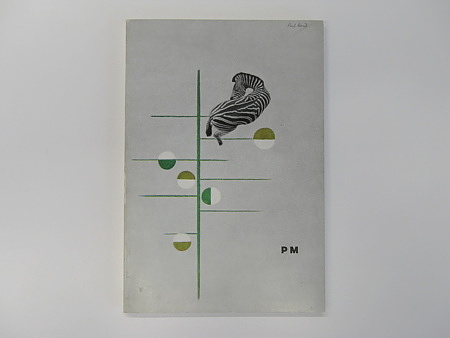
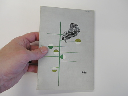
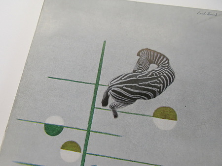
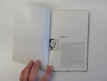
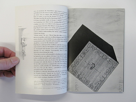
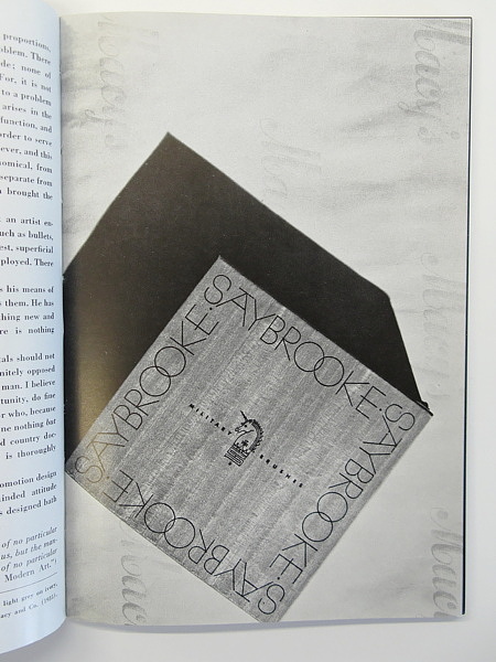
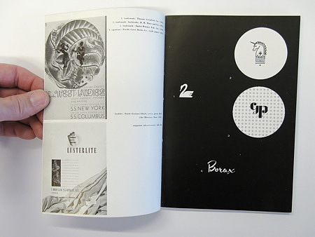
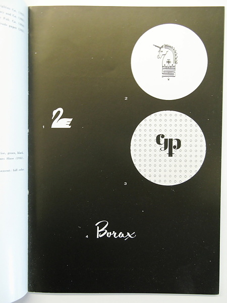
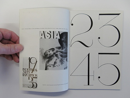
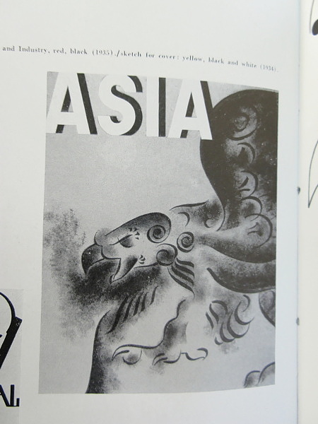
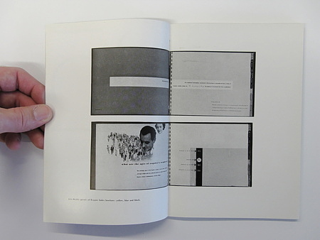
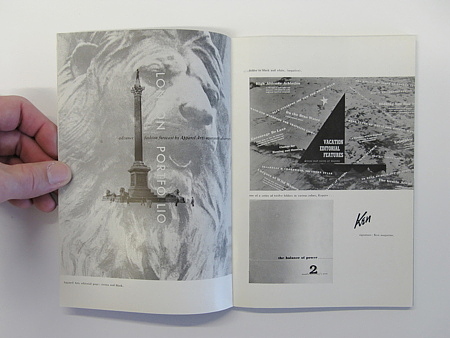
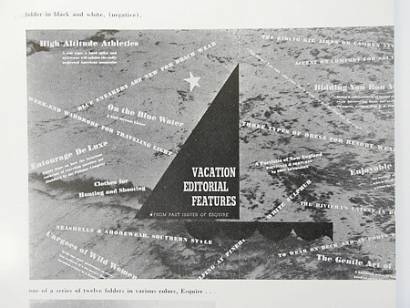
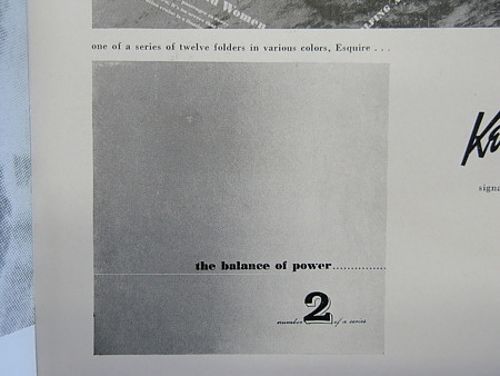
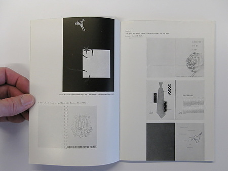
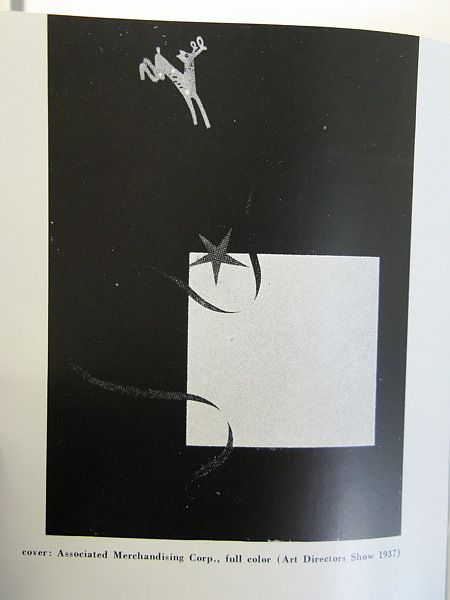
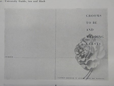
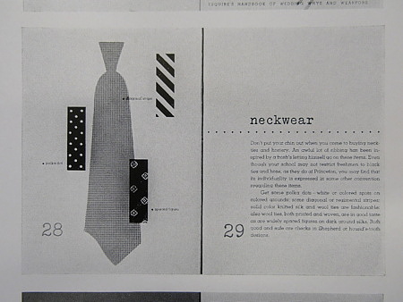
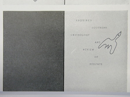
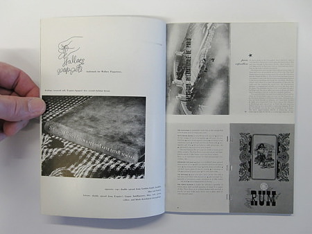
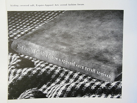
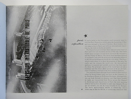
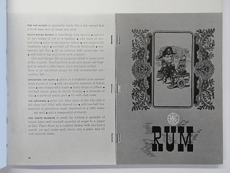
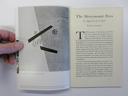
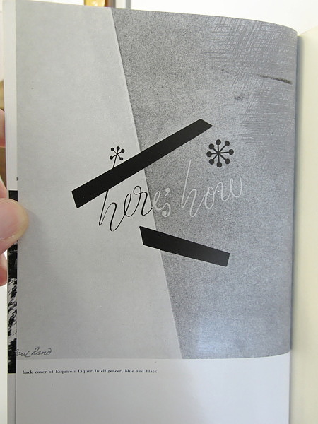
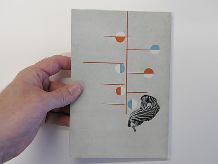
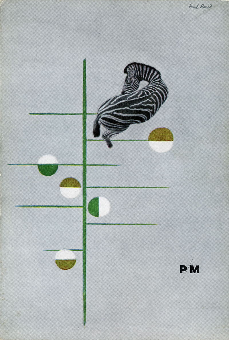
This volume measures 5.5 x 7.75 with 83 [13] pages of articles and advertisements. This issue of PM rates a singular high point in the history of American Graphic design due to its spotlighting of Paul Rand—this is the FIRST article to acknowledge Rand’s professional output. Rand designed the wraparound cover as well as the 16-page letterpressed insert that shows the early development of the modern american master.
The cover of this PM is widely recognized as one of the iconic images of 20th-century American Graphic Design, as has been reproduced countless times in design histories/anthologies. A classic piece of original ephemera from the most influential graphic designer of all time.
Also included is a 16-page Portfolio of Reproductions from the Christmas Cards Published by the American Artists Group printed in 5-color offset and featuring many WPA-eras artists including Rockwell Kent, Thomas Hart Benton, Grant Wood, Doris Lee, Adolph Dehn, John Stuart Curry, Emil Ganso, Dale Nichols and others.
In this issue, the PM / A-D Shorts column mentions Hans J. Barschel, Rex Cleveland, Edward A. Adams, Kurt H. Volk , Peter DeNapoli, Laszlo Matulay, John Kanelous, Fritz Eichenberg, Daniel Berkeley Updike, George Switzer, August Gauthier, Evelyn Harter, Percy Seitlin.
Walker Evans American Photographs hot off the presses from the Museum of Modern Art is reviewed rather favorably with one photograph reproduced.
PM magazine was the leading voice of the U. S. Graphic Arts Industry from its inception in 1934 to its end in 1942 (then called AD). As a publication produced by and for professionals, it spotlighted cutting-edge production technology and the highest possible quality reproduction techniques (from engraving to plates). PM and A-D also championed the Modern movement by showcasing work from the vanguard of the European Avant-Garde well before this type of work was known to a wide audience
The Original Text
By Unknown
PAUL RAND
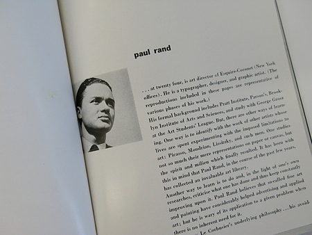
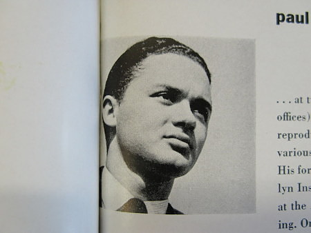
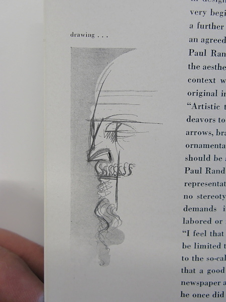
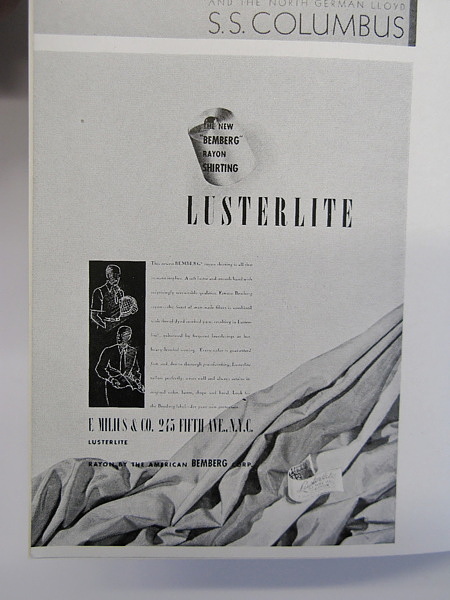
…at twenty-four, is art director of Esquire-Coronet (New York offices). He is a typographer, designer, and graphic artist. (The reproductions included in these pages are representative of various phases of his work.)
His formal background includes Pratt Institute, Parson’s, Brooklyn Institute of Arts and Sciences, and study with George Grosz at the Art Students’ League. But, there are other ways of learning. One way is to identify with the work of other artists whose lives are spent experimenting with the imposed limitations to art: Picasso, Mondrian, Lissitzky, and such men. One studies not so much their mere representations on paper or canvas, but the spirit and milieu which finally resulted. It has been with this in mind that Paul Rand, in the course of the past few years, has collected an invaluable art library.
Another way to learn is to do and, in the light of one’s own researches, criticise what one has done and thus keep constantly improving upon it. Paul Rand believes that so-called fine art and painting have considerably helped advertising and applied art: but he is wary of its application to a given problem when there is no inherent need for it.
He favors Le Corbusier’s underlying philosophy…his avoidance of ornament, his dependence upon masses, proportions and inherencies for success in the solution of a problem. There are many ways to express this functional attitude: none of them, it seems, is easy for the layman to grasp. For, it is not altogether true that the perfect functional solution to a problem in design inevitably results in beauty. A dispute arises in the very beginning over what is to be considered the function, and a farther one arises over what is to be chosen in order to serve an agreed upon function. One thing is certain, however, and this Paul Rand insists upon: it is wrong and uneconomical, from the aesthetic point of view, merely to “borrow” or separate from context without understanding the factors which brought the original into being.
Artistic tricks”, he says, “distract from the effect an artist endeavors to produce, and even excellent elements, such as bullets, arrows, brackets, ornate initials, etc. are, at their best, superficial ornamentation unless logically and reasonably employed. There should be a reason for the elements used.
Paul Rand is unhampered by traditions and takes his means of representation wherever he happens to run across them. He has no stereotyped style because every task is something new and demands its own solution. Consequently, there is nothing labored or forced about his work.
“I feel that and artist well grounded in fundamentals should not be limited to any one sphere of design. I am definitely opposed to the so-called specialist, and to pigeon-holing a man. I believe that a good poster artist can, if given the opportunity, do fine newspaper ads. And, the chances are that the actor who, because he once did a good job as a gangster has since done nothing but gangsters, could probably do schoolteachers and country doctors, too, if he got the chance…provided he is thoroughly grounded in the craft of acting.”
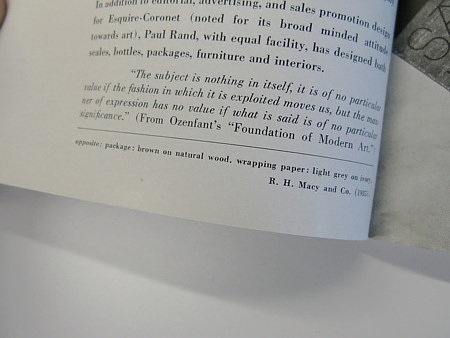
In addition to editorial, advertising, and sales promotion design for Esquire-Coronet (noted for its broad minded attitude towards art), Paul Rand, with equal facility, has designed bath scales, bottles, packages, furniture and interiors.
“The subject is nothing in itself, it is of no particular value if the fashion in which it is exploited moves us, but the manner of expression has no value if what is said is of no particular signifigance.” (From Ozenfant’s “Fountains of Modern Art”).


