
8.75 x 11.75 saddle-stitched magazine with 36 pages of advertising and editorial content. American Artist offers a unique combination of respected editorial by providing in-depth profiles, historical surveys, and instructional demonstrations in a variety of media including acrylic, oil, watercolor, charcoal, and pastel.
The Original Text
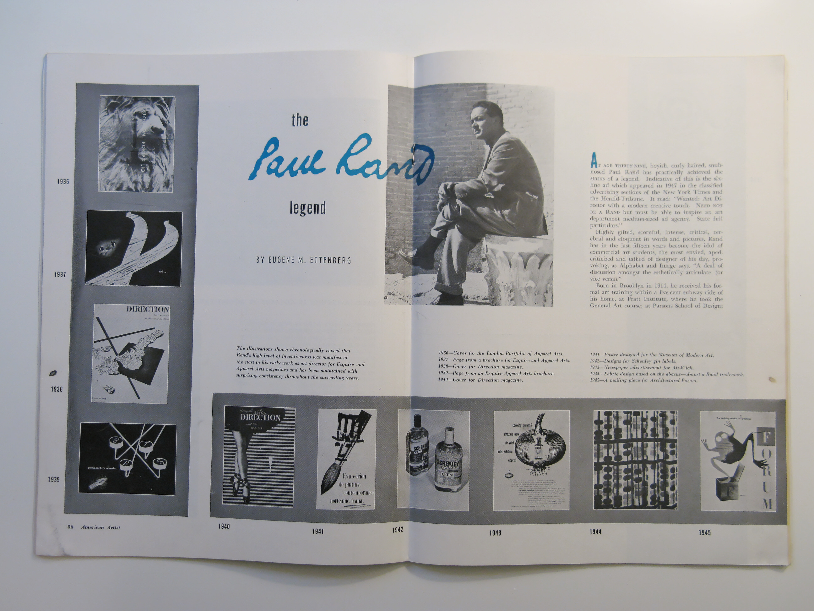
By Eugene M. Ettenberg
AT AGE THIRTY-NINE, boyish, curly haired, snub-nosed Paul Rand has practically achieved the status of a legend. Indcative o this is the six-line ad which appeared in 1947 in the classified advertising sections of the New York Times and the Herald-Tribune. It read:
Wanted: Art Director with a modern creative touch. NEED NOT BE A RAND but must be able to inspire an art department medium-sized ad agency. State full particulars.
Highly gifted, scornful, intense, critical, cerebral and eloquent in words and pictures, Rand has in the last fifteen years become the idol of commercial art students, the most envied, aped, criticized and talk of designer of his day, provoking, as Alphabet and Image says, “A deal of discussion amongst the esthetically articulate) or vice versa.”
Born in Brooklyn in 1914, he received his formal art training within a five-cent subway ride of his home, at Pratt Institute, where he took the General Art course’ at Parsons School of Design; at the Brooklyn Institute of Art and Science and under the tutelage of George Grosz at the Art Students League. George Switzer, the pioneer industrial designer, took him under his wing and in Rand’s most formative years gave him glimpses of the new idioms of design that were then seeping out of Europe.
At twenty-three he was appointed art director of Esquire and Apparel Arts magazines, It was then that the Rand legend started. His employers wisely gave him a loose rein, and, taking the bit of creative advertising in his mouth, he was off in a burst of brilliant design. In the past sixteen years he has risen to the position of the highest paid advertising agency art director in the nation.
As an art director of the William H. Weintraub & Company advertising agency, and as free-lance designer, his layouts for such accounts as Air-Wick, Coronet Brandy, Dubonnet, Jacqueline Cochrane Cosmetics, Stafford Fabrics, Smith, Kline & French Pharmaceuticals, Robeson Cutlery, Kaiser Motors, El Producto Cigars, Disney & Lee hats, Kaufman’s and Ohrbach’s department stores, and Country Club Ice Cream have won him the Art Directors Club Medal and numerous awards for distinctive merit, citations, certificates of excellence, and awards from the Direct Mail advertising Association, the Society of Typographic Arts in Chicago, the American Institute of Graphic Arts, and a fellowship in the British Royal Society for the Encouragement of the Arts—honors that justify the painter-like signature that appears on all his designs.
He has, between times, designed products and packaging for Coty, Air-Wick, Schenley Distiller and R.H. Macy’s, and books for Alfred A. Knopf, Inc,. Rinehart Company and George Wittenborn.
If a poll were taken among lay persons in New York City to determine which of the newspaper ads in recent years had “gotten though,” penetrated the almost calloused skin of the cynical New York shopper, I’d be willing to be that the Ohrbach ads would come out on top. Indeed a survey has shown that sixty-three per cent of men and eighty-five per cent of women newspaper readers read the Ohrbach ads. For this achievement Jerome K. Ohrbach, writing in Fashion Trade magazine at the time Rand was working on these advertisements, has, in large measure, credited Paul Rand. These ads embody much of Rand’s expressed thinking. On the surface they have appeared disarmingly simple, almost childlike, using easy, everyday selling phrases and puns, illustrated with gay, animated animals, birds, fish, abstracted in form so that every meaningless line is blanked out. Type, when used, is bold and uncluttered’ while a legible, round unstudied written hand is employed for emphasis. Simple, easily understood symbols are made use of to imply to the lady from uptown the advantages of shopping in this Fourteenth Street store.
A great many words have been used by art and graphic arts journals in attempting either to understand or interpret Rand’s genius. Time Magazine feels that “Rand’s ads are sometimes as pristine as a good abstract painting, sometimes as jumbled as Dadaism on an off day” and goes on to say that “unlike many frustrated ad artists who like to paint ‘the real thing’ on Sundays, Rand believes he can put his art into ad.”
A. Zigrosser of the Art Institute of Chicago, in the late lamented Magazine of Art, detects in Rand a “love of order, color, uncluttered planes and surfaces’ humor and innuendo, the latter assuming some intelligence on the part of the audience.”
The Swedish Grafisk Tenik, the Danish Annon Soren, The London Times Literary Supplement and the Swiss Graphis have all shown his unstereotyped work to their readers.
In the Swiss Werk, Max Bill, architect and designer, says: “In spite of many daring combinations of familiar elements, Paul Rand avoid s the pitfalls of our ‘graphc’ homey style and the boring new ‘functionalism’ which poisons our Swiss graphic work. He combines in a felicitous manner idea and urge, beauty and necessity, using media which are typical of our period.”
Rand, unlike some of his contemporaries, has allowed us some in sight into his working methods, his creative processes, aside from his teaching and lecturing on his technique of graphic presentation at Cooper Union and Pratt Institute.
He raise his voice critically in the 1949 Penrose Annual when he called American book designers to account for failing to show more inspiration. He blamed it on their failure to realize 1. the modern concept of space; 2. the disappearance of classical perspective; 3. the relationship between background and foreground’ 4. relations between volumes and planes; 5. historical and spiritual differences of tradition and the poetic content (the perceived image).
In 1946 Wittenborn published Rand’s “Thoughts on Design”, a book of illustration s interspersed with many of the principles and disciplines that govern art. Critic Roger Fry and philosopher John Dewey are quoted frequently in it. Both are credited with having taught Rand much about the uses of art and with having helped to crystallize his thinking.
His table of contents—The Beautiful and Useful; The Designer’s Problem; The Symbol in Advertising’ The Versatility of the Symbol; The Role of Humor; Reader Participation, and Typographic Form and Expression—suggest the direction of his thinking.
To design a good liquor ad, Rand says, a designer must know what it is to feel convivial. The hardest part of his work is to find the symbol which will differentiate between one brand of liquor and another. The same, of course, applies to cosmetics, fabrics, etc. He points to Cassandre’s little Dubonnet man and glass; to his own brandy-glass shaped waiter for Coronet and to his patchwork horse for Stafford Fabrics.
He has no patience with slickness, with facility; he is a particularly severe critic of the hackneyed and the insincere. All this is deadwood, he argues, to be cleared away.
Copy, art and typography, he believes, are indissoluble.
With McKnight Kauffer, he maintains that very few ads are ust plain good to look at, instead they overemphasize fear, sex, maternity, snobbism and the like.
He favors Le Corbusier’s underlying philosophy—avoidance of ornament—depending instead upon masses and proportions. Artistic tricks, he feels, divert from the effect an artist endeavors to produce, and even excellent elements such as bullets, arrows, brackets, ornate initials, etc., are at best superficial ornamentation unless logically and reasonably employed.
From a critique he wrote of the Fifty Books of 1948 we get this insight into his dislike for calligraphy: “I don’t understand what relation calligraphy has to twentieth-century living, e.g., to the typewriter, for instance. The old scribe had no other way of reproducing the written word, and, by virtue of a great deal of experience, achieved a desirable end. But calligraphy has nothing to do with modern handwriting, it is in itself and affectation. It is like pseudo-Greek architecture for government buildings— a throwback to impress one with the past.”
The nub of his thinking on the making of layouts (a word he finds inadequate to describe the design of an ad—he prefers the word “composition” in the sense it is used in painting) is that, consciously or not, the designers analyzes, interprets, translates. He apprises himself of the new scientific and technological developments in his own and kindred fields. He improvises, invents new techniques and combinations. He coordinates and integrates his material so that h may restate his problem in terms of ideas, picture forms and shapes. He unifies, simplifies, eliminates superfluities. He symbolizes—abstracts from his material by association and analogy. He intensifies and reinforces his symbol with appropriate accessories to achieve clarity and interest. He draws upon instinct and intuition. He considers the spectator, his feelings and predilections. In sum, the designers experiences, perceives, analyzes, organizes, symbolizes, synthesizes.
Rand finds a confirmation of his theories in the work of the Shakers; in the examples of archaic Chinese art, and in oriental miniatures.
When he doesn’t have to be in his New York office, Paul Rand works at home in Weston, Connecticut, where he paints, works on free-lance accounts, gardens and plays the accordion for all who will hear. The house, recently featured in Esquire, was designed by himself and his wife Ann, a former student of the famous architect, Mies Van Der Rohe. A fitting house, those will agree who have seen it, for the subject of a legend.


