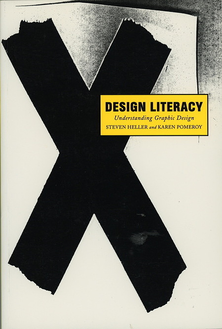
This is the first book to provide explicit case histories of the successful marriage of form and content in graphic design. It explores nearly 100 classic and contemporary works and explains why they are aesthetically significant and how they function as good design. By focusing on the study and appreciation of specific works, Design Literacy breaks new ground and will be of interest to students and designers at all levels.
The Original Text
By Steven Heller
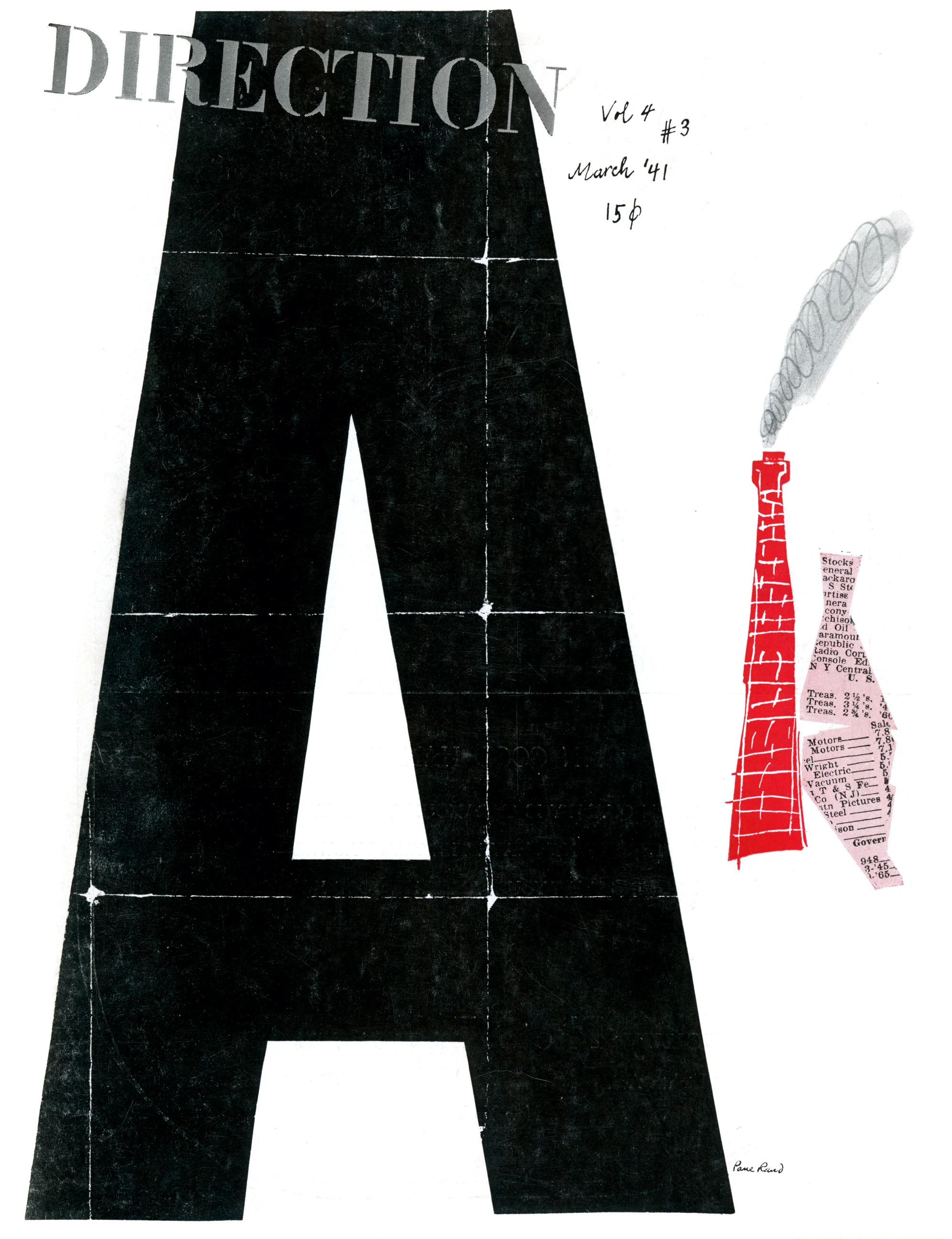
“He favors Le Corbusier’s underlying philosophy…his avoidance of ornament, his dependence upon masses, proportions, and inherencies for success in the solution of a problem,” exclaimed the October–Novermber 1938 issue of PM magazine of Paul Rand (1914–1996), at twenty-four years old the leading American proponent of functional design. “Artistic tricks divert from the effect that an artist endeavors to produce, and even excellent elements, such as bullets, arrows, brackets, ornate initials, are, at best, superficial ornamentation unless logically and reasonably employed,” Rand explained. But at that time these graphic accoutrements were considered soothing to most clients. So how did Rand succeed in expressing himself, and otherwise change conventional practice? The answer can be found in a a series of covers designed for Direction magazine between 1939 and 1943.
Rand was reared in the commercial art bullpens of New York and understood the needs of American commerce. He never intended to be a radical, but from the outset of his career he had an instinctive understanding of modern painting, a passion for popular art, and a flair for wedding the two. He was harshly critical of the lack of quality in American design practice, and believed that even the most common aspects of everday life could be enriched by an artist’s touch.
Although he was enthused by the new currents in art and design, he refused to mimic or follow them blindly. Rand insisted that it was not only wrong but also “uneconominal from the aesthetic point of view” merely to borrow or separate from context without understanding the factors that brought an original into being. He further gave credence to Le Corbusier’s dictum that it is necessary to unerstand history, “and he who understands history knows how to find continuity between that which was, that which is, and that which will be.” PM concurred: “Rand in unhampered by traditions…He has no stereotyped style because every task is something new and demands its own solution. Consequently, there is nothing labored or forced about his work.”
Rand’s artistic awakening came in the late 1920s at the New York Public Library where he explored the stacks and pored through volumes of Commercial Art, the British trade journal that published articles on the European avant-garde practitioners, including expatriate E. McKnight Kauffer. He had a second epiphany at a little magazine store adjacent to the Brooklyn Academy of Music, where in 1929 he bought his first issue of Gebrauchsgrafik, the most influential German advertising arts magazine ever published. It was in this periodical that Rand learned about the practice of, and the term, graphic design.
By 1938 Rand had produced enough noteworthy design that he caught the eye of Marguerite Tjader Harris, the daughter of a wealthy Connecticut munitions manufacturer. She was intent on having Rand design covers for Direction, an arts and culture magazine that she published on a shoestring, which featured articles by Le Corbusier, Jean Cocteau, and other avant-gardists. She offered Rand no recompense, but plenty of freedom and, ultimately, a couple of original Le Corbusier drawings. But Rand has another motive, “In a country that was used to decorative work, the common sense way to have what I was doing accepted was to do it for free,” he explained.
More than any other projects, the Direction covers exemplified the timelessness that Rand attributed to the most significant art and design.
“When I designed a cover of Direction, I was really trying to compete with the Bauhaus. Not with Norman Rockwell,” clarified Rand. “I was working in the spirit of Van Doesburg, Leger, and Picasso. It was not old fashioned. To be old fashioned in, in a way, a sin.”
Each Direction cover illustrated a particular theme or point of view; the first, and his most politically astute, showed a map of Czechoslovakia torn in half, representing the nation’s evisceration by the Nazis. Contrasted with an E. McKnight Kauffer Direction covers showing a realistic hand impaled by a Nazi dagger, Rand’s abstract depiction was both subtle and eloquent. Rand avoided conventional propagandistic tools in favor of imagery he believed would serve as both art and message. His 1940 “Merry Christmas” cover was a visual pun that substituted barbed wire for gift wrap ribbon. Rand photographed real barbed wire against a white background lit to pick up the shadows. Little red circles made by a hole punch represented spilled blood. The barbed wire was a striking mnemonic symbol for oppression.
“It pinpoints the distinction between abstract design without and abstract design with content,” he insisted. “You can be a great manipulator of form, but if the solution is not apt, it’s for the birds.”
The surprising juxtaposition of visual elements and universal symbols was born of necessity. Messages had to be conveyed quickly and efficiently. Since there was no budget for materials he often used handwriting instead of type for many of the covers. He even pieced together the stenciled masthead (a precursor of the stenciled IBM logo, perhaps) from the letters in type catalogs. His images were often assembled from various elements. “Collages don’t imitate reality,” he stated. “The machine aesthetic dictated that you don’t do things by hand anymore.” Nevertheless, the Direction covers did not slavishly conform to such modern principles, and hand drawing was used on occasion.
Rand was the first to confess that these breakthrough covers were not entirely unique.
“I never claimed that this was great original stuff,” he confided. “Other guys in Europe were doing this kind of thing.”
But even though he admitted to paying homage both to Picasso and the surrealist art magazines Verve and Minotaur, Rand created a unique visual vocabulary—and a collection of memorable magazine covers—that was unlike anything being done in the United States at that time, or for a long time after.


