
Communication Arts is the largest international trade journal of visual communications. Founded in 1959 by Richard Coyne and Robert Blanchard, the magazine’s coverage includes graphic design, advertising, photography, illustration and interactive media. The magazine continues to be edited and published under the guidance of Coyne’s wife Jean and their son Patrick Coyne. Currently, Communication Arts (CA) publishes six issues a year and hosts six creative competitions in graphic design, advertising, photography, illustration, typography and interactive media and two Web sites, commarts.com and creativehotlist.com
Contents Include:
- Isadore Seltzer
- Robert Overby
- Peter Rogers
- Sheldon Seidler
- Westways
- William Accorsi
- Phil Marco
- Paul Rand article by Allen Hurlburt. 20 pages of examples and a wonderfully written article covering Rand’s history.
The Original Text
By Allen Hurlburt
If the word legend has any meaning in the graphic arts and if the term legendary can be applied with accuracy to the career of any designer it can certainly be applied to Paul Rand. When I first met him in 1951 at a lunch with Arnold Gingrich, the founding editor of Esquire magazine, the legend was already firmly in place. By then Paul had completed his first career as a designer of media promotion at Esquire-Coronet and as an outstanding cover designer for Apparel Arts and Direction. He was well along on a second career as an advertising designer at the William Weintraub agency which he had joined as art director at its founding. Paul Rand’s book, Thoughts on Design, with reproductions of almost one hundred of his designs and some of the best words yet written on graphic design, had been published four years earlier-a publishing event that cemented his international reputation and identified him as a designer of influence from Zurich to Tokyo.
Paul Rand was only 32 years old when he completed Thoughts on Design and he was still in his thirties when we met. My impressions of that meeting are still vivid-the quick, curious, and intensely analytical look in his eyes framed by dark-rimmed glasses; the close cropped hair above a forehead where a frown always seemed to lurk ready to pounce on the first banality that had the effrontery to rear its ugly head; all of this over a conservative suit marked by a black-knit tie-the trademark of his Madison A venue days. Paul recalls a time when, in a somewhat less conservative mood, he was wearing a bright red viyella shirt and matching red socks that prompted his friend Saul Steinberg to remark, “That must be the longest underwear I ever saw.”
There has been little change since the Madison Avenue period-his hair is certainly grayer after twenty years; his frown is less evident and his glasses are now trifocal; but the eyes continue their curious analysis of anything that has the nerve to cross his field of vision. Today his dress is more casual, but still conservative, and the Chaplinesque humor that plays such a role in his design ideas still lingers in the background of this very private person.
The Early Years
In an interesting way the chronology of Paul Rand’s design experience has paralleled the development of the modern design movement. In America, unlike Europe where the poster was dominant, new design directions came first to magazine design and media promotion. By the 1940s this emphasis began to shift to advertising design following the pioneering work already being done at N.W. Ayer in Philadelphia and at Young & Rubicam and Calkins and Holden in New York. At the end of the 1950s with the rapid growth of national companies into multi-national corporations, another shift of emphasis placed the spotlight on coordinated corporate design programs. Paul Rand’s first career in media promotion and cover design ran from 1937 to 1941, his second career in advertising design ran from 1941 to 1954, and his third career in corporate identification began in 1954 and is continuing. Paralleling these three careers there has been a consuming interest in design education and Paul Rand’s fourth career as an educator started at Cooper Union in 1942. He taught at Pratt Institute in 1946 and in 1956 he accepted a post at Yale University’s graduate school of design where he holds the title of Professor of Graphic Design. He is also an honorary professor of Tama University in Tokyo. His essay on “Design and the Play Instinct” written in 1965 for the book Education of Vision, published by George Braziller, still stands as an outstanding statement on design education.
The Rand apprenticeship in graphic design began in 1935 when he worked for George Switzer, an innovative designer whose package and advertising design helped set the style for modern merchandising. In 1937 Paul launched his first career at Esquire. Although he was only occasionally involved in the editorial layout of that magazine, he designed extensive promotion and direct mail material on its behalf and turned out a spectacular series of covers for Apparel Arts, a quarterly published in conjunction with Esquire. In spite of a schedule that paid no heed to regular working hours or minimum wage scales, he managed in these crucial years to find time to design an impressive array of covers for other magazines, particularly Directions. From 1938 on his work was a regular feature of the exhibitions of the Art Directors Club.
Advertising Design
Most contemporary designers are aware of Paul Rand’s highly successful and often compelling contributions to advertising design; What is not well known is the significant role he played in setting the pattern for future approaches to the advertising concept. Paul was probably the first of a long and distinguished line of art directors to work with and appreciate the unique talent of William Bernbach. It was shortly after Bernbach’s stint with the New York World’s Fair and several years before he was to become the principal creative force at Doyle Dane Bernbach that he worked briefly with the recently formed Weintraub agency. Paul describes his first meeting with Bill Bernbach as “akin to Columbus discovering America,” and goes on to say, “This was my first encounter with a copywriter who understood visual ideas and who didn’t come in with a yellow copy pad and a preconceived notion of what the layout should look like.” A few years later when Bill Bernbach had moved on to the Gray Agency, Paul and Bill were brought together again to create advertising for Ohrbachs, a New York department store. For over two years they created the now famous series of intensely visual newspaper advertisements. During this period Paul worked at Weintraub and served the Ohrbach account as a design consultant.
You can’t quite say that it all began here, because it was a time when too many things were happening in advertising in too many places, but it is reasonable to assume that from this point on the isolation of the art and copy departments was destined to give way to a closer if not always harmonious working relationship between these two creative forces.
The William Weintraub Company originally consisted of a small staff drawn largely from the business side of Esquire, but by 1951 it had a staff of over one hundred. Today the agency continues to function under a different name, but it is a far different agency from the one that was built around Paul Rand’s talent in 1941 when he was 27 years old.
During the years when Paul was at the agency, Weintraub served many impressive accounts including Schenley, Revlon, Kaiser, Seeman Brothers, Stafford Mills and El Producto Cigars. His advertisements for Air-wick that combined modem typography with nineteenth century engravings not only introduced a new product, but succeeded in turning a local distributor into a nationwide success story over night.
Paul spent fourteen years in advertising and left a mark that would last for many more. He was a primary mover in the fusing of visual ideas and persuasive communication. He demonstrated the importance of the art director in advertising and helped break the isolation that once surrounded the art department. He played a key role in establishing the art and copy team as the base for the advertising concept. But perhaps his overriding contribution was the inspiration that his brilliant approach to design brought to a generation of future advertising art directors.
To me, an even more significant contribution was his sense of responsibility to the reader and his emphasis on quality and good taste. Today this contribution may be more honored in the breach than in the observance in many agencies, but scores of responsible art directors around the world continue to demonstrate that the Rand influence was considerably more than a brief moment of an advertising Camelot.
The final thought of his Thoughts on Design is worth repeating: “Even if it is true that commonplace advertising and exhibitions of bad taste are indicative of the mental capacity of the man in the street, the opposing argument is equally valid. Bromidic advertising catering to that bad taste merely perpetuates that mediocrity and denies him one of the most easily accessible means of aesthetic development.”
Rand also points out that when an art director translates a literal approach into a “visual message which is not only arresting and persuasive, but imaginative, dramatic and entertaining as well, he has fulfilled his obligation to his audience, and perhaps he has fulfilled his obligation to more personal standards .”
By the time he decided to leave advertising, Rand had gained considerable experience in the not so gentle art of working with difficult people. It began with David Smart and William Weintraub at Esquire which in its early days was a pressure cooker par excellence. He recalls a time when Dave Smart stuffed him with artichokes in his luxurious hotel apartment so that Paul could go back to the loft and work through the night on a special Esquire Christmas promotion. William Weintraub was himself a legendary accomplished, but unusually tough salesman, who had once tried to convince the Stein way people through an elaborate presentation that by advertising in Esquire they could increase the sale of pianos in bordellos.
Bill Weintraub was a formidable impresario who you remembered as being taller than he actually was. He appreciated and exploited the commercial value of Paul Rand’s talent and taught him how to make and enjoy money, but he was never an easy man to work for. He was a master of the demeaning gesture, and it was sometimes his style to create tension and conflict among his staff in the misguided belief that controversy had something to do with creativity.
Client relations at the agency were no bed of roses either with clients like Revlon’s Charles Revson and Schenley’s Lewis Rosenstiel. In fact, one of the more absurd myths surrounding the Rand legend is the notion that while other art directors are forced to face day-to-day pressures, Paul operated in the splendid isolation of some ivory tower. Nothing could be further from the truth. One of the outstanding, but little known, attributes to his success has been his ability to bridge the gap between creative communication and business needs and he has achieved all of this without any assistance from representatives and without compromising his principles.
Although he was never at ease with the time-consuming and rarely productive meetings of the plans board, and he avoided these sessions whenever he could, he was excellent in the all important face-to-face meetings with major management executives where most of the real decisions are made.
Corporate Identity
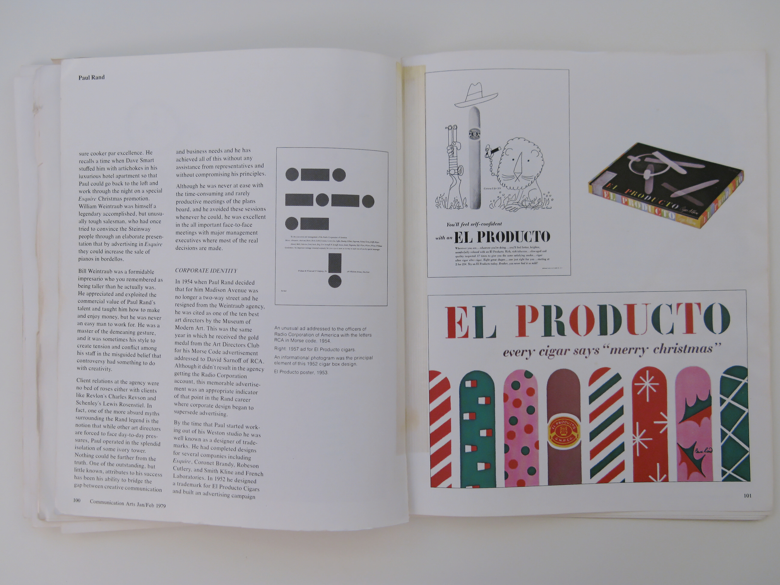
In 1954 when Paul Rand decided that for him Madison Avenue was no longer a two-way street and he resigned from the Weintraub agency, he was cited as one of the ten best art directors by the Museum of Modern Art. This was the same year in which he received the gold medal from the Art Directors Club for his Morse Code advertisement addressed to David Sarnoff of RCA. Although it didn’t result in the agency getting the Radio Corporation account, this memorable advertisement was an appropriate indicator of that point in the Rand career where corporate design began to supersede advertising.
By the time that Paul started working out of his Weston studio he was well known as a designer of trademarks. He had completed designs for several companies including Esquire, Coronet Brandy, Robeson Cutlery, and Smith Kline and French Laboratories. In 1952 he designed a trademark for EI Producto Cigars and built an advertising campaign around it that was to be part of his first independent corporate design program for the Consolidated Cigar Company. This coordinated campaign included some of the best package designs for such products since the invention of the cigar box.
In the period between 1954 and 1956 Paul also began work on some children’s books in collaboration with his wife, Ann Rand. His daughter Catherine was then only a baby and the books reflect her father’s warmth and his personal identification with play and the childlike character of much of his design. The first of these books was called “I Know a Lot of Things” and it was followed one year later by “Sparkle and Spin.”
By 1955 the fates that continued to play a fortuitous role in channeling the Rand talent toward critical areas of design began to set the stage for his third major design career. Thomas J. Watson, Jr., had come recently to the presidency of the International Business Machines Corporation and, with his expanding vision of the future for computers in science and word processing, he felt the need to clarify the identity of this somewhat amorphous company. He had already brought in the late Eliot Noyes to reshape the product lines, and the search for a graphic designer to create the corporate image led to Paul Rand.
He worked on a graphic design program during the last half of 1955 and a trademark was designed and accepted early in the following year. At the outset it was decided that this program would not be based on rigid standards or some predetermined theme that might date the project and deny it the flexibility that the continuous growth and change of this company demanded. From the beginning the trademark was used with a unique freedom. By making the style of the design the guiding influence over a carefully organized group of international designers, a progressive unity was achieved without the loss of spontaneity and excitement.
Heading this outstanding design program was a triumvirate of noted designers as Charles Eames joined Noyes and Rand as consultant on displays, exhibitions, and films. In 1976 when Tom Watson brought the group together at a dinner to mark twenty years of the design program, he pointed out that not only was the selection of designers right, and their design philosophy correct, but in 1956 the time had been right. He had to admit that it might have been impossible for IBM to achieve the same result at a different time in the company’s development.
The work at IBM led to a new program for Westinghouse under the guidance of the same design team. This project began in 1960. During this period Paul also engineered redesign programs for Harcourt Brace in 1957, Colorforms in 1959, United Parcel Service in 1961 and American Broadcasting Company in 1962. In the 1960s he undertook a major corporate design program for Cummins Engine Company and he continues to serve this account and his two other major accounts, IBM and Westinghouse. This means a heavy workload and an extensive travel schedule, but he still finds time to take on an impressive array of other commissions including a surprising number for nonprofit organizations that he serves without any design fee.
It would not be fair to cover his career in corporate design without mentioning one of the accounts that didn’t quite work out according to plan. In 1966 the Ford Motor Company asked Paul to redesign the quasi-spencerian script and oval medallion that had adorned Ford automobiles for more than sixty years. After extensive research and considerable design exploration, a new style was worked out and a handsome printed and bound presentation was prepared in a limited edition for the eventual review by Henry Ford II. After some deliberation, Mr. Ford finally decided that, when it came to the family name, what was good enough for his grandfather was good enough for him.
The Rand Style
To understand Paul Rand’s personal style as an artist, designer, and educator, it may be helpful to take a closer look at his early background. He was born in 1914 in Brooklyn, New York, a remarkably fertile ground for the nurturing of design talent, though no one can say quite why.
His earliest years were spent living behind the store where his parents ran a shop serving the neighborhood’s needs for a wide variety of necessities. He remembers, with some fondness, the early hours of many cold winter mornings when the fresh bread and rolls were delivered. Freshly baked and still hot, they were unceremoniously passed through the convenient window of his room to add their warmth to the foot of his bed.
There is nothing very unusual about Paul’s early educational background, but somewhere along the line he decided that art and design was his calling. Like many of his contemporaries in these infant years of graphic design, he pretty much shaped his own learning process. At that time art schools were almost totally committed to the fine arts and only a few were making tentative explorations in the applied art form that was then called commercial art. The pervading philosophy of the time was that students who didn’t show sufficient talent at the easel might become illustrators, and if a student’s skill as a draftsman was inadequate then perhaps he could be passed off as a commercial artist. Designations like art director and graphic designer were hardly known.
There was never any doubt in Paul’s mind about becoming a designer and he took advantage of three of the better schools - Pratt Institute, the Parsons School, and the Art Students League where he studied with George Grosz who had been a member of the Dada movement in Berlin after World War I. Paul Rand’s intellectual curiosity, and a natural bent for academic scholarship, took him far beyond the meagre limits of the schools he attended, and today his knowledge of design is rarely matched by design theorists. His lectures at Yale University on Cezanne and other post-impressionist painters often broke new ground in art history and research.
Like most American designers who were educated in the early thirties, one of his principal sources of design awareness was the European design publications that were beginning to find their way into American libraries. Two of the most important were Gebrauchsgraphik from prewar Germany and Arts et Metier Graphique from Paris. Paul Rand is probably the only private collector with a complete file of Arts et Metier Graphique.
Rand’s personal library includes nearly every major book on the modern design movement. He was an early follower of the work and writings of El Lissitzky, the Russian pioneer constructivist graphic designer, and he has read practically every word written by Theo van Doesberg, a leading design theorist and one of the major influences of the de Stijl movement.
For him the learning process has never ended, and his conscientious concern for knowledge has led him from his own studies to the teaching of others. In spite of a heavy work schedule, he has been involved in one way or another in design instruction throughout his career. His course at the Yale University School of Design has received international acclaim and his ex-students include the partners of several major design studios on both sides of the ocean, a number of design directors, and the head of the department of graphic design at more than one university.
Most of the influences that helped shape the Rand style mentioned up to now originated in Europe, and yet his style could never be described as Swiss, German, or French. To explain the uniquely American aspects of his style, it is necessary to turn to another source. This leads us to an interesting group of American industrial and graphic designers who came into prominence in the late twenties. This group was represented by the stylishness of Raymond Lowey and the theatricality of Norman Bel Geddes, but it is also known for the pioneering designs of George Switzer, Paul’s first boss, that were to become the foundation for modern package design. This group of designers also included Walter Dorwin Teague, Joseph Sinel, Donald Deskey, and Gustav Jenson, a designer who brought a sense of elegance to graphic, packaging, and industrial design that has rarely been matched. The important contribution to contemporary American design by this still underrated list of designers was somewhat dimmed by the influx of middle European designers in the 1930s.
The Rand Typography
Paul has always believed that a design is the synthesis of all of its elements and that type is an integral part of the design process. For that reason it is difficult to isolate his typographic approach which was devoted to the refinement of use rather than eccentricity of selection.
He was one of the first designers to use traditional Garamond in a modern design; he used and understood san serif letterforms long before the invention of Helvetica; he mastered the application of modern faces like Bodoni, Baskerville, and Walbaum to the smooth white surfaces of modern paper; and he was a pioneer in the effective use of typewriter type and stencil letters .
Probably the Rand typographic credo is best revealed in his comment in Thoughts on Design: “By carefully arranging his type areas, spacing, size, and color, the typographer is able to impart to the printed page an aesthetic message which in turn complements the message conveyed by the words. He is able to transmit tactile sensations and intensify and minimize these sensations at will. By concentrating the type area and emphasizing the margin [white space], he reinforces by contrast the textural quality of the type.”
His belief in the simple reality that words are meant to be read and that reading should be a pleasant experience has kept his work clear of the. pitfalls of merely fashionable solutions. Nowhere in his design will you find the telescoped typography or wall-to-wall copy sometimes identified with current layout. He understands and uses the Swiss style of typography, but he is not locked in to its pristine austerity and he will still indent a paragraph or use an initial letter where it will aid the design or readability.
While he has deliberately avoided the bizarre and expressed himself as opposed to “the folly of distorting English letters in the character of Chinese calligraphy because the subject happens to deal with the Orient,” his typography has not been lacking in innovation. His ABC trademark designed in 1960 revived a modification of the san serif style that originated at the Bauhaus and anticipated its more general revival by nearly a decade. He based his IBM trademark on a well designed but neglected typeface called City medium, and his Westinghouse trademark introduced an original identifying letterform.
Paul Rand believes in the creative use of grid structures in his own design and emphasizes their value in his teaching “because the making of the grid necessitates analyzing simultaneously all the elements involved, and once the grid is evolved the designer is free to play with pictures, type, paper, ink, color and with texture, scale, and contrast.” It is this balance of play and constraint plus his demands on the student for the appropriate and innovative solution that lies behind his impressive teaching record.
Style And Lifestyle
Another way to gain some insight into the Rand style is to visit his Weston, Connecticut, home and studio where he is living behind the store once again. Set on eight rolling acres, the house is built on his own modular design and echoes but does not imitate the asymmetrical order that characterizes Japanese domestic architecture. Like an oriental house, it is designed to open outward to embrace its environment. In this instance, it is the New England landscape, which is in turn honored by the walls of native fieldstone that set off the dark gridded white panels and expanses of glass. The early American aspect is also revealed in the massive stone-faced woodburning fireplace at one end of the living room.
Inside, one fails to find the expected pristine modern interior design. Instead there is a pleasant, disarmingly casual, arrangement of furniture and an exciting, almost cluttered, collection of objects that have a special appeal to Paul. There are primitive wood carvings, weathervanes, carpenter’s tools from Japan, an iron shoe sprouting flowers, and amusing hand-crafted toys and objects from the past.
The furniture combines the best of Le Corbusier’s chairs with functional tables designed by Paul and at night the room is lighted with warm splashes of light from the inverted bowls of Swiss and Scandinavian lamps. The interior is undergoing continuous change and each visit holds some surprise. A new white cabinet divides the entrance from the dining area and it houses some of the growing archives, work files, books and ephemera that are beginning to search for space beyond the bulging studio walls. On my last visit I discovered that the new side table by my chair was in reality a stove. Black, low, and handsome this was certainly no ordinary stove. It was, in fact, a perfect example of Shaker design, rare, unbelievably expensive, and worthy of a museum.
The off-white walls are also a living and changing part of the environment. From one visit to the next I often find that the display of paintings, prints, and objects has been carefully redesigned to provide a fresh view of his extensive collection that includes works by Paul Klee, Fernand Leger, El Lissitzky, Hans Arp, Le Corbusier, Richard Lindner and John Constable.
The studio itself changes even more. Set to the north with a twenty-foot wall of translucent glass, it is by no means a small room, but it seems to grow smaller under the pressure of new filing cabinets and book cases. The studio acquired an annex some years ago when the original garage was taken over to make room for the stat-machine, a photographic section, and more files. On the whole, the studio suggests highly organized chaos and it is here that Paul Rand and one assistant, Bert Jackson, who has been with him since 1956, continue to produce a volume of superb graphic design that is unmatched by studios three or more times as large.
Between the studio and the living room there is a pleasant space devoted to dining and food preparation. This is the world that is ruled over by Marion Swannie Rand who left a highly successful career at IBM to add her creative presence to this lively center of design. The dining room is an inviting open plan that is enjoyed for its food, its conversation and its view of the courtyard and the countryside beyond. In the adjoining space there is a kitchen that shares modern convenience with the businesslike stance that characterizes the design of this splendid house that received Interior magazine’s 1951 award as one of the ten best designs of the year.
Describing Paul Rand’s style remains somewhat akin to catching ‘1 lightning in a bottle. Perhaps the true measure of that style lies in the fact that it is uniquely his. He is one of the few graphic designers practicing today whose work can be identified without his signature and whose work has never been successfully imitated in spite of the wide range of commissions he has handled over such a long period of time. In an era when contemporary graphics are being progressively homogenized by the pressure of fashion and group involvement, it is still refreshing to encounter Paul Rand’s innovative and highly personal style.
Laszlo Moholy-Nagy, a pioneer typographer, photographer, and designer of the modern movement and a master at the Bauhaus in Weimar, may have come closest to defining that style when he described Paul as “an idealist and a realist using the language of the poet and the businessman. He thinks in terms of need and function. He is able to analyze his problems, but his fantasy is boundless.”


