Estimated reading time: | Select text to share via Facebook, Twitter or Email
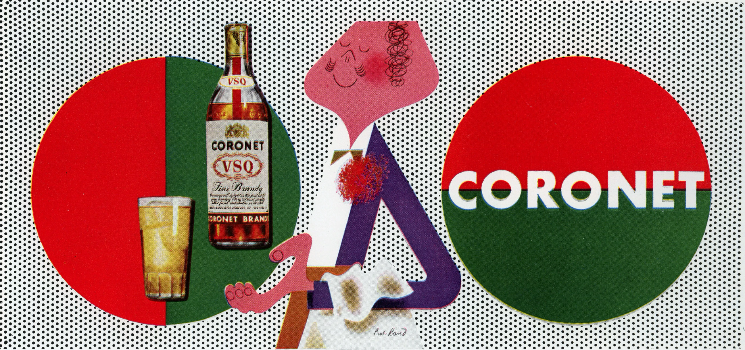
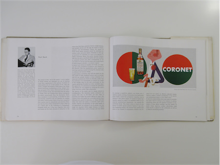
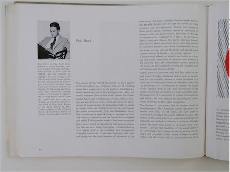
The essence of the “art of the poster” is not a matter of literal content nor technique but one of creating visual ideas appropriate to the medium.
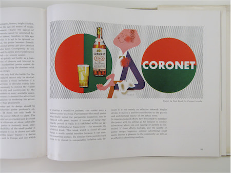
Countless so-called posters are not in fact posters at all- they are merely enlarged illustrations which ignore the fundamental functional considerations of size, distant viewing, and speed of the viewer which should be the determinant of poster design. By demanding that the poster be simple, bold, and striking these factors distinguish the poster unequivocally from the illustration which, like a miniature or easel painting, is intended for close and leisurely inspection and can therefore be complex and subtle. Unfortunately where it has been recognized that a poster must be immediately and potently attractive this has been widely interpreted to mean a blow up of a “pretty girl” or the rendering of a fantastically elongated motor car.
It has been forgotten that color and design are the basic elements of attraction in the same sense that flags, pennants, flowers, bright fabrics, and heraldic devices are the age old means of dramatization and advertisement. Clearly the appeal of these purely plastic elements cannot be calculated by surveys, polls, and pulse takers; therefore in this age of reverence for statistics it is apt to be ignored or lightly dismissed. Hence, the poster becomes formulized into the above mentioned pretty girl plus product or oversized product plus label.
Consequently to see one poster is to see all, and the prime and crucial factor in poster design is flouted - i.e. sensory appeal.


