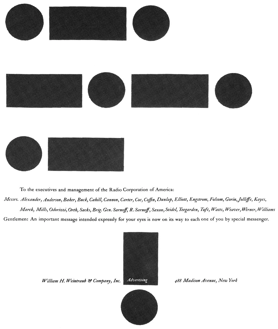
Our account department had learned that the lucrative RCA advertising business might be up for grabs, and the agency decided to run an ad to make a pitch for the account. That was on Monday and the ad had been scheduled to appear on Thursday so we were in our usual rush situation. Nothing much came out of the morning meeting of the plans board, and the afternoon brainstorming was equally unproductive. As was so often the case, I took the problem home to Weston, Connecticut, with me.
The more I analyzed the problem the more I became convinced that General Sarnoff was the key. I knew that while a million eyes might see that copy of the Times, the only eyes that mattered were his. I knew that his career in radio had begun as a wireless operator with Marconi, and somewhere I had heard that his proudest moment was when he was one of the first to pick up the distress call from the Titanic. This brought me to the Morse code. The letters SOS might have made an arresting headline in code, but I didn’t think RCA or the agency would appreciate the connotations. It was then that I decided to try RCA in code. My dictionary provided the symbols of the International code, and I knew I had the foundation of an idea.
The next morning on the 8:05 heading for the office I began putting the pieces together. In the convenient white space of someone else’s ad in my morning paper, I began to sketch out the layout. From the beginning the use of Caslon typography seemed right to me. It not only had the ultimate contrast with the boldness of the dots and dashes, but it had the proper earnest tone derived from its years of association with fine books.
My first sketch was slightly top-heavy and the ad signature seemed weak. It was while I was pondering this problem that the added twist that the idea needed came to me. Almost automatically I noted that the dot and dash of the last letter in my headline became a perfect exclamation mark when it was turned on end. It was only later that I realized that the A in advertising related to the symbol. Later when the layout was submitted in finish form to the agency, the usual flack developed, and it was only when our television director joined in its defense that the idea was approved.
Did the advertisement work? If attracting a lot of attention means anything it was a big success. On the morning the ad appeared, when I arrived at the Saugatuck station, the first thing I noticed was a group gathered around a man with his copy of the Times open to my ad, and on the trip into New York I overheard a lot of comment. But what happened on the executive floor of the RCA Building? General Sarnoff must have seen it, because there was a call from his office later that morning to set up a meeting with our agency people. In the end the agency didn’t get the RCA business for reasons unrelated to the ad and its objectives.


