Estimated reading time: | Select text to share via Facebook, Twitter or Email
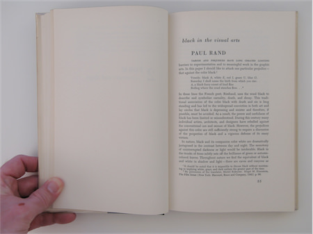
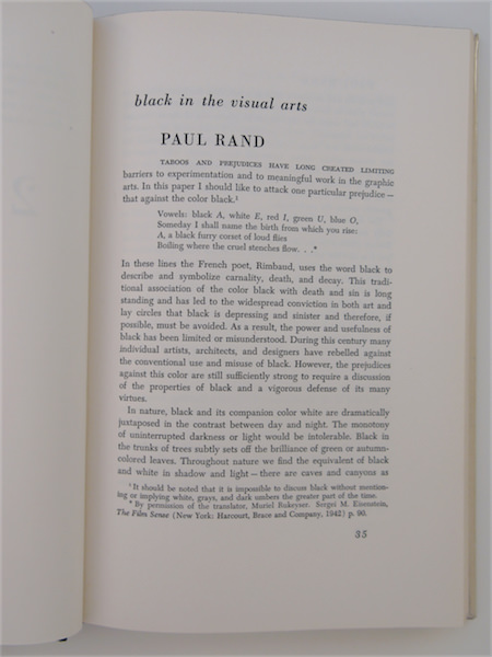
Taboos and prejudices have long created limiting barriers to experimentation and to meaningful work in the graphic arts. In this paper I should like to attack one particular prejudice — that against the color black.1
Vowels: black A, white E, red I, g/reen U, blue O, Someday I shall name the birth from which you rise: A, a black furry corset of loud flies Boiling where the cruel stenches flow…*
In these lines the French poet, Rimbaud, uses the word black to describe and symbolize carnality, death, and decay. This traditional association of the color black with death and sin is long standing and has led to the widespread conviction in both art and lay circles that black is depressing and sinister and therefore, if possible, must be avoided. As a result, the power and usefulness of black has been limited or misunderstood. During this century many individual artists, architects, and designers have rebelled against the conventional use and misuse of black. However, the prejudices against this color are still sufficiently strong to require a discussion of the properties of black and a vigorous defense of its many virtues.
In nature, black and its companion color white are dramatically juxtaposed in the contrast between day and night. The monotony of uninterrupted darkness or light would be intolerable. Black in the trunks of trees subtly sets off the brilliance of green or autumn-colored leaves. Throughout nature we find the equivalent of black and white in shadow and light—there are caves and canyons as well as fields and meadows. Man as a rule does the least violence to nature when he uses either natural materials, such as stone or wood, or black and white for the objects he places out of doors. Natural colors are integrated, white participates by reflecting its environmental color, and black modestly provides perfect background for the riotous nature colors. Certainly those people who observed with pleasure the old-fashioned black steam engine wind its way agreeably through green fields and forests, have watched with a kind of horror the orange or blue streamliner that now streaks garishly across the countryside.
The decidedly ambivalent nature of black has been understood in daily use. In the east and southwest of the United States and in Europe black is by far the most popular color for pleasure vehicles, but it is also the color of the hearse. In clothes black is the color of tragedy, mourning. At the same time it is the color of elegance and of sensuous enjoyment in the conventionally “sexy” black lingerie.
If we look further into the psychological significance of black, it is linked with mystery, with death which is unknowable, with night which is full of hidden things—of fear and magic.
In some countries black or near-black has been employed extensively in architecture and interior design, The color pattern of the Japanese house is based on the contrasting use of dark and light materials. Dark wood often delineates the basic structure of the house and separates it aesthetically from the light colored partition walls (fusuma) and floor mats (tatami).
The first of my illustrations (A) shows a building designed by Mies van der Rohe in which black is a crucial aesthetic factor. The structural members of this steel building are exposed and painted black. The effect of this is manifold: the structure is clearly defined, it is placed in dramatic contrast to the pale non-bearing brick walls, the bulk of its members is reduced making them appear light and delicate, great elegance is achieved without the use of expensive materials or decoration, and the restraint and restfulness of black makes the building a welcome oasis in the chaotic heart of the city.
It is, of course, understood that like any color the value of black depends upon the manner in which it is used. Black will be lugubrious or bright and elegant depending on its context and form. Despite the successful use of black in Japan and in modern buildings and interiors there are still many people who deny black categorically.
A doctor writing on the use of color in interiors issues a grim warning against black: “This is the most dismal of all colors—it expresses all that is opposite to white.”[2] Among these opposites he lists the grave, sin, and crime.
This type of blanket denunciation of a color completely ignores the relative nature of any color or form. Eisenstein writing about the film says: “Even within the limitations of a color-range of black and white … one of these tones not only evades being given a single ‘value’ as an absolute image, but can even assume absolutely contradictory meanings, dependent only upon the general system of imagery that has been decided upon for the particular film.”[3] He goes on to illustrate this important point by the reversal of the role of black in relation to white in the two films Old and New and Alexander Nevsky. In the former, black signified things reactionary, outdated, and criminal, while white denoted happiness, life, and progress; whereas in Alexander Nevsky white was the color of cruelty, oppression, and death, and black, identified with the Russian warriors, represented heroism and patriotism. Eisenstein’s response to the surprise and protest of the critics at this reversal of traditional symbolism is to cite Moby Dick’s famous white whale—the reader will recall that the leprous, livid whiteness of this whale symbolized the world’s monstrous and baffling evil.
During the Middle Ages and the Renaissance, black (with some notable exceptions) was treated as a linear element or was associated with modeling and chiaroscuro. Kahnweiler in The Rise of Cubism says: “Since it was the mission of color to create the form as chiaroscuro, or light that had become perceivable, there was no possibility of rendering local color or color itself.”[4] Although Kahnweiler is referring to color in general, this statement applies very forcibly to black. In the twentieth century the possibilities of rendering color as a thing in itself and not primarily as a description of three dimensionality or “objectivated light,” have been rediscovered and exploited. Coincident with this trend, black has come into its own as a positive “plastic” value.
Among the many artists who have used black as a vital element in their work are Rouault, Braque, Miro, Leger, Arp, and Picasso. Beardsley, Masereel, and Posada, for example, have used it almost exclusively.
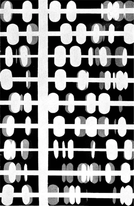
Arp, describing his painting reproduced here (B), says:
The black grows deeper and deeper darker and darker before me. It menaces me like a black gullet. I can bear it no longer. It is monstrous. It is unfathomable.
As the thought comes to me to exorcise and. transform this black with a white drawing, it has aheady become a surface. Now I have lost all fear, and begin to draw on the black surface. I draw and dance at once, twisting and winding, a winding, twining soft white flowery round. A round of snakes in a wreath…white shoots this way and that… [5]
Arp understands that black alone and out of context is frightening, but he also knows its potency once it is formed and related.
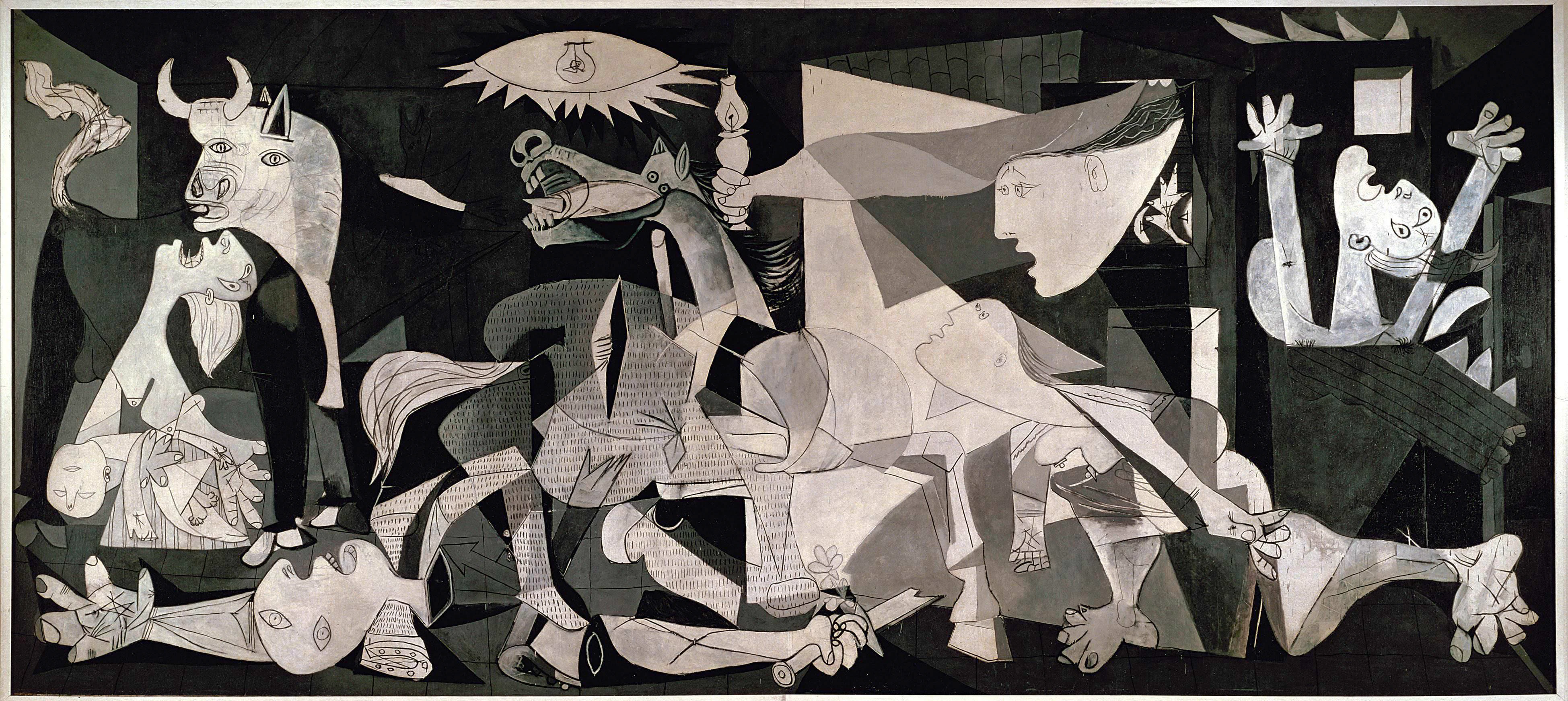
Picasso’s “Guernica” (C) is eloquent testimony of the expressive power of black and its natural companions gray and white. Although we do not know the intentions of the artist, we can venture a few statements about the more obvious effects achieved by the substitution of black, white, and gray for the usual colors. The absence of the expected pictorial colors in this mural dramatizes the impact of the work. Furthermore, the lack of color implies all colors and forces the spectator’s imagination into activity by not telling him everything. The use of black, white, and gray is an understatement which makes possible and bearable the horror and violence of the imagery. At the same time, paradoxically, it emphasizes the brutally tragic imagery. It is probably beyond question that in this mural black and white play their ancient, symbolic roles. They are the raw unadulterated colors of the struggle between life and death.
For many centuries Chinese and Japanese painters have revered black as a color. In Japanese painting, black (sumi) is often the only color employed. The Japanese artist feels that “colors can cheat the eye but sumi never can; it proclaims the master and exposes the tyro.”[6] One famous Japanese painter, Kubota, frequently expressed the wish that he might live long enough to be able to discard color altogether and use “sumi alone for any and all effects in paintings.”[7]
7 Ibid., p. 43.
8 M. E. Chevreul, The Laws of the Contrast of Color (London, 1883), p.54.
In 1860 Chevreul wrote: “I do not know whether the use of black for mourning prevents the use of it, in numberless cases, where it would produce most excellent effects.”[8] This quotation is as pertinent today as it was in the nineteenth century. Most graphic artists still shy away from black. When they are confronted with no alternative other than black, as in newspaper advertising or typography, they often accept it grudgingly and make little effort to discover or develop its potentialities. However, the psychological and physical qualities of black which have been discussed so far in relation to architecture and painting are equally significant for the graphic arts: advertising, cover design, and typography. I should like to illustrate this with several examples of the use of black in my own work.
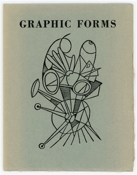
The tension between black and white in the cover is heightened by opposing a large area of black to a small area of white. The contrast theme is carried out further by the drastic variation in the size of the letters. The roughness of the edges of the large A emphasizes the sharpness of those of the smaller A’s, and the extreme diagonals of the letters are counteracted by the right angles of the book itself. But the most dramatic element of contrast lies in the use of black and white. Black and white lend dignity and elegance to the book cover, yet the vigorous contrast between the two gives it a poster-like quality.
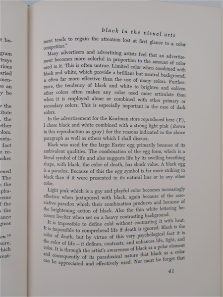
Thomas B. Stanley in The Technique of Advertising Production [10] says: “While color has high attention value on short exposure, psychological tests indicate that the longer the time during which advertisements are examined, the more a black and white treatment tends to regain the attention lost at first glance to a color competitor.”
Many advertisers and advertising artists feel that an advertisement becomes more colorful in proportion to the amount of color used in it. This is often untrue. Limited color when combined with black and white, which provide a brilliant but neutral background, is often far more effective than the use of many colors. Furthermore, the tendency of black and white to brighten and enliven other colors often makes any color used more articulate than when it is employed alone or combined with other primary or secondary colors. This is especially important in the case of dark colors.
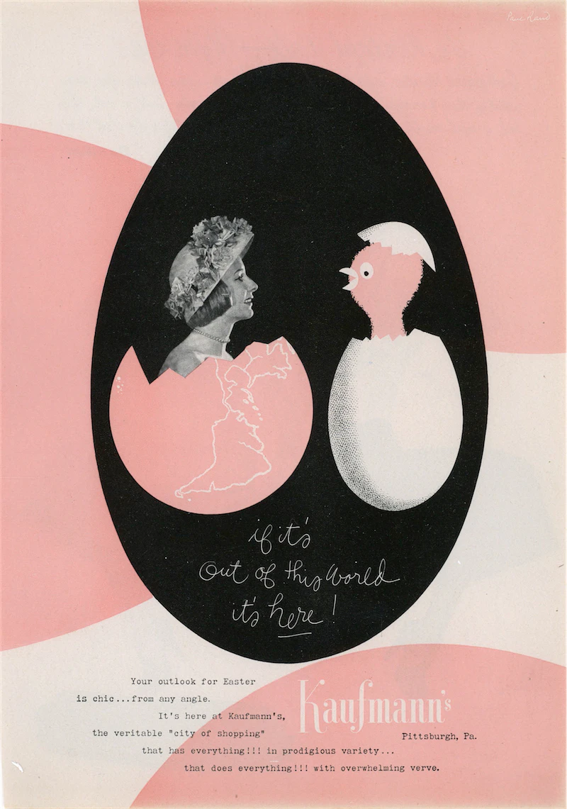
In the advertisement for the Kaufman store reproduced here (F), I chose black and white combined with a strong light pink (shown in this reproduction as gray) for the reasons indicated in the above paragraph as well as others which I shall discuss.
Black was used for the large Easter egg primarily because of its ambivalent qualities. The combination of the egg form, which is a literal symbol of life and also suggests life by its swelling breathing shape, with black, the color of death, has shock value. A black egg is a paradox. Because of this the egg symbol is far more striking in black than if it were presented in its natural hue or in any other color.
Light pink which is a gay and playful color becomes increasingly effective when juxtaposed with black, again because of the associative paradox which their combination produces and because of the brightening action of black. Also the thin white lettering becomes livelier when set on a heavy contrasting background.
It is impossible to define cold without contrasting it with heat. It is impossible to comprehend life if death is ignored. Black is the color of death, but by virtue of this very psychological fact it is the color of life it defines, contrasts, and enhances life, light, and color. It is through the artist’s awareness of black as a polar element and consequently of its paradoxical nature that black as a color can be appreciated and effectively used. Nor must he forget that the neutrality of black makes it the common denominator of a multicolored world.
The necessity for the artist to free himself of traditional and conventional thought patterns if he is to create freely is obvious. Prejudices must be broken down, ruts avoided, and new paths or old forgotten ones explored if the artist is to perform one of his most important functions, that of broadening our visual world.
The Original Article
(Use ← → keys to navigate. Click for larger view.)

