
8.5 x 11 magazine with 64 pages of editorial content and advertisements. An excellent, profusely illustrated look at the state of the art of American Typography, circa 1985.
Contents:
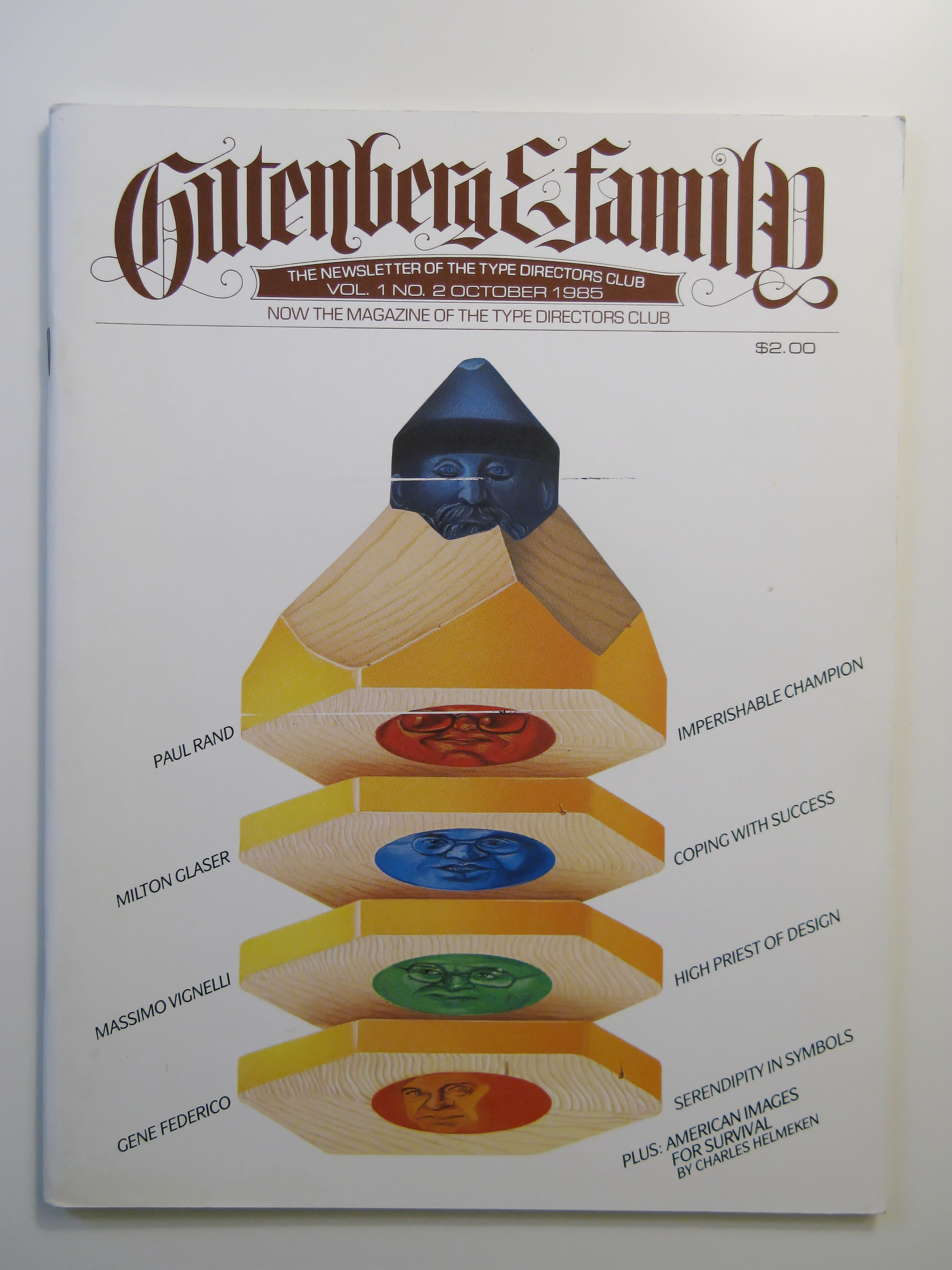
- Paul Rand: Imperishable Champion: 6 pages and 25 color and b/w images.
- Milton Glaser: Coping with Success
- Massimo Vignelli: High Priest of Design
- Gene Federico: Serendipity in Symbols
- Words on Paper by Leonard B. Schlosser
- American Images for Survival: a showing of peace posters by Milton Glaser, Shigeo Fukuda, Minoru Morita, Tom Geismar, Gene Federico, Arnold Bank, McRay Magleby, John Casado.
- and more.
The Original Text
By John Luke (editor)
A review of “A Designer’s Art” and interview with Paul Rand.
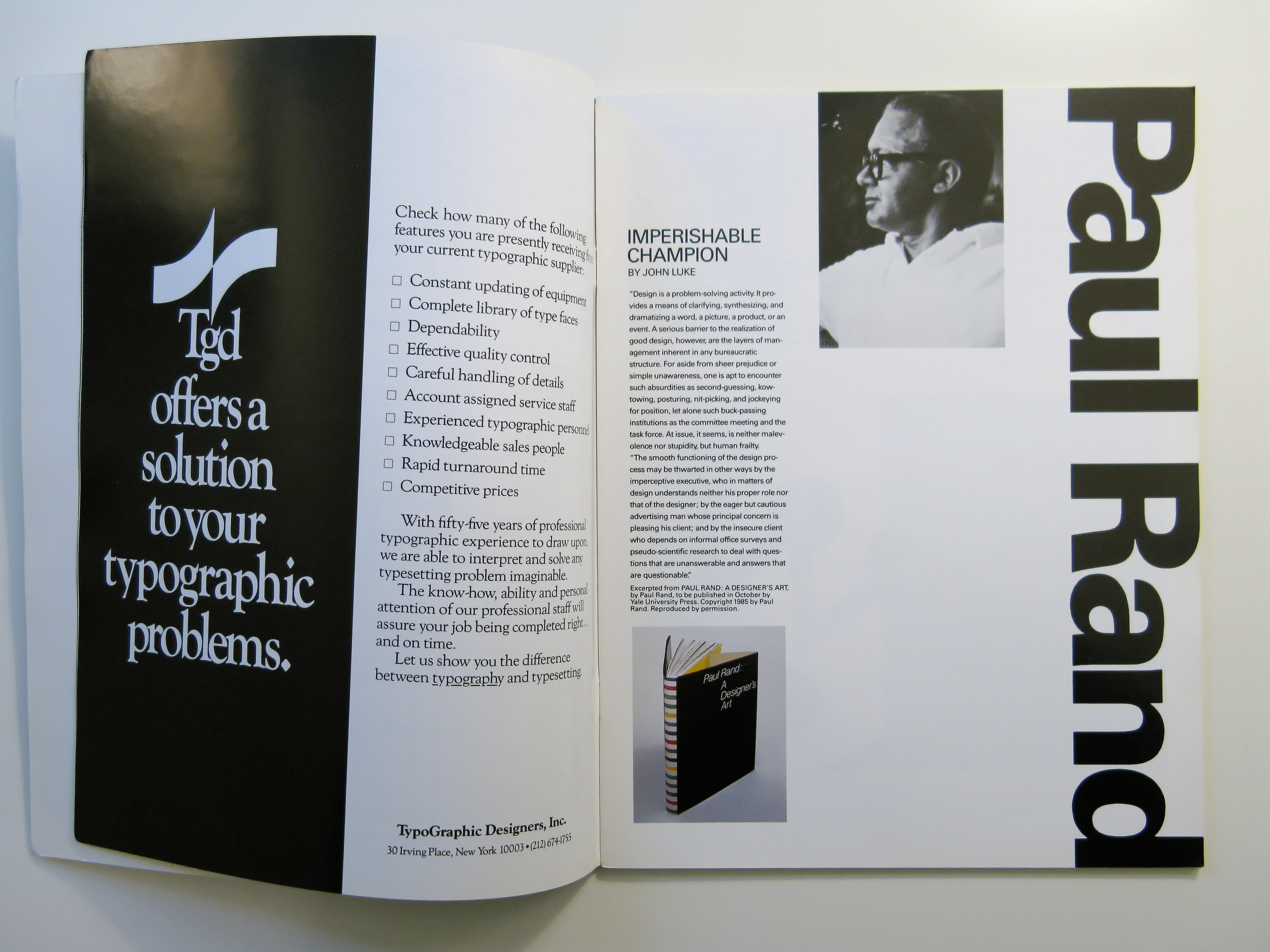
“Design is a problem-solving activity. It provides a means of clarifying, synthesizing, and dramatizing a word, a picture, a product, or an event. A serious barrier to the realization of good design, however, are the layers of management inherent in any bureaucratic structure. For aside from sheer prejudice or simple unawareness, one is apt to encounter such absurdities as second-guessing, kowtowing, posturing, nit-picking, and jockeying for position, let alone such buck-passing institutions as the committee meeting and the task force. At issue, it seems, is neither malevolence nor stupidity, but human frailty.
“The smooth functioning of the design process may be thwarted in other ways by the imperceptive executive, who in matters of design understands neither his proper role nor that of the designer; by the eager but cautious advertising man whose principal concern is pleasing his client; and by the insecure client who depends on informal office surveys and pseudo-scientific research to deal with questions that are unanswerable and answers that are questionable.”
Excerpted from PAUL RAND: A DESIGNER’S ART, by Paul Rand, to be published in October by Yale University Press. Copyright 1985 by Paul Rand. Reproduced by permission.
I met with Paul Rand at the grand old Yale Club in Manhattan. I interviewed him in the dining room, during the busy lunch hour. There, amidst the clatter of dishes, Rand talked excitedly about his new book, Paul Rand: A Designer’s Art. which will be published this fall by the Yale University Press.
“The project has been going on for three years,” Rand reveals, “it took me a long time to finish it. I worked day and night.”
“Although I’ve done thousands of jobs, I have only about 250 pieces in the new book. It was difficult to choose material. The book is organized so that pictures must follow text, which means you can’t have pictures that don’t belong. There are about sixty color plates, which is about a quarter of the total number of pages.”
In Paul Rand: A Designer’s Art, Rand has revised many of the topics that won him fame for his first book, Thoughts on Design. He includes “The Beautiful and Useful,” “The Designer’s Problem,” “The Role of Humor” and others. The new book will feature short discussions on provocative subjects like “About Legibility (Type).” “The Third Dimension,” “The Complexity of Color,” “Politics of Design” and more.
Rand wrote Thoughts on Design in 1946 [1947], when he was seen by the graphic design world as a young, talented and prominent designer. The book was a collection of his work to date that focused mostly on advertising and his personal observations and philosophy concerning the scope of graphic design. Some even thought of it as the “Bible” for designers.
In the preface, Rand stated that his purpose in writing Paul Rand: A Designer’s Art was to demonstrate the validity of those “timeless principles” which, by and large, have guided the artist since the time of Polyclitus. He declares his aim is to emphasize those (classical) ideals to “those who have grown up in a world of punk and graffiti.”
Rand has a love/hate relationship with the design profession. He loves the creative side and hates the politics. Rand, more feisty than ever, speaks his mind and doesn’t pull any punches. He is perhaps the most qualified designer to write a book on the philosophy of design. His passion for the art over the past fifty years, and his great accomplishments in creating break-through advertising and editorial design, gives him singular legitimacy when he pronounces his opinions about the merit of typefaces, or client relationships. “A lot of stuff is revised, though my views on graphic design have not changed,” he insists. Rand explains that he wrote on “Politics and Design” because it lets people know what they’re in for.
“Some of the stuff has been published in DQ (Design Quarterly). People are constantly asking me for articles I wrote. This book gives me a chance to put it all together.”
In “About Legibility,” Rand discusses the difficulties of getting objective opinions on typography.
“Typography is a very peculiar subject. In the book I quoted Morison, who said, ‘All titles should be in caps. And avoid lower case at all costs.’ Now thats absolute garbage for him to make that remark. So in my new book, I added a paragraph about the difficulties of getting objective opinions about typography. Its impossible!”
In looking at the origins of the Western alphabet, Rand calls attention to its evolutionary process.
“In the Bauhaus period,” Rand observes, “designers attempted to use only lower case characters. That doesn’t work in our culture. For example, I know a number of beautiful books that use all lower case, but they’re books about artists, not about medicine or something that would be life-threatening.” Arguing that differentiation between upper and lower case is vital to understanding the nuances of meaning in the alphabet, Rand warns that designers “should be careful when tampering with type and tradition.”
“Look at all the money and time spent on developing a new phonetic alphabet, and its still not adopted. Its too ambiguous in comparison to the one we have now.”
Rand says he’s never been a typography man in the sense that he has ever set type. But he does understand the importance of type as a design element.
“I just picked it up,” he says.
Rand likes to do business his way, which is why he’s never expanded his operation. “I don’t have a big business,” says Rand, “I only have one assistant. The reason for this is there’s a lot of work that takes time- mechanicals, paste-ups-and takes you away from doing creative work, so I need an assistant.
“But the reason I don’t want to start up a big business is that I don’t want to be dependent on clients,” says Rand. “Besides IBM, and one or two other major clients, I rarely take any other work. I don’t want to accept more work than I can do myself.”
Looking back into Rand’s past, you find a certain continuity in his desire to do it his way. When Esquire hired Rand in 1936 for six months to help produce an anniversary issue for their catalog, he lived and worked in a little studio at 151 East 38th Street. (The building is still there.) Rand recalls that “the room was barely big enough for a desk and I had to climb over my desk in order to get to my chair. That was how small the room was. It cost me $15 a month.
“I worked for Esquire for six weeks, and at the end they wanted me to continue, but it was very indefinite. So I said, ‘If you want me to continue, you’ll have to make it permanent. I just can’t go on like this.’ So they made it permanent. Afterward they offered me a job as the art director, but I refused to take it. I didn’t think I was ready for such an important job.” Rand finally did take the art directors job later on, but continued to do outside work, including a magazine called The Glass Packer.
Later on, while working at an ad agency halftime, Rand began to build up his freelance work. He remembers, “It’s all a matter of conducting your life so you can be independent. Anybody can do it. Just do it. But you’ve got to work hard.”
“If I was not a graphic designer, I might have been a cabinet maker or even an architect. Yes, I believe I would have been an architect. I’ve done a lot of store interiors. To me its the same problem. Its color and form.”
Many years ago, L. Moholy-Nagy wrote this about Paul Rand:
“Paul Rand is an idealist and a realist, one who uses the language of the poet and the businessman. He thinks in terms of need and function … but his fantasy is boundless”


