The Original Text
By James Woudhuysen
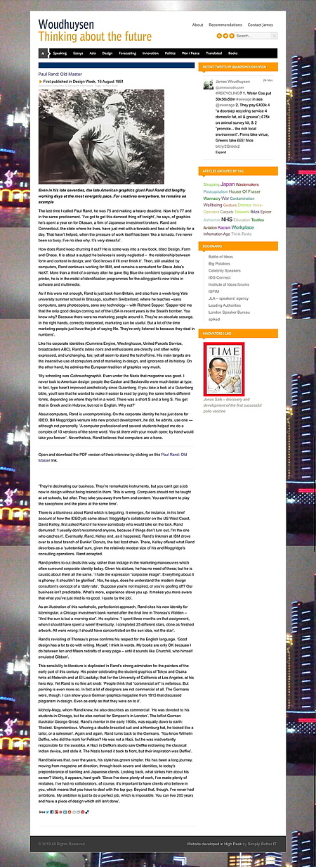
The last time I called Paul Rand, he was 75 and making a heavy deadline. Now he’s 77 and in the same predicament. ‘I’ve got to get this damned thing off tonight’, he says, of graphics he’s spent a year on for Okasan, a firm of Japanese investment brokers. Rand and Connecticut, the state where he lives, have just met with a tornado and loss of electricity for a day. That hasn’t helped, when the pressure of work itself has been ‘like a tornado. I’ve never been so busy. I’ve no idea why. It’s very stressful’.
How does Rand keep churning it out? He is some way into a new book, titled Design, Form and Chaos. It is about a subject he believes is sorely neglected — the relationship between form and content in design; and ‘God knows if I’ll ever finish it’. Then, still unaided by computers, Rand continues working for IBM, and remains a consultant for Steve Jobs’s NeXT. More than a third of a century after he gave Big Blue the confident typography of a line printer, he is in the midst of identification programmes for the ailing giant’s new tricks in software and multimedia.
As if this were not enough, Rand is just back from Britain, and also from a week-long Yale university summer school in Brissago, southern Switzerland, where he teaches — sans computers, sans photocopiers, sans any technology — with Richard Sapper. ‘Sapper told me that the only good design coming out of the USA in recent years is the Stealth bomber. You know why? Because there were no marketing people around it. They’re an absolute scourge. In the right hands, correctly interpreted, marketing can be useful. But a lot of the time marketing people just have the job of saying No. They’re only listened to because they deal in numbers’.
Like his corporate identities (Cummins Engine, Westinghouse, United Parcels Service, broadcasters ABC), Rand’s bêtes noirs and enthusiasms are directly and often wittily expressed, and unchanging, too; yet all seem to stand the test of time. His main targets are the insensitive use of computers and of marketing in design, and ignorance of its history. On the other hand, he admires the European tradition of graphics very much.
‘My schooling was Gebrauchsgraphik. Even under the Nazis that magazine was good. I never took to American design: people like Caslon and Baskerville were much better at type. In fact, type hasn’t improved aesthetically since Gutenberg. If you take a look at a Gutenberg bible, you’ll see that he wanted to make it easier to read by giving the same letters different forms, depending on where they fell in a word. There was a short S and a long S. You get that in Greek and in Hebrew, but not in English. Why not?’
About computers, Rand is uncompromising. On the corporate identity he has just done for IDEO, Bill Moggridge’s venture into new product development, he did, he admits, use one – although not personally. ‘A computer professional and several students helped me do a complex of 10 versions of the same word. You sit there with your mouth open; by hand would take you forever’. Nevertheless, Rand believes that computers are a bane.
‘They’re decimating our business. They’re remarkable instruments, but you can’t get a job now in design without being trained in them. This is wrong. Computers should not be taught at art schools, but after. They take you away from form and content. You can’t learn to play the saxophone and the piano at the same time’.
There is a bluntness about Rand which is beguiling. It emerges, for instance, in his brief account of how the IDEO job came about. Moggridge’s collaborator on the US West Coast, David Kelley, first asked Rand if he knew somebody who would take on the task. Rand demurred: ‘I usually don’t recommend anyone, because if things don’t turn out, I’m the one who catches it’. Eventually, Rand, Kelley and, as it happened, Rand’s linkman at IBM drove over to a local branch of Dunkin’ Donuts, the fast food chain. There, Kelley offered what Rand describes as a ‘substantial’ sum, given the relatively modest size of his and Moggridge’s consulting operations. Rand accepted.
Rand prefers to cut deals this way, rather than indulge in the marketing manoeuvres which often surround corporate identity today. Given his stature, he has no need of these; but he is caustic about them all the same. ‘I hate the expression “corporate image”. Everything about it is phoney. It shouldn’t be glorified’. Nor, he says, does he understand the modern design consultant’s concept of a ‘daily rate’. ‘Suppose you’re not inspired, or you’re goofing off? Our business isn’t predictable. What’s more, experience slows you up. It makes you more aware that what you’ve just tried is no good. I quote by the job’.
As an illustration of this workaholic, perfectionist approach, Rand cites his new identity for Morningstar, a Chicago investment bank named after the final line in Thoreau’s Walden – “And the sun is but a morning star”. He explains: ‘I spent three months on that assignment, when I should have spent a week! Eventually, I completed 25 different stars, done as finished artwork. All were wrong: I should have concentrated on the sun idea, not the star’.
Rand’s revisiting of Thoreau’s prose confirms his respect for the English language. ‘Good design has a lot to do with writing. Myself, I think in words. My books are only OK because I do between ten and fifteen redrafts of every page — until it sounds like Churchill, who himself emulated Gibbon’.
This sensibility to literature is duplicated in Rand’s strong admiration for the painters of the early part of this century. His poster celebrating the student graphics of Tokyo and Osaka hints at Malevich and at El Lissitzky; that for the University of California at Los Angeles, at his hero Arp. Yet Rand is no fine art snob: ‘People think that “commercial art” is nefarious. But painting is even more so. In fact a lot of designers are not commercial at all. The Germans were, though. I can show you a German graphics magazine from 1915 that discussed plagiarism in design. Even as early as that they were on to it’.
Moholy-Nagy, whom Rand knew, he also describes as commercial: ‘He was devoted to his students in Chicago, but he also worked for Simpson’s in London’. The leftist German illustrator George Grosz, Rand’s mentor in the early 1930s, was equally down to earth: ‘Modest. Unpretentious. Wearing a double-breasted suit and a Homburg hat, he looked like a tailor, or a salesman’. Again and again, Rand turns back to the Germans. ‘You know Wilhelm Deffke, who did the mark for Pelikan? He was not a Nazi, but he was inadvertently responsible for the swastika. A Nazi in Deffke’s studio saw Deffke redrawing the classical Indian device, and stole it. The Nazis turned it back to front, but their inspiration was Deffke’.
Rand believes that, over the years, his style has grown simpler. His has been a long journey, moving from magazine art direction, through book covers and identities, to today’s preponderance of banking and Japanese clients. Looking back, what strikes him about his career? Mainly, it appears, hard graft: ‘Since I’ve done plenty of work, I’ve made plenty of mistakes. I’ve had no collaborators. of course, it’s important to have clients who believe in you, which means that you have to deal with the top guy. Beyond that, though, I’ve never had ambitions. My ambition is just to do a perfect job, which is impossible. You can live 200 years and have a piece of design which still isn’t done’.


