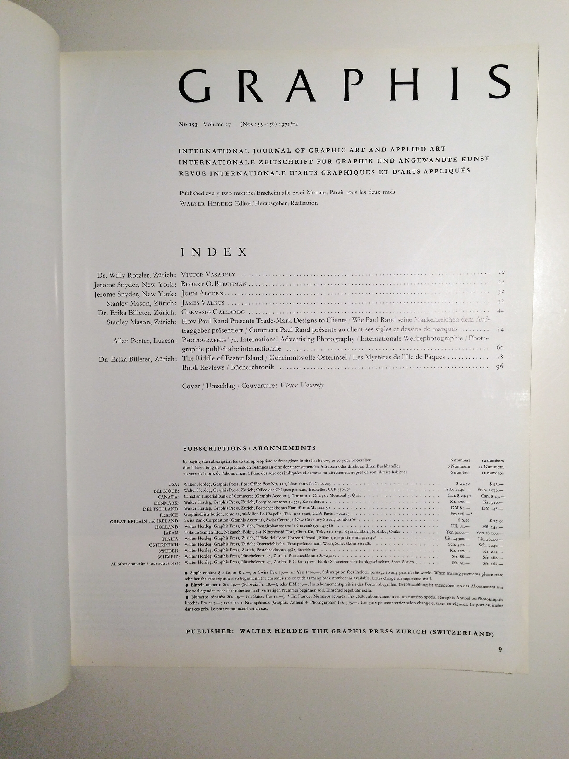
9.25 x 11.75 magazine with 102 pages of b/w and color examples of modern graphic design, circa 1947. Text in in English, French and German.Graphis was (and still is) one of the most important and influential European graphic design publication. Each issue always showcased the best graphic and applied art, including advertising, typography, posters, printmaking, illustrators, book arts, ethnic art, etc, with a focus on modern European designers. Graphis is still being published, but the most influential and groundbreaking years are from the 1940s to the early 1960s.
Contents:
- Dr. Willy Rotzler, Zurich: Victor Vasarely
- Jerome Snyder, New York: Robert O. Blechman
- Jerome Snyder, New York: John Alcorn
- Stanley Mason, Zurich: James Valkus
- Dr. Erika Billeter, Zurich: Gervasio Gallardo
- Stanley Mason, Zurich: How Paul Rand Presents Trade-Mark Designs to Clients
- Allan Porter, Luzern: Photographis ’71. International Advertising Photography
- Dr. Erika Billeter, Zurich: The Riddle of Easter Island
- Book Reviews
- Cover: Victor Vasarely
These periodicals are much harder to find than the well known Graphis Annuals, which are essentially pictorial “best of” collections and lack the depth and text of the originals. These publications are also more valuable as they are the original documents. Many of the articles are written by important artists, critics and scholars.
The Original Text
By Stanley Mason
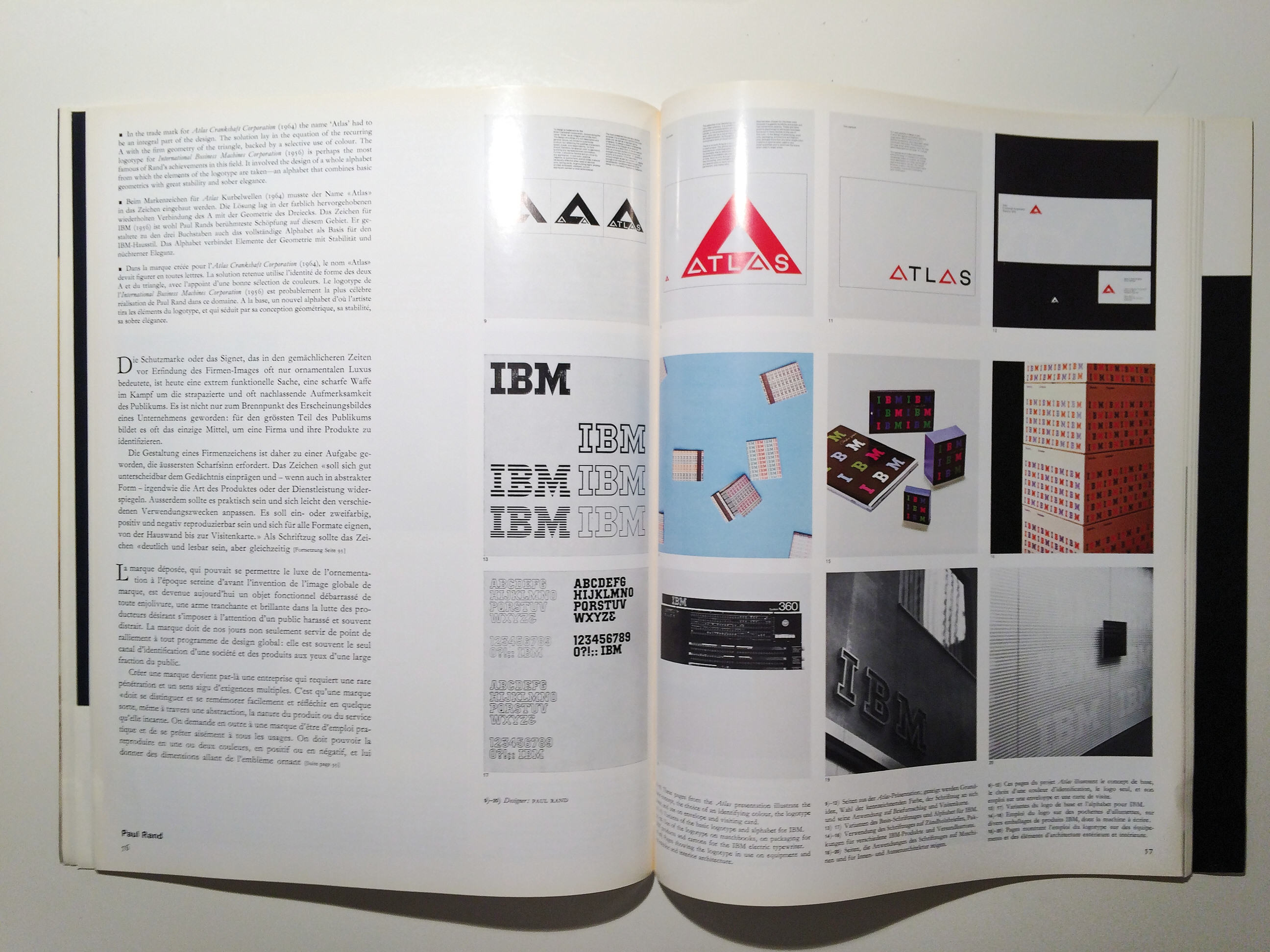
The trade mark, which in the spacious days before the invention of the corporate image could afford to live in a measure of ornamental luxury, has today become a sharply functional thing, a bright weapon for the attack on the overworked and often sluggish attention of the public. Not only must it serve as the focal point of corporate design programmes: it is often the only medium through which large sectors of the public identify a company and its products at all.
The design of a trade mark thus becomes an undertaking of the most exacting acuity. Such a mark ‘should be distinctive, memorable, and reflect in some way, however abstractly, the nature of the product or service it represents. Furthermore, it should be practical and easily adapted to a variety of applications. It should be reproducible in one or two colours, in positive and reverse form, and in sizes as large as build-ing signs and as small as, or smaller than, calling cards.’ As a logotype it should be ‘legible enough to be read and unusual enough to be re-membered’. Its purpose is, after all, ‘to identify appropriately to lend authority, and to help create the right visual climate in which a company can operate’.
These requirements, redoubtable as they may seem, are not all. For however good a trade mark may be, it is certainly not the slightest use till it has been accepted by the company it is to epitomize. And here is the rub: modern companies are usually topped by a hierarchy of executives, many of whom have little understanding of design, but who would hardly renounce their right to share in the choice of a company symbol. How is good design to be sold to them?
Illustrated on these pages are some of the graphic layouts—usually made up into large booklets of some 20 to 40 pages—with which Paul Rand presents his trade-mark designs to his clients. These custom-made booklets may go to anything from 25 to 100 top-ranking executives. Characteristically, Rand avoids what he calls ‘sound, music and lights presentations’. Believing that ‘graphic designers are really silent sales-men’, he thinks that trade marks should convince by their own impact and quality. The presentations usually begin with a lucid exposition of the thinking which has led to this particular trade-mark design. They then follow up with examples of use, from visiting cards and letterheads to large outdoor signs. Occasionally skilful use is made of ‘animated’ sequences. Colour is used where needful, and the booklets are always impeccably produced.
The texts that accompany the graphic layouts are likewise by the designer. Although Paul Rand says that ‘he finds the problem of writing very distressing’, words originally spoken of sound design might easily be applied to his texts: they are ‘marked by imagination and constraint, by brevity and wit’. This quotation, like all the others in these paragraphs, is borrowed—need we add?—from Paul Rand himself.
Paul Rand, one of the pioneers of contemporary graphic design, was born in New York in 1914; at 23 was art director of Esquire; has taught at Pratt Institute, Cooper Union and Yale University; has been design consultant to many large corporations, including IBM and Westinghouse; was the subject of the book Paul Rand by Yusaku Kamekura, published 1959; has written a book on trade marks as well as Thoughts on Design (1947, revised edition 1971) and many much-read articles; has received awards and featured in exhibitions far too numerous to itemize here. Editor
In the trade mark for Atlas Crankshaft Corporation (1964) the name ‘Atlas’ had to be an integral part of the design. The solution lay in the equation of the recurring with the firm geometry of the triangle, backed by a selective use of colour. The logotype for International Business Machines Corporation (1956) is perhaps the most famous of Rand’s achievements in this field. It involved the design of a whole alphabet from which the elements of the logotype are taken—an alphabet that combines basic geometries with great stability and sober elegance.
The problem posed in the presentation illustrated here was to bring an old trade mark up to date while retaining its essential character. Direct comparisons of the old and the proposed new trade mark were made, in addition to a fairly wide range of examples of application. The booklet was produced in 1966. Although the new mark was not adopted, its presentation remains an impressive example of the genre.
-
Repetitive use of trade mark for decorative effect on cover.
-
Large and small reproductions illustrate size flexibility.
-
To demonstrate its suitability for very large applications, the mark is here shown on an industrial tower.
-
Use of the mark on a light bulb package.
-
A page of variants reveals the pitfalls of the three I’s.
-
Hybrid capital/lower case I’s lend distinction and suggest a link with the T; the R becomes a dividing element.
-
A pale blue-grey colour completes the unique logotype.
-
Example of a cover with black logotype on blue-grey ground.
-
Cover of the presentation.
-
A brief reconstruction of the atmosphere of the era in which the Ford trade mark originated.
-
An animated’ presentation of the proposed design.
-
- A study in size flexibility culminating in a doublepage spread, all in the familiar blue colour of the old mark.
-
A detailed comparison of the old and updated marks.
-
Owner’s manual, showing the use of the mark as a background and corporate/product identity distinction.
-
Examples of dealer identification signs.
-
- Two fold-outs showing use on a trailer and a building.


