Estimated reading time: | Select text to share via Facebook, Twitter or Email
I’m the only employee, but I have about half my wife. The one closest to us is unexpectedly invisible. People sometimes don’t understand what is clear. And sometimes the idea doesn’t come to mind. Sometimes I don’t understand when I look at things. Sometimes people don’t see what the designer sees. There is a French literary trend called Dikons Traction. The idea of a French philosopher named Jacques Derrida has had a negative impact on American graphic designers. Is Japan a little influenced by that? This is a literary way of thinking that criticism is more important than what is being criticized. The idea is that critics are better than artists. When I was a kid, I loved drawing and naturally became a designer. It wasn’t a decision, it was just as natural as eating if you were hungry. I didn’t know IBM Chairman Watson from the beginning, but first I knew architect Elliott Noyes and met Watson on his introduction. IBM had three typefaces so far, but I created a new logo. It is important that the logo is easy for people to remember. I think that things will be carried out systematically and properly regarding the work procedure of work. I have never been directed by anyone. I have never had a meeting or discussion. I just did what I wanted to do. Logic is born when you see a work. Logic does not come before the work. I learned about Japanese design because I saw the work, and I didn’t study it in particular. The Encyclopaedia Britannica wrote about Japanese painting and design, which inspired me. I feel depressed when I think about the current design world. We are going in a direction that is neither artistic nor artistic. Dicons
Traction and postmodernism are terrible. Even if you do a good job, you may not be accepted, so you don’t want to work on your own. In the case of American design schools, about 20 students attend summer schools. Five teachers are in charge for each week, and it is the same every year. Even though Japan has had excellent designs for a long time, it is difficult to understand why we ask foreigners. The newest and finest design was made as a hieroglyph in ancient Egypt 7,000 years ago. Design does not evolve. Symbols cannot be recognized without learning, whether they are alphabets or Japanese kanji. On the other hand, there are some that can be recognized in the form of a telephone company bell. The general public does not know much about design and art. However, it can be solved by associating or imitating. Marilyn Monroe, for example, is beautiful. Therefore, I think that if I make myself like Monroe, I will be said to be beautiful. Is the IBM logo good because it looks good because it is the logo of a company that makes good products? Because it’s the company that makes it. Is it the charm inherent in the logo? This is not clear. The standard when I say good or bad about design is the comparison with Japanese design and German 1920-30s design. The logo has two elements. One is time, and the many times the quality is associated with the logo enhances the importance of the logo. Recognizing by seeing. The other is association. A company that makes good products You don’t necessarily need a good logo to be a good company. This is because some companies succeed whether the logo is good or bad.
It may seem strange, but in reality, quality is more important than the image of the company. Sometimes clients want the logo to be something that represents a specific job, but sometimes it’s better to be abstract.
Paul Rand
Goodhill Road
Weston Connecticut 06883
Tel No. 203-227-5375
Fax No. 203-227-5374
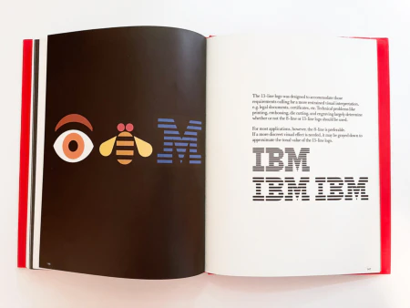
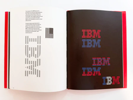
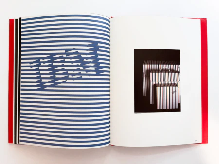
IBM’s 13-line logo was designed for legal documents, certificates, etc. when the appearance had to be plain. Decide whether to use 8 or 13 lines by printing, embossing, die cutting, engraving, etc. In most cases, use 8 lines. If you want to make it more sober, make the whole gray to give it a tone of 13 lines. IBM logo stripes are used primarily for attention. Thanks to the stripes, ordinary characters have become special. The stripes are easy to remember and suggest efficiency and speed. The market is flooded with striped logos these days because it’s effective. If you put a stripe on a block of letters, the letters will be connected. It is especially useful for groups of characters that are becoming more and more widespread and uncomfortable, such as IBM.
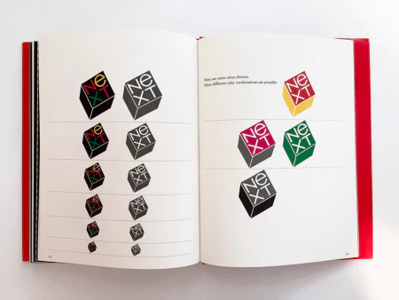
An example of a color combination. Other combinations are possible.
Presentation is an example of IBM in the form of a picture book
Paul Rand said that the newest and most wonderful design is the hieroglyphs of ancient Egypt 7,000 years ago

