A Logotype for IIT Research Institute
A Logotype for IIT Research Institute
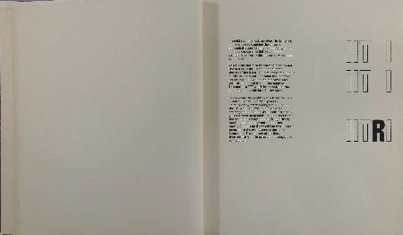
A trademark, service mark, or logotype should be distinctive, memorable, and reflect in some way, however abstractly, the nature of the product or service it represents. Furthermore, it should be practical and easily adapted to a variety of applications. It should be reproducible in one or two colors, in positive and reverse form, and in sizes as large as building signs and as small as, or smaller than, calling cards.
The design of the logotype in question presents certain unique problems:
A. The initials IIT and RI represent two entities, rather than a single unit. B. The configuration of the initials makes reading difficult. C. The letter forms are all vertical, with the exception of the right side of the letter “R”. The absence of contrasting shapes creates a grouping which is confusing visually.
With these inherent problems it is evident that the best solution would be a design containing only one element, rather than a combination of elements, such as letters and a pictorial device. Furthermore, any pictorial device would seem arbitrary since no one special kind of research is involved here. And symbols such as globes, orbiting electronic devices, chemical retorts, etc., etc., are so commonplace that they defeat the very purpose of a logotype in which the quality of uniqueness is paramount.
Because the first two letters of the mark are “II’s” the problem of legibility arises, especially if the letters are capitalized.
Regardless of the style of letter form, this particular configuration makes reading ambiguous. For example, the two “II’s” can be read as Arabic numeral “eleven” or as two “one’s” in a sans serif face. In a face with serifs, it is possible to read them as Roman numeral “two” or the Greek letter "pi.”
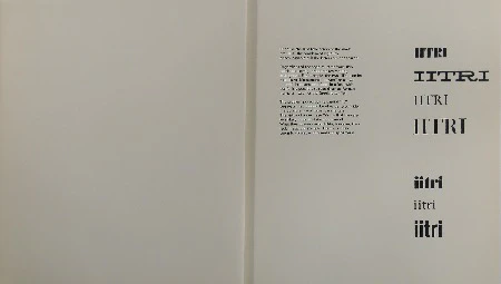
The problem posed by the capital “I’s” suggests that it would be of value to consider the possible use of lower case letters. The virtue of lower case “i’s” is that they are less likely to be mistaken or misread. What they possess in legibility, however, they lack in appropriateness. The mood they seem to convey is informal and ephemeral.
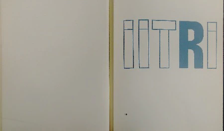
It would seem logical, therefore, in designing the logotype to combine the virtues of the capital letters (dignity, authority) with that of the lower case (legibility), to create a single letter form which is not only readable but unique.
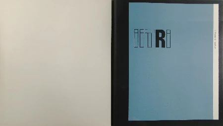
This is accomplished by drawing a horizontal line at a point through the top quarter section of the letter “I” to reinforce the unique quality of the letter, the same line is drawn across the point where the horizontal and vertical sections of the “T” are tangent. This makes a “T” which is not only unusual but in harmony with its adjacent letter.
To overcome the problem of relating the two entities (IIT and RI) a focal point is established by emphasizing the “R” but not the “I” which follows it. In addition to creating an interesting visual contrast, the “R” yields a more memorable image, underscores the research activity, and helps legibility by breaking up the long word. It does not, however, break up the word into two separate parts, since the eye returns to the same letter form (I) at the end of the line, thus receiving the impression of a single and compact unit.
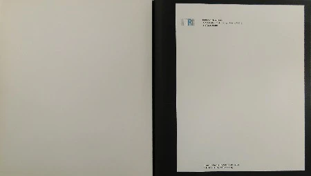
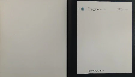
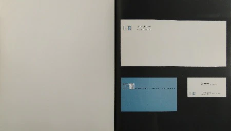
Following are examples showing the logotype in use.
(Stationery Examples)
(Stationery Examples)
(Stationery Examples)
(Stationery Examples)
Paul Rand
Weston, Connecticut
January 1964
(Backcover)


