Frigiking
Logo

Logo Presentation Booklet

[Cover]
A proposal for a new Frigiking logotype

A housemark, trademark, servicemark, or logotype should be distinctive and memorable and, if possible, uniquely related to the product it identifies.
The work Frigiking is based on, and reminiscent of, names like Frigidaire and Thermo King, both of which make use of some form of heraldry as a means of identification. It is essential, therefore, that Frigiking avoid such pompous clichés as shields and crowns, in order to avoid confusion, assert its contemporaneity, and establish its own individuality.
The Frigiking logotype should be unique; it should also be utilitarian. It should be simple enough to be recognizable at great distances, in very large and very small sizes; on buildings, on vehicles, as well as on letterheads and calling cards. I believe the design shown on the following page accomplishes these objectives.

The letterforms are geometric in design, unique in style, and bold in spirit. The sharp contrast between negative and positive areas suggests precision and confidence. The rounded f, r, and g’s are in keeping with the idea of the tubing in the cooling system. The position of the letters within the oblong is striking and dramatic. These features, together with the unusual blue, make for a compact and useful logotype and, if conscientiously applied, a memorable means of identification.

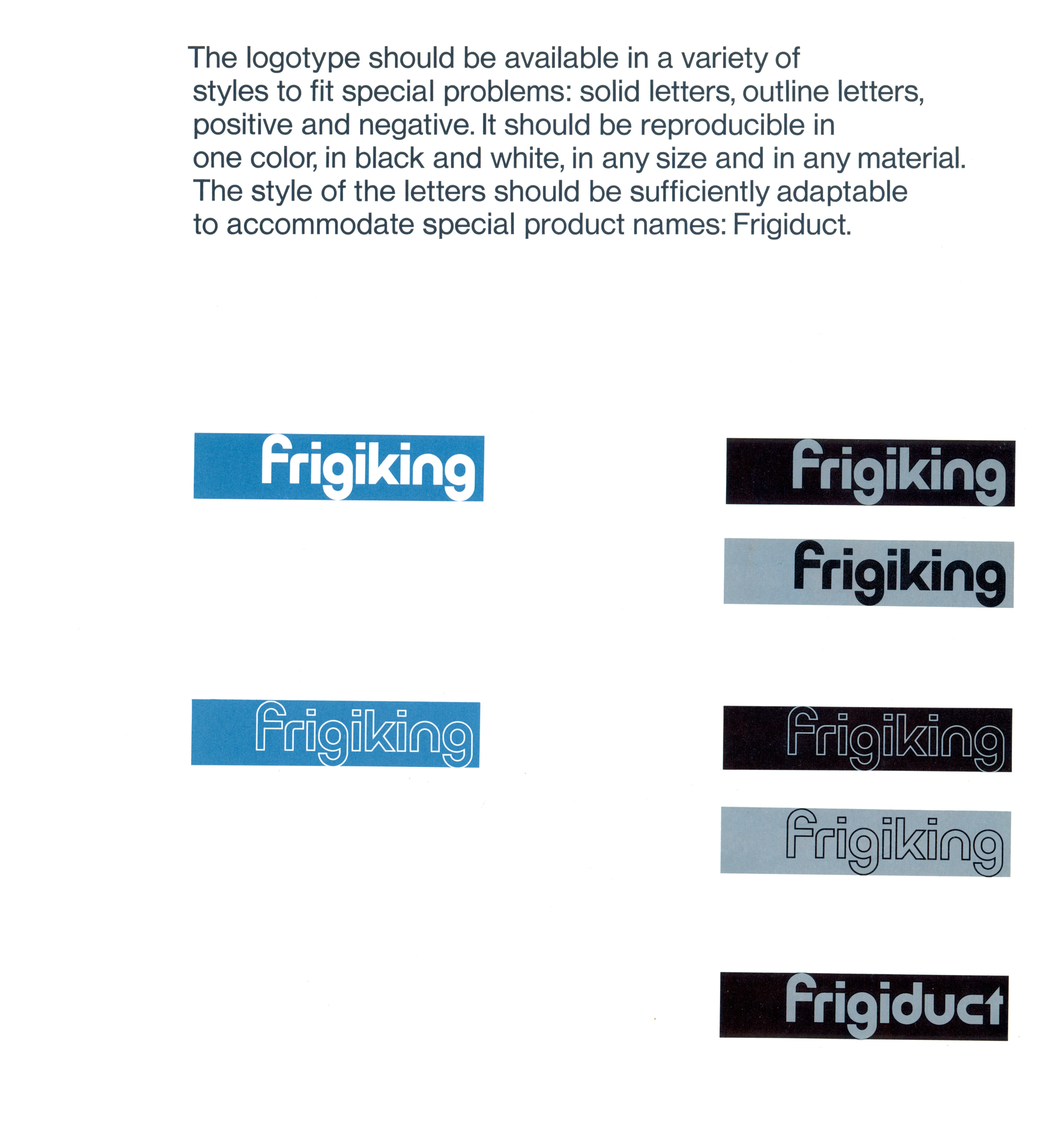
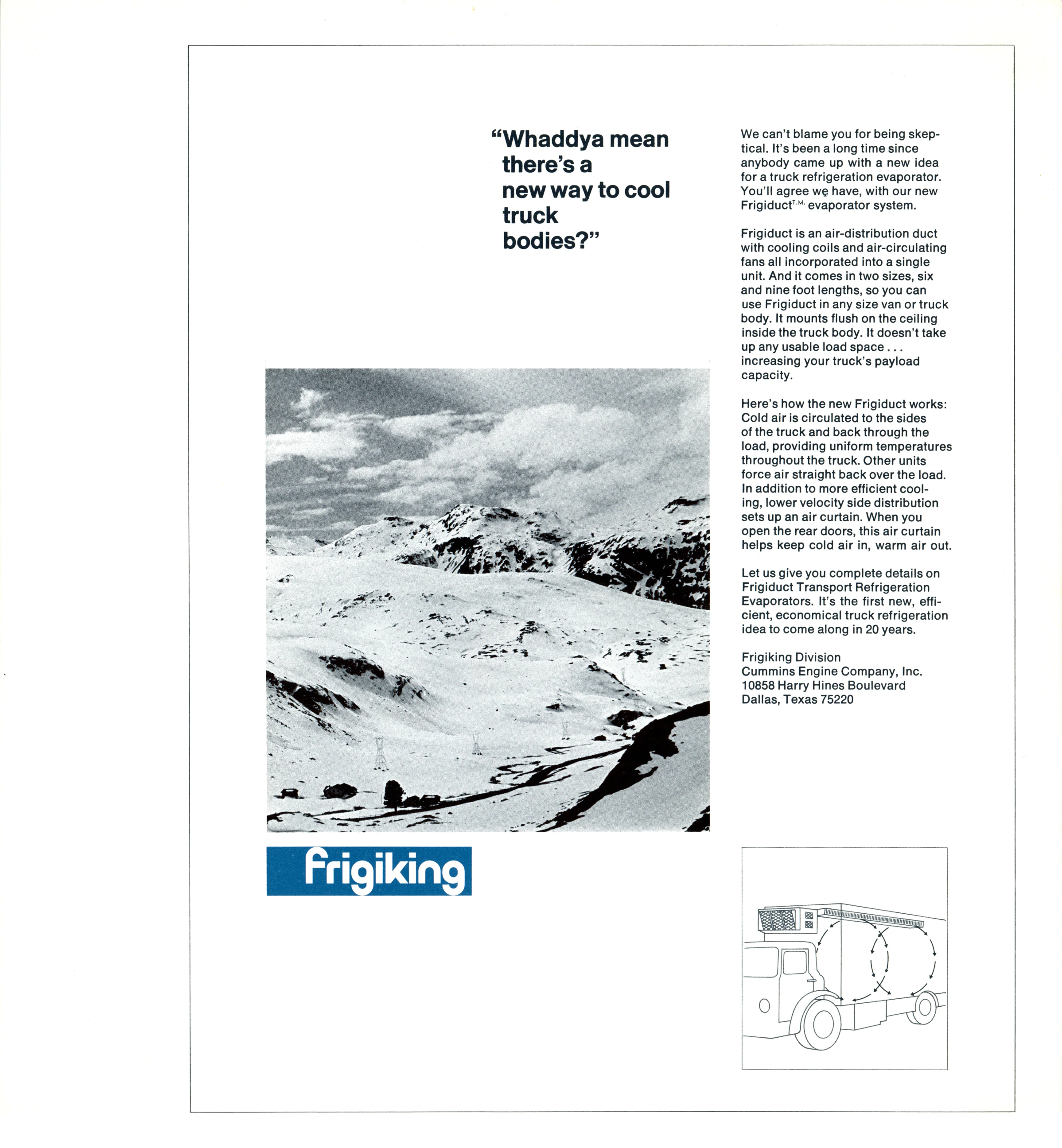
The logotype should be available in a variety of styles to fit special problems: solid letters, outline letters, positive and negative. It should be reproducible in one color, in black and white, in any size and in any material. The style of the letters should be sufficiently adaptable to accomodate special product names: Frigiduct.

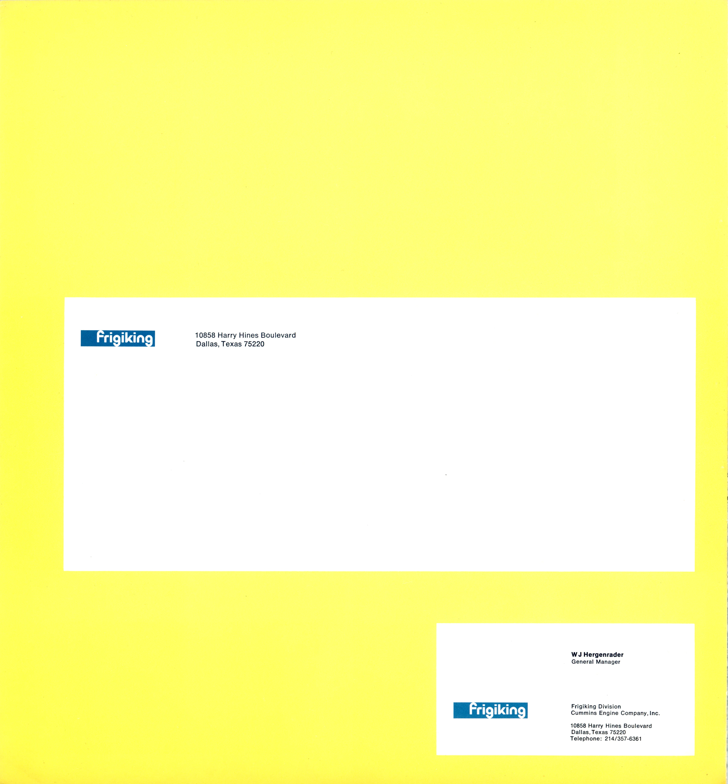
The proposed logotype design for Frigiking is based on the premise that a well-designed nameplate is as essential to product identity as it is to product appearance. To capitalize on this idea, and to take advantage of the benefits of repetition, it is suggested that the nameplate format be applied not only to products, but to all printed material, internal and external, as well.
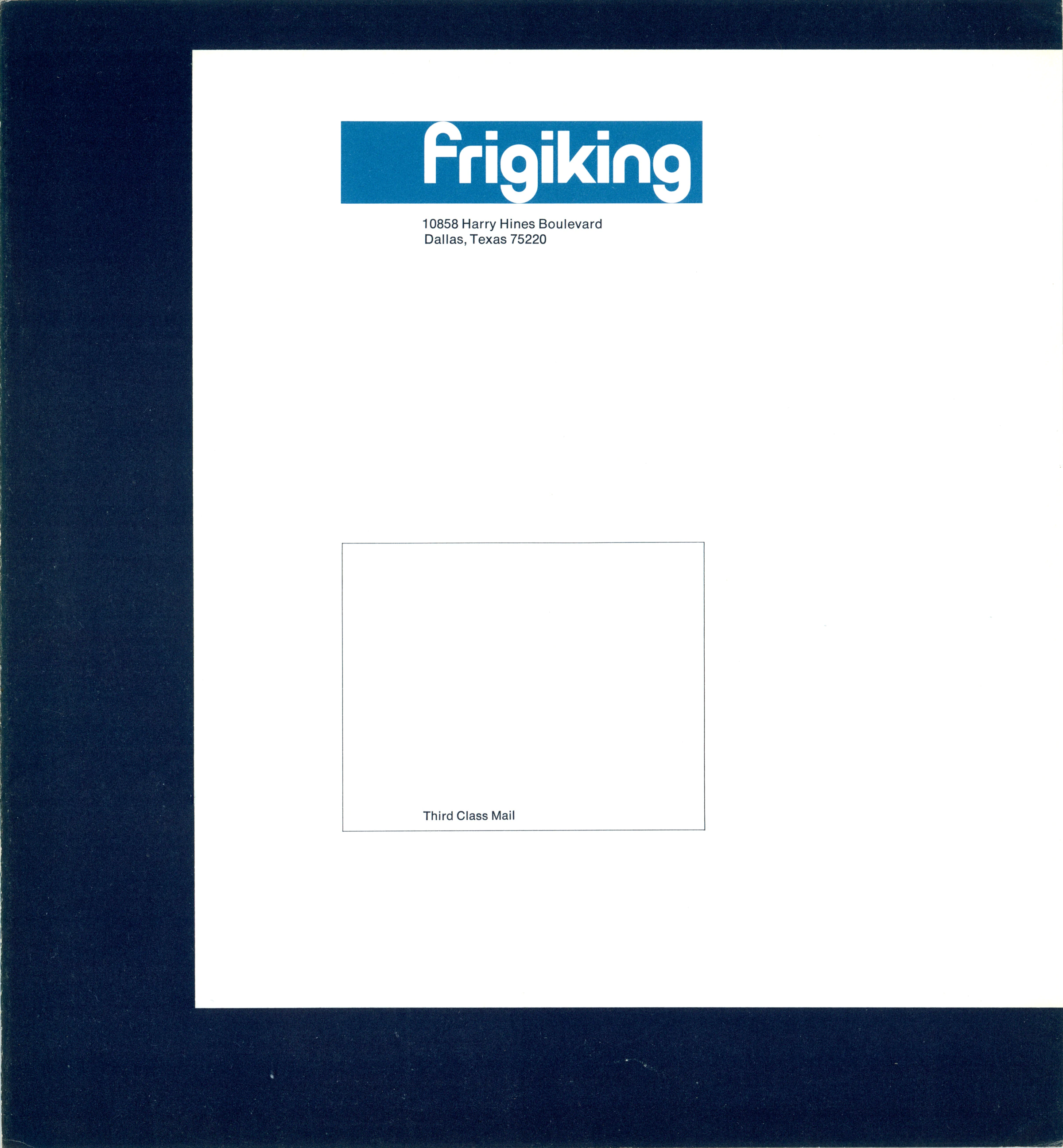
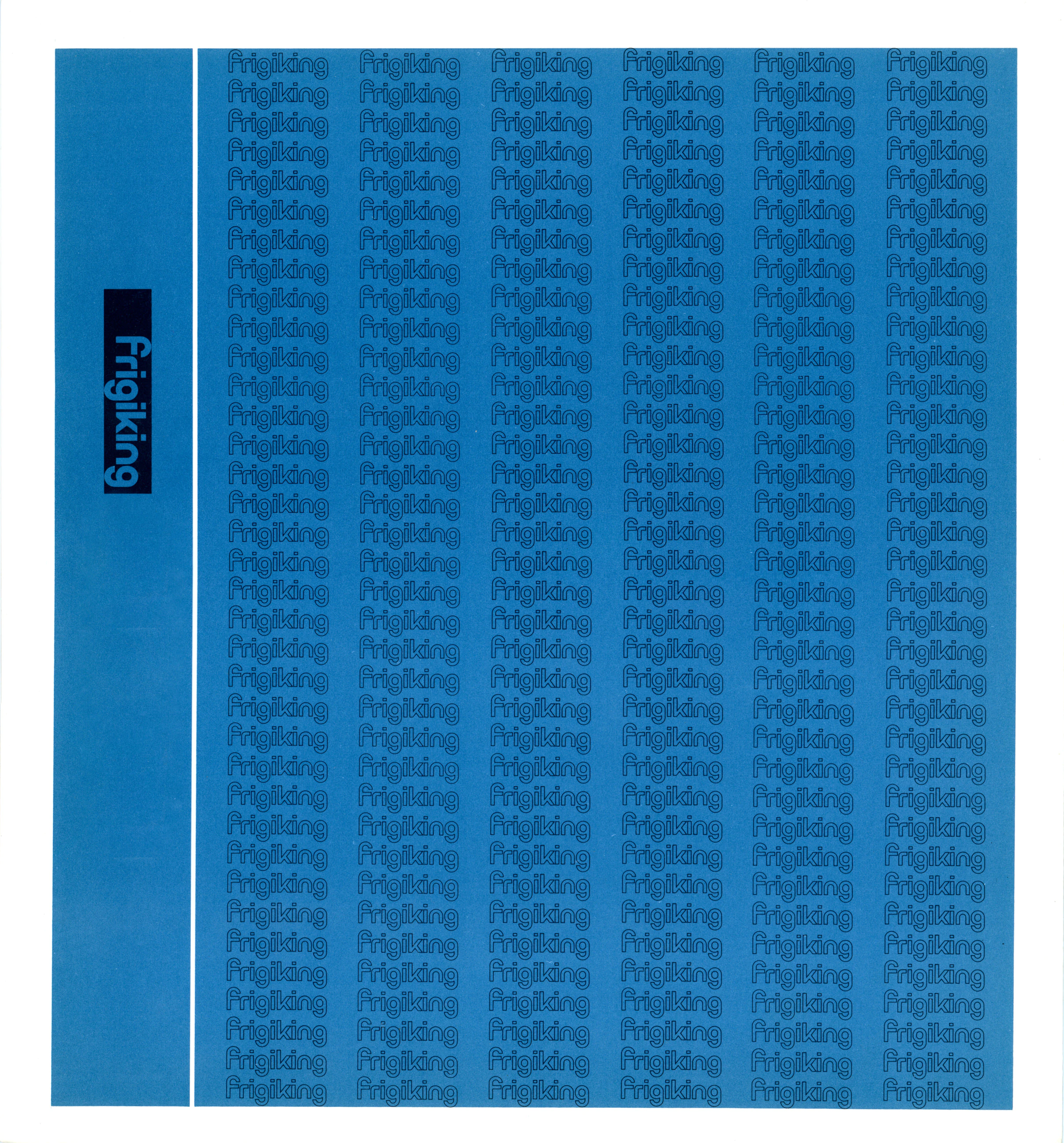
Following are examples of the logotype in use:
- Letterhead
- Envelope
- Calling card
- Large mailing envelope
- Binder cover
- Advertising format
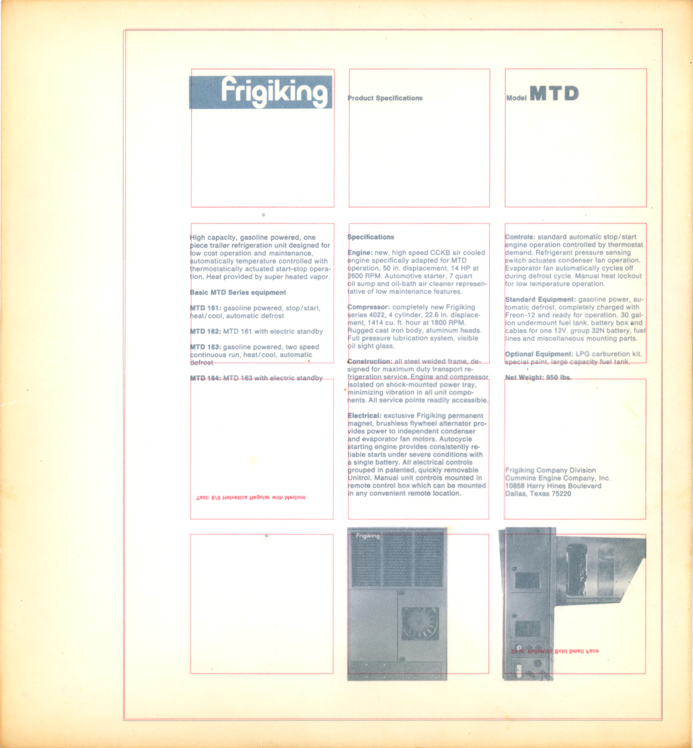
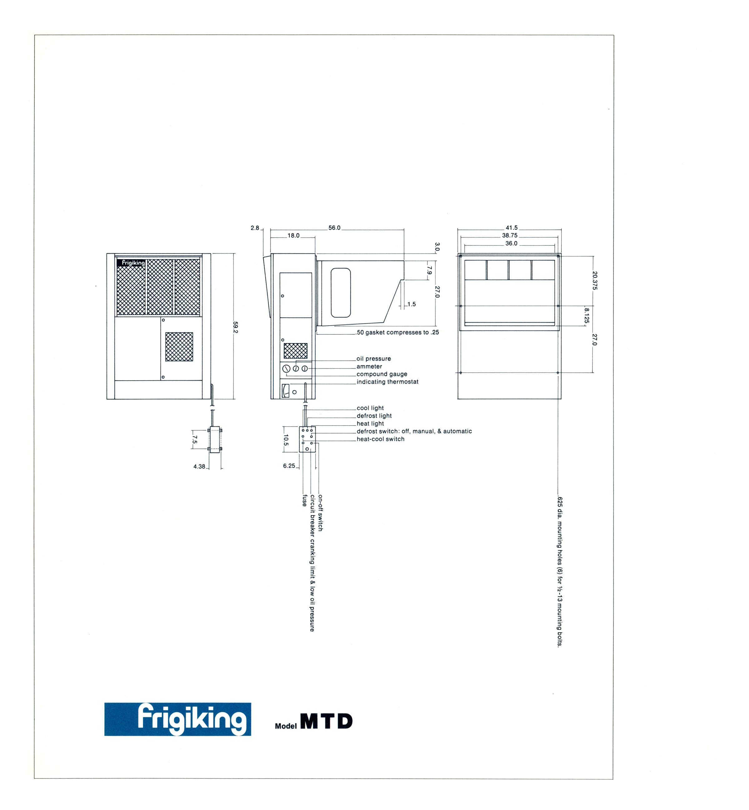
- Specification sheets


Proposed by Paul Rand
May 1966, Weston, Connecticut
For Frigiking Company Division
Cummins Engine Company, Inc.
Dallas, Texas