A new Symbol
for the
United States Department
of the Interior
Bureau of Indian Affairs
Prepared by Paul Rand Inc.
Weston, Connecticut
June 1968
The Problem:
To design a symbol for the United States Department of the Interior, Bureau of Indian Affairs.
“Some of the objectives of the Bureau of Indian Affairs are the acceleration and expansion of educational, community, and economic development opportunities, as well as the utilization of human and natural resources—with objectives of economic self-sufficiency of Indians, full participation of Indians in American life and equal citizenship privileges and responsibilities for Indians.”
Obviously, a symbol in and of itself cannot accomplish objectives. It can, however, reflect symbolically the spirit of an organization or program. In time, it will also suggest, through association, the degree to which the objectives of the program or organization are being met.
It is the Bureau’s continuous striving toward worthy goals which will give meaning to this new symbol. The device will then begin to serve its real function, that of symbolizing the accomplishments of the agency it represents.
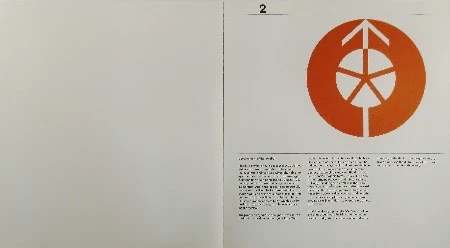
As in any meaningful symbol, the design shown in this presentation does not attempt to illustrate in literal terms any moral, event, or anecdote. Rather, it attempts to convey a universal idea in ideographic terms: Indian and American are one and the same being.
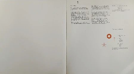
The elements comprising the symbol:
1 The sun…
2 the arrow…
3 the star…
were chosen because they have a universal quality and positive implications.
They suggest the ideas of:
-
life-giving force
unity -
Indian
progress
aspiration
optimism -
American
patriotism
hope
The composite is demonstrated on the following page.
Development of the Symbol:
Ideally, a symbol should possess those qualities which will make it comprehensible, memorable, unique, and timeless. Simplicity helps the eye to notice and the mind to absorb an image. Juxtaposition of elements in some unusual relationship helps to make that image unique and memorable. And if the image is geometrically conceived, it will not be burdened with the shadow of time nor the frivolities of fashion. This geometric quality will help also to contribute to its typographic compatibility, which is so important in the day-to-day problems of applying the symbol.
The proposed symbol is designed in the spirit of traditional American Indian symbology. Stylistically, it is akin to the picture writing which we all recognize as part of Indian art and life. The Indians have always exhibited the rare ability to arrive at the visual essence of an idea by ingenious juxtaposition and simplification of geometric and/or organic forms. This skill is seen in their ornamental work, their pictographs and petroglyphic designs, as well as in their basketry, weaving, pottery, feather and leather work. It is ironic that the art of picture writing, which not so long ago was dismissed as crude or primitive, is today accepted as a genuine art form, serving as an inspiration to designers and artists of our time.
In addition to saying visually “American Indian”, the symbol suggests the idea that the Indian is a man of dignity. This idea is intimated in the simplicity of the design, the elegance of the proportions, and the distribution of the components which constitute the whole.
Application of the Symbol:
The success of a symbol depends not only on its intrinsic design merits, but on judicious use and effective implementation. The purpose of a symbol is to help dignify and lend authority to whatever it identifies: printed forms, buildings, signs, flags, film titles, service pins, or vehicles. It should have complete versatility: be reproducible in any medium, any size, in two dimensions, in three dimensions, fixed or animated, in one color for economy, in multiple colors if necessary or desirable. It should be flexible enough to be engraved, embossed, stamped, cut out, appliqued, painted, sculpted, or embroidered.
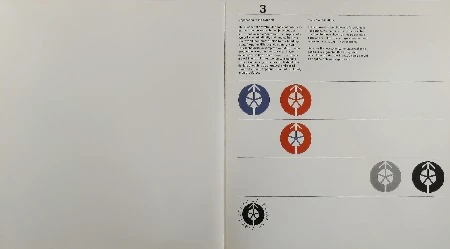
Color Combinations:
In the interest of simplicity and forcefulness, it is suggested that the choice of colors be confined to those shown on this page: terra cotta and/or blue. Black or gray may be used when necessary, e.g., in newspapers.
Because it is too complex for universal application, it is suggested that the symbol which incorporates the Bureau’s name should be applied only with expert care.
Type face:
The type face used for the examples in this presentation is limited to the family of sans serif known as ‘Standard.’ It is available in small weights, in both foundry and linotype.
The design of the face is straightforward, simple, and legible. It is compatible with the proposed symbol. It does not attempt to be cute or quaint, rather its design evokes a sense of dignity and candor, in order to preclude any idea of condescension, negative associations with arts and crafts have been carefully avoided, both in the design of the symbol and in the choice of the type face.
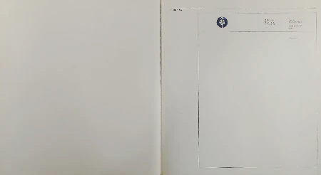
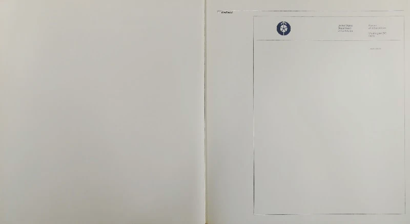
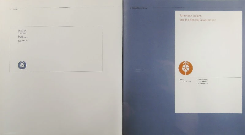
Following are examples of applications of the symbol:
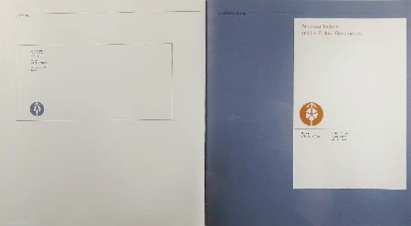
- letterhead
- envelope
- booklet cover format
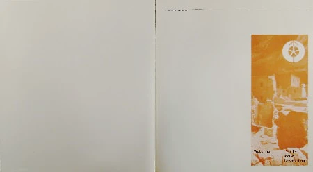
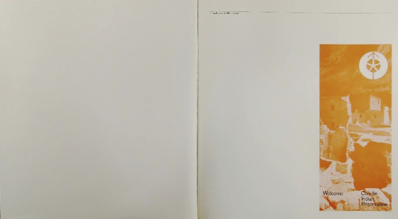
- welcome folder cover
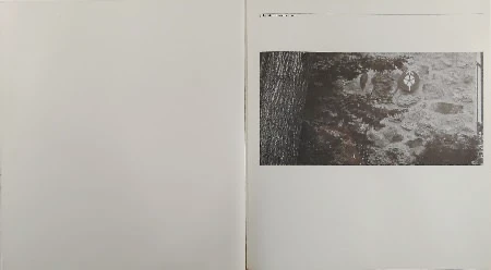
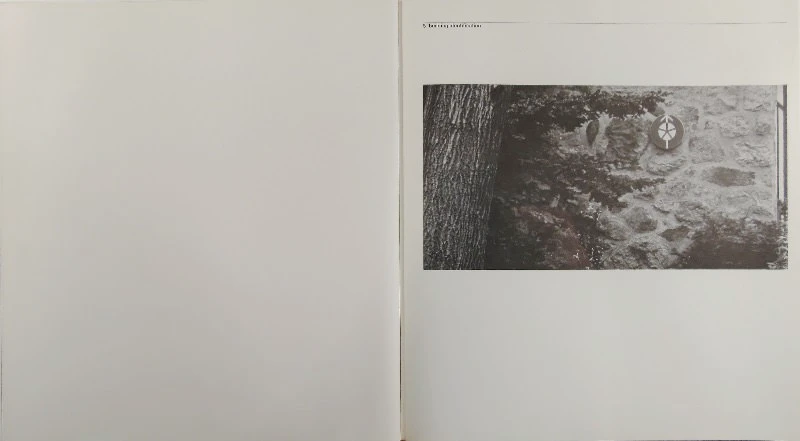
- building identification
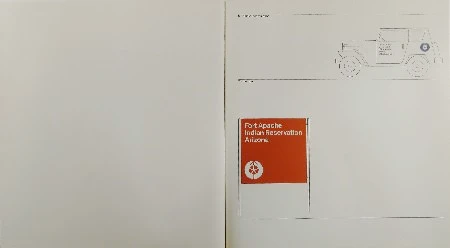
- vehicle identification
- site-sign


