Paul Rand, Andreas Feininger (photography), William Bernbach (copy) 1942
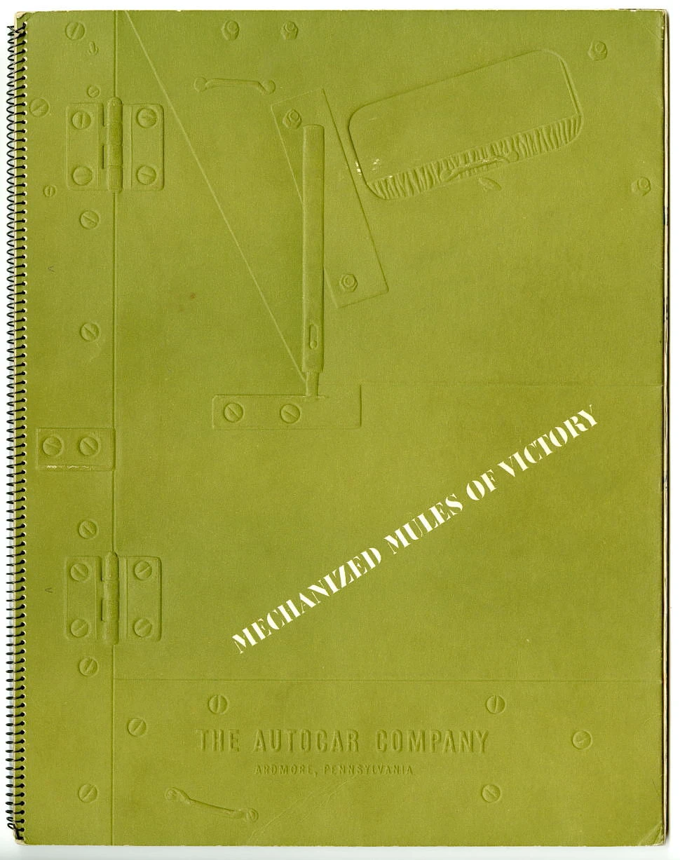
Ardmore, PA: The AutoCar Company, 1942. Original edition. Wire-bound booklet in embossed and decorated covers. A true high point of American Graphic Design and a truly rare document.
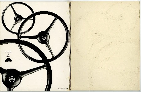
8.5 x 11 spiral-bound booklet with embossed cover and 16 interior pages with one printed vellum sheet as frontis. Printed in two colors throughout with photography by Andreas Feininger and text copy by William (Bill) Bernbach.
Most contemporary designers are aware of Paul Rand’s successful and compelling contributions to advertising design. What is not well known is the significant role he played in setting the pattern for future approaches to the advertising concept. Rand was probably the first of a long and distinguished line of art directors to work with and appreciate the unique talent of William Bernbach. Paul described his first meeting with Bernbach as “akin to Columbus discovering America,” and went on to say, “This was my first encounter with a copywriter who understood visual ideas and who didn’t come in with a yellow copy pad and a preconceived notion of what the layout should look like.”
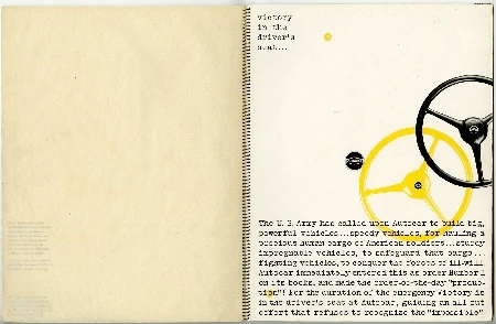
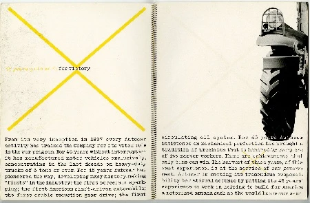
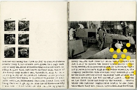
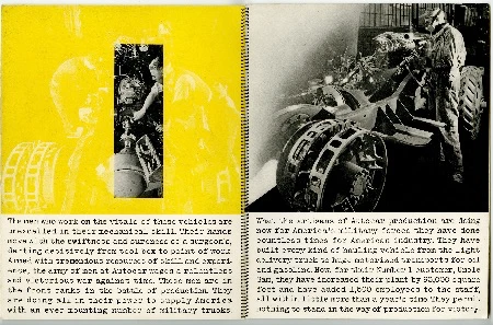
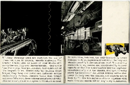
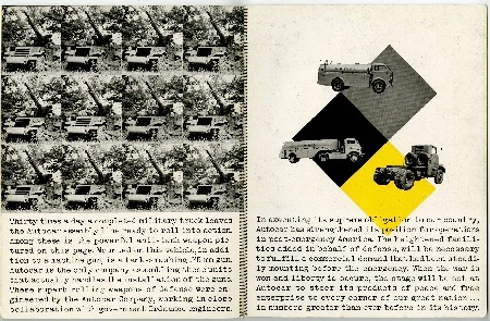
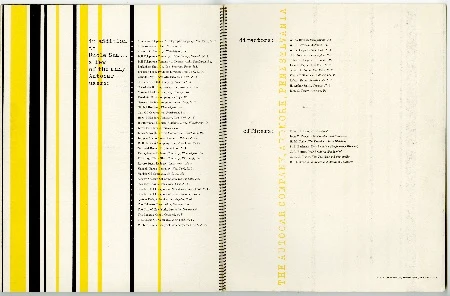
In 1942 William Weintraub hired Bernbach as a copywriter. His first assignment was a collaboration with Rand, Weintraub’s star Art Director, on a project for The AutoCar Company of Ardmore Pennsylvania. Rand had already spent some time on this project, working with Andreas Feininger to develop a visual image for the Armoured vehicle manufacturer. Frustrated by the lack of visual interest in Feininger’s images, Rand developed a series of contiguous, two-page spreads divided in half along the same axis. The top half of the pages were for the images—silhouettes, montages and repetitions to suggest movement—the bottom half of the page was reserved for an unusually large amount of copy explaining AutoCar’s manufacturing process and to complement the images.
Rand specified the text set in American Typewriter—a most unorthodox type choice for the time. “I told Bill this was what I wanted. And he filled the space with copy. That’s all he did. But it was great copy,” Rand told Steven Heller in 1988. In 1942 American Printer magazine praised the design of the spiral-bound brochure as a “successful variation on the Bauhaus theme, in yellow and black typewriter type.” And MECHANIZED MULES OF VICTORY was then included in just about every graphic design history, compendium and anthology that has been published since then. And that is how history is made.
— Randall Ross of modernism101.com

