10 3/4” x 11 3/4”, perfect bound, 36 page book.
A rare and hard-to-find magazine. Contains a classic Rand interview by Viriginia Smith which has been recently republished in Franc Nunoo-Quarcoo’s “Paul Rand: Modernist Designer”.
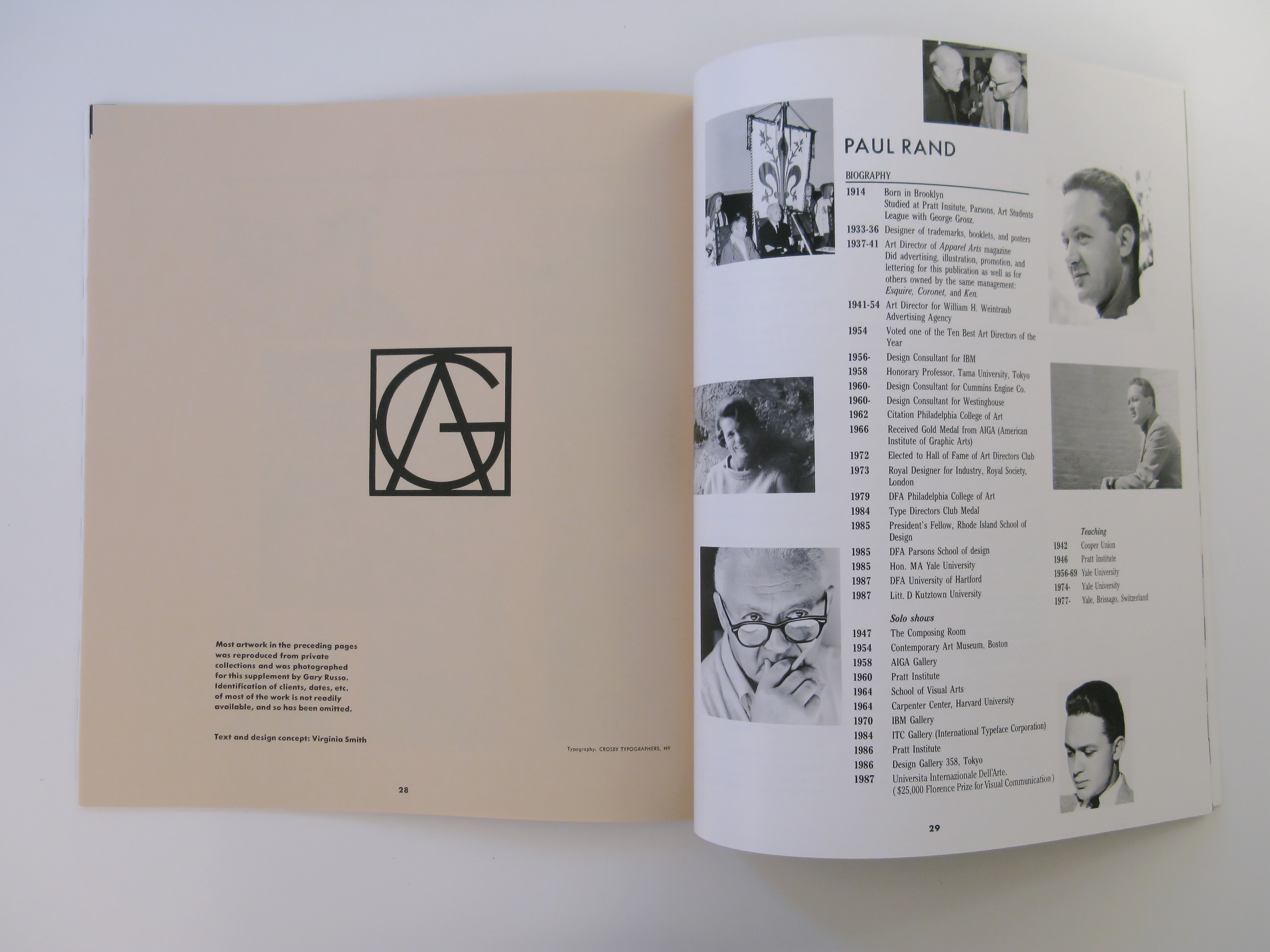
Also includes a 12-page “abecedarium” of the European designers that have influenced Rand. These designers and artists were mentioned during the interview, in alphabetical order.
The Original Text
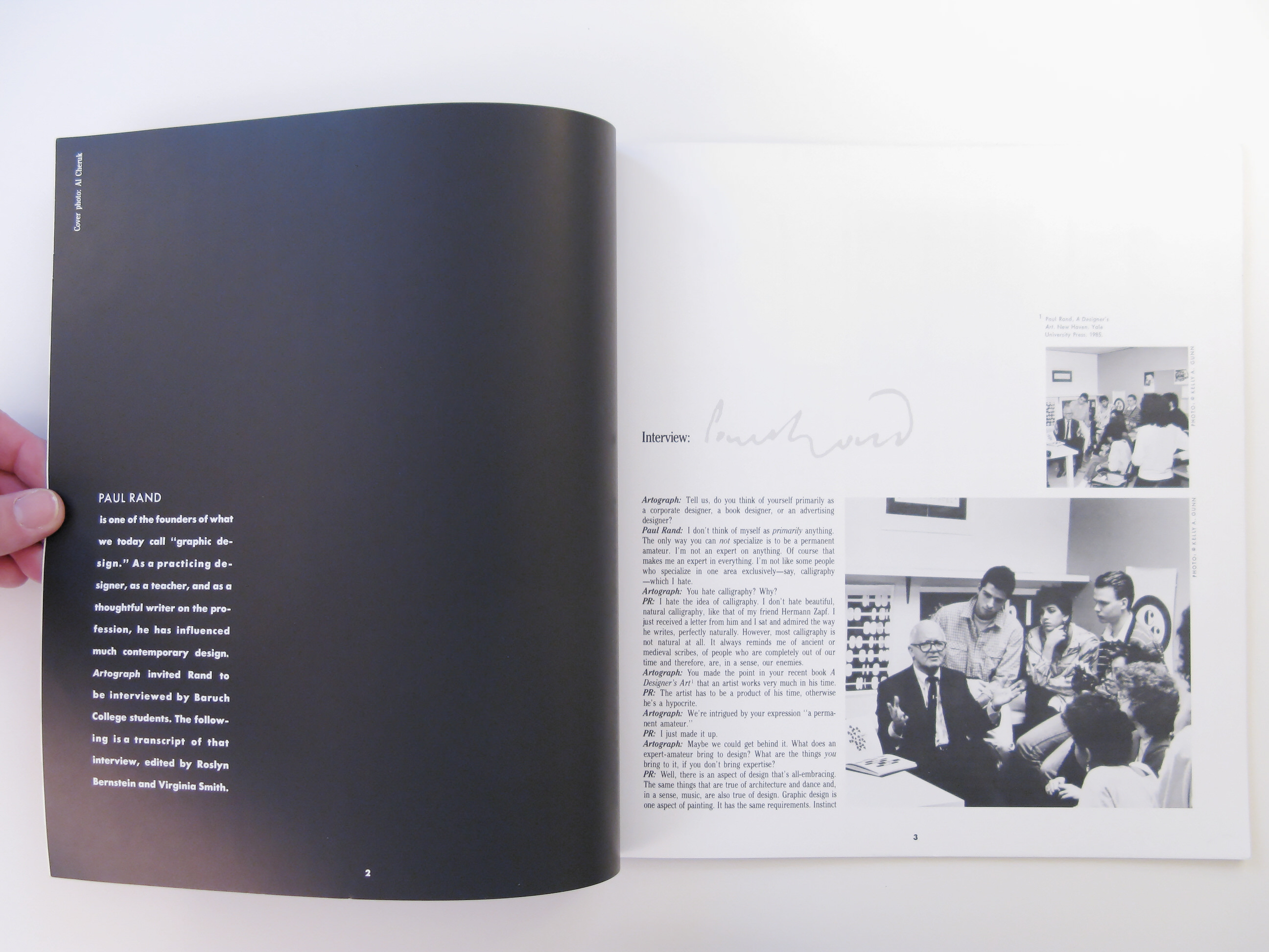
By Roslyn Bernstein & Virginia Smith
PAUL RAND is one of the founders of what we today call “graphic design.” As a practicing designer, as a teacher, and as a thoughtful writer on the profession, he has influenced much contemporary design. Artograph invited Rand to be interviewed by Baruch College students. The following is a transcript of that interview, edited by Roslyn Bernstein and Virginia Smith.
Artograph: Tell us, do you think of yourself primarily as a corporate designer, a book designer, or an advertising designer?
Paul Rand: I don’t think of myself as primarily anything. The only way you can not specialize is to be a permanent amateur. I’m not an expert on anything. Of course that makes me an expert in everything. I’m not like some people who specialize in one area exclusively — say, calligraphy — which I hate.
AG: You hate calligraphy? Why?
PR: I hate the idea of calligraphy. I don’t hate beautiful, natural calligraphy, like that of my friend Hermann Zapf. I just received a letter from him and I sat and admired the way he writes, perfectly naturally. However, most calligraphy is not natural at all. It always reminds me of ancient or medieval scribes, of people who are completely out of our time and therefore, are, in a sense, our enemies.
AG: You made the point in your recent book A Designer’s Art that an artist works very much in his time.
PR: The artist has to be a product of his time, otherwise he’s a hypocrite.
AG: We’re intrigued by your expression “a permanent amateur.”
PR: I just made it up.
AG: Maybe we could get behind it. What does an expert-amateur bring to design? What are the things you bring to it, if you don’t bring expertise?
PR: Well, there is an aspect of design that’s all-embracing. The same things that are true of architecture and dance and, in a sense, music, are also true of design. Graphic design is one aspect of painting. It has the same requirements. Instinct or intuition has to operate, as well as reason, in both disciplines. There’s no difference at all. I can say so because I’ve painted, and I’ve felt just as miserable doing painting as doing graphic design (when misery was part of the picture). Or, when elation was part of it. No difference. The difference that some artists like to believe exists between fine art and commercial art is pure snobbism. Saying, “I’m better than you.” They’re not better. They may be better than me, but they’re not better than graphic designers who are better than me. Cassandre, for example, was a marvelous painter—as good as the best painters. But he left the commercial work at which he was a genius, to do what he called “pure painting.” That consisted of nude women and chickens running around farm yards. Or little houses and clouds. I saw them in his studio—tons of pictures stacked up against the wall. Paintings which were beautiful in a technical sense but they were, you know…
AG: It’s interesting that you say that you’re in the emotional state of whatever is required at the time, misery or excitement. Do you have to work yourself up into that?
PR: I’m afraid you just get worked up without wanting to.
You know, parenthetically, why I don’t like being interviewed? Because people look at you as if you’re an expert, and I don’t consider myself an expert. It’s a little bit like asking a horse how he wins a race. He can’t answer. It’s just natural for him. He just wins the race. He has talent, he’s a horse, he has four legs and he wins. It’s the same thing with an artist.
I’ll give you an example of how it works. Somebody calls me and asks me if I’m interested in a design job. If I’m not interested, if I have no time, or if I don’t like the subject, nevertheless, when I hang up, I sit down and figure out a design solution. I do it anyway; I always do it.
AG: Is it discipline?
PR: No. I hate discipline. It’s a natural urge. It’s animal instinct, like a cat goes after a mouse. I go after solutions; it’s a challenge. You know, sometimes you get very difficult problems. They are almost insoluble. But you sit down, and see if you can do it. People call me to ask if I will design something, and I sometimes do it for the sole reason that I’m curious to see if I can. And I often try to solve the problem before I even meet with the client.
AG: You have said that you hate discipline. But in your writings you recommend a disciplined approach.
PR: Oh, yes, you have to be disciplined, but that doesn’t mean you have to like it. I remember saying to Herbert Matter once, “I hate doing maps.” He said, “Well, you don’t have to love it to be able to do it.” There are people who love doing things, but they do terrible things.
AG: Were you taught in a disciplined manner?
PR: No. The kind of teaching that you get in, let’s say, the Kunstgewerbeschule in Basle? No. When I went to school the instruction was lackadaisical. There was no system. When I studied with George Grosz2 in the ’30s he had just come over from Europe, and he didn’t speak a word of English. You can imagine what his classes were like. He walked around and looked at your work and made a few marks, and you wondered what he was driving at. I’m still wondering. I’m not an expert in teaching, although I have been teaching for forty years. I learned a lot from magazines of the field. The old Gebrauchsgraphik was a marvelous source. There has never been anything like those pre-war issues of the magazine. A man by the name of Frenzel was the editor. He had wonderful articles, and understood, really understood, and talked above the commercial viewpoint. But also he stressed the need to be practical. If it wasn’t practical it was nothing, neither art nor commerce.
Another magazine of the time was Advertising Art. Ruth Fleischer was the editor. I was dying to get my stuff in that magazine. I managed to get one thing in, a package I did which I think today is just terrible.
AG: What was it like?
PR: It’s kind of abstract, very simple. In those days you were ashamed to do anything if it wasn’t done by hand. You didn’t use rub on type, or photostats. I never used a photostat, everything was drawn. If your students don’t do it, you should. Drawing letters. To make you sensitive to curves. Like Albers used to say, “Come on, fellows, get out of your steel suits and work.” Relax and be able to move your hand around.
AG: Solutions don’t come from application or concentration, or discipline, then. Where do they come from?
PR: Well, they come from experience, in part. Some problems are more difficult than others. Some problems are very difficult because they don’t lend themselves to visual interpretation, and maybe they shouldn’t even be interpreted. People want you to design their product, and they may expect you to come up with flying angels and Bach cantatas, but that’s not appropriate. I try to keep things pretty earthy. For example, I did the UPS trademark, and I had only a week to work on it (because they had already tried everybody else). I showed it to my daughter, who was about ten years old at the time. I showed her a sketch and I said; “Catherine, what’s that?” She said, “That’s a present, Daddy.” I said, “Perfect.” Ten years old. And I often show things I do to people who have no preconceived notions about design. I just say, “Can you read this?” I think that things should be read. I’m not particularly interested in these fancy solutions to trademarks, this tendency to be as circuitous as possible to attain the most “elegant” kind of solution. Real elegance doesn’t scream. It’s very modest.
AG: Does everyone respond to certain basic symbols? The cross, the mask, others?
PR: Yes. But there is a misconception about symbols and about trademarks. It isn’t the designer who makes the trademark, it’s the corporation who uses it. For example, the Nazis made the swastika, which was an ancient symbol, into one of the most terrible signs in history. A company could make a trademark done by Michelangelo look terrible, merely by association.
I remember when the Chase Manhattan trademark was done. When it first came out I was in London, and I stopped at the Chase Bank there and asked the teller what he thought of it. He said he thought it was terrible. Now everybody thinks it’s great, because it has become associated with a rich Rockefeller bank. So it has become meaningful, but in itself it is merely a nut (nut and bolt).
AG: Let’s discuss the humor in your work. It seems, sometimes, there is a certain humor born of anticipating spectators’ reactions to things.
PR: There is an aspect of humor in my work, but it’s not the same kind of humor, for example, as that little Dubonnet man. That’s funny, I mean that’s humorous—the little nose and the little derby. Or, in this piece [pointing to page]. I remember when I did this. This is not ha-ha humorous, but it’s humorous. It’s a serious business; it’s a real-estate business, selling tracts of land that are very expensive. I remember when I did this thing my liaison said to me, “You know, everybody liked the design, but… ” and I knew something was coming, and was ready for him. I didn’t know what he was going to say, but whatever he was going to say, it was going to be “no.” And he said, “Some of the people thought it looked a little too much like a toy.” And I said “They’re going to have to live with it, or, if they don’t like it too bad, then don’t use it.”
AG: Why did you use the ducks?
PR: Because they have several duck ponds in the place. In fact, three of them. Oh, yes, it is definitely illustrative, and very rarely can you do that. But we’re talking about humor. [Looking through the book and pointing to various designs] This is sort of humorous, the man with three eyes. This is humorous, you should have heard the comment by the Board of Directors when I did this. Ah, this is sort of funny…
AG: The Chopin advertisement for Westinghouse?
PR: Yes. Often when I have a logo to do, I’ll zip through a type book.
AG: And look at forms?
PR: No, I look at ideas, not at forms. I look at things that associate with the problem, and make connections. Take this AIGA cover design. The eye stands for the letter “I.” That ancient practice of using an image for this purpose is called a “rebus.” The whole idea of a rebus is humorous. Visual puns: those are also funny. I have written about these concepts. But the important thing to remember is that you try to do them because they are mnemonic devices. They lend themselves to being remembered.
AG: In your recent book you wrote that one should not use the obvious type face.
For example, a designer shouldn’t use an oriental type face when designing an oriental product.
PR: Don’t take that too literally. There’s always somebody who can show you up. You never say “never” in design or art.
AG: What about the UPS logo?
PR: The UPS logo is humorous, too. I mean, it’s not serious: you wouldn’t use it for an undertaker.
AG: The top part is easily identifiable as a gift. Is the bottom part a shield?
PR: Yes, that was given. Previous designers had developed a shield-like element. The company had used about fifty designers, including the best. It can be a problem when you see what another designer has done. You either build on it or you avoid it. In this case they insisted on it. So, it was something to work with. Another problem was that the UPS employees—the men who deliver your packages—were to vote on the design. They’re stock holders in a small way. There is one part of the logo I wanted to do differently, but I didn’t, because I knew that it would become a problem. Specifically, I don’t like the points; I prefer the half circle. But I anticipated that they would read it not as a shield, but as a pocket. So I avoided it, but I think that it would have been better with the half circles.
AG: Did you use brown and beige because they’re colors associated with paper and packages?
PR: No, I used brown because that was their color, and I never change the color if I think it’s good. Why change it?
AG: In the IBM Product Centers you used color as a unifying force.
PR: Yes, everything is red—furniture, signs, everything.
AG: How much is it the color, the beauty of the red, and how much is it just keeping it the one color that makes it successful?
PR: That’s a very good question. Obviously, it would have to be a color that you can use, I mean, not pea green. But it might even be pea green under certain conditions. But, all things being equal, the idea is less the attribute of red than it is the idea of having only one color. So that the concept “the red store,” “the yellow store,” or the “blue store,” is simple and easy to remember. Take Benetton. One thinks of green in connection with Benetton, right? You don’t have blue and red and yellow, even though they might sprinkle it through the store. But one thinks of green at Benetton. Green also happens to be one of my favorite colors. But red, whether you like it or not, is an extremely potent color. Ask any bull.
I did one of the first IBM Product Centers in Silicon Valley. I remember the first morning the people working at IBM walked in. A woman said, “What a wonderful feeling it is to be in this store!” You know, the sun was shining, the red was reflecting in her face, and she looked as if she had just come from Palm Beach; she looked so healthy with the reflection of the sun on her face. But there’s nothing new about using red. It’s as old as the hills. In medieval days red was one of the most common colors. It’s greatly used in the Roman Catholic Church—look at the red robes, the mitred hats, the carpets.
AG: You wrote an essay called “Black Black Black” about the power of black. What’s the psychological advantage of black?
PR: Now you’re asking me to be a psychologist. I don’t know. I happen to like black. Black is the absence of all colors, but it is also the implication of all colors, too. Today most TV monitors are black. Compare them to the crummy things they had not too long ago, the walnut trimmed with chromium. I had a Sony TV which was walnut, and when I saw another monitor I got rid of the Sony and bought the nicer one. For me, things that look good are preferable to things that don’t look good. Even if it costs a lot of money, I buy the better-looking object. I don’t know how other people feel about it. Some people won’t spent a cent even if the world were coming to an end. They’re either insensitive or indelicate, I don’t know. I have bought every electric razor that Braun ever made, because they’re absolutely beautiful, but not very good razors compared to Remington. I have a lot of Braun products that I buy just for their beauty and then put in a drawer.
AG: You’re talking about reputations. What is associated with a company, or product?
PR: You can’t avoid this whole problem of association, I get jobs, big jobs, sometimes, because I have a reputation. That’s annoying. People don’t understand that I can do some things better than somebody else, but there are people who can do some jobs better than I can. I remember when I did the ABC trademark. They showed me the “7,” and they said, “Well, we’d like to see if you can do something. I tried, and then I got back to them and I said, “No, what you have is better than I can do.” I think you have to be honest about it. A lot of people change things just because they are given the opportunity. For example, I could have changed the UPS truck to several other beautiful colors, but that would have been a waste. There is an ethical problem. Ethics is a very important part of design. It’s almost by definition the nature of design. Design means organizing, and organizing means something positive, putting things together so they become presentable, become interesting, become amusing, become fascinating. All of these things are part of the organizational problem, which is an ethical problem. And just to change things for more money or more business or to show how clever you are is, I think, unethical.
AG: How can an ethical sense be instilled in designers?
PR: I don’t know. It seems to be innate in some people and not in others. Just like people who are religious or atheistic, or people who are amusing. They just are.
AG: Why is it unethical to change a design if it will bring more business to the company? Isn’t that what business is all about?
PR: You ask such leading questions. From the point of view of business, it’s certainly not unethical. My credo, and I don’t mean to sound fancy, because I’m a very simple guy, but my credo really is that when you design something it must have a certain standard of quality. It makes no difference what it is, it must have quality. So, if somebody changes something that is already good, he has to change it to something that’s equally good or better. But if he changes something that is already good to something that’s bad, for business reasons, then I think that’s unethical.
AG: Suppose a designer does a job to the best of his abilities, but his ability is not as good as what went before?
PR: Well, now we’re getting into a different kind of problem. Now you’re talking about individual talents. I’ve really said what I can say about ethics. You’ve had my Sunday sermon.
AG: Do you think that the IBM logo had any influence on the style of that corporation?
PR: I have no idea. All I can tell you is that, before I did that logo I never saw a logo with stripes, and afterwards stripes were taken up by the whole industry. The stripes had nothing to do with speed or electronics. I’ll tell you the reason why I did it that way. There was a problem to be solved, because of the nature of the three letters “I,” “B,” “M.” The letters are in a sequence of little, bigger, biggest. That’s uncomfortable, because you expect the sequence to keep going; it could go on for ever. It has a rhythm—like do-re-me. Also, I wanted to introduce the idea of authority. Have you seen in old documents lines where you are to sign your name? Those lines are put there to prevent counterfeiting, to prevent people erasing or copying the name. I thought, “Why not just take the letters and make those the lines?” That’s how it happened. But, again, it is the company that has made the mark. It’s a very good company, and by association, the stripes have become symbols of quality.
People have some sort of superstition about a trademark, a belief that you cannot touch it. I was asked to do the Ford Motor Company mark some years ago, and I did it. We printed a big book and there was a big production and everybody liked it except Mr. Ford. He looked at it and he said, “I don’t think what we have is old-fashioned.” And that was the end of it.
AG: If you change an existing logo, don’t you risk losing the recognition it has with the public? Isn’t it dangerous?
PR: I don’t think it’s dangerous, I think it’s expensive. Look at Nissan. Look at what they did. You don’t even remember the name they replaced. Visually, they obliterated the old mark. What was it? Datsun? Right. They put a lot of money into changing it, and did it. But these are things which have nothing to do with design. Don’t get things mixed up.
There is another matter when you’re dealing with visual things (or even with verbal things). Opinions are so personal, so subjective. When someone says to you “I think that’s a great design,” and you agree with him, it doesn’t mean you agree for the same reason. We may be talking different languages. Even in discussions like this interview, I wonder how well you understand me, and how well I understand you. We’re talking about things that are, in a sense, ineffable, ineluctable. The real thing, the real art, the thing that makes something art, one can’t talk about. And as for opinion, whether somebody likes something or doesn’t like something doesn’t have to do with design. I recently read an essay by Henry James called “The Art of Fiction.” In it he refers to the very difficult problem of liking or not liking. Liking or not liking is unavoidable, but also, the reasons are unprovable. I like it, and if somebody else doesn’t, like Ford, that’s the end of it. You can’t do anything about it unless you have some special skill and can talk people into, or out of anything.
AG: When you present a new logo to executives of a corporation, do they ever say, “I’m not really sure… I have to think about it for a while.”
PR: Big business people are usually pretty definite. They don’t shilly-shally around. And I am very direct. But you never work with the Chief Executive of a large corporation in these design matters. The decision comes down through three other executives. There’s no way you can do anything about it, unless you want to go over their heads.
AG: To what extent does presentation affect the design decision?
PR: Well, the art of presentation is part of our business, and it is also, ironically, the art of deception. Much bad design can be sold through a great presentation. When you look around at the bad design, you can say, “It must have been a terrific presentation!” I never make a presentation, personally. I usually send it in the mail.
AG: Why?
PR: Maybe because if it’s going to be rejected I don’t want to be there. But more importantly, I think that the thing has to stand on its own merits. I’ve seen skillful presentations made by people doing terrible work and selling it. People spend money making presentations with three-dimensional things and lights and theatrical effects, dancing girls and music—true! I mean, if you get a million dollars or two, you have to do something, you can’t just do a mark. That’s one of my big problems. If I charge a client a million dollars and give him only a mark, I’ve got to make it worth his while. You may think that I’m kidding, but this is an aspect of the serious part of the business: the problem of selling.
AG: To what extent were you involved in the presentation to Ford?
PR: I didn’t go to the presentation, I just sent it in. I might have succeeded in selling it, but I might also have been thrown out. I didn’t want to be thrown out. You know, they set you up in a hotel for VIPS, a very uncomfortable place. They send a limousine for you, and you go to lunch and sit in a Mies van der Rohe chair. The whole thing is very ritualistic.
AG: Let’s talk about some designers and type designers and how you have related to them.
PR: It would be wonderful if you could deal with people who have the same sense of values you have yourself. That’s one of our big problems. You know, W. A. Dwiggins, who was a designer in the ’20s, referred to me as one of the “Bauhaus boys.” He was being perfectly honest, but his values were not mine. He was a medieval scribe and I’m a guy who just went to the moon. We don’t speak the same language. This is true of so many of those early moderns: Stanley Morison, Frederick Goudy, and others. Stanley Morison referred to modern designers as “gigolos.” That’s what he called them. Not me. I wasn’t illustrious enough to be mentioned by him.
AG: Did you know Morison?
PR: I once had the pleasure of meeting him at the Garrick Club in London. He was sort of like the Pope. He sat there in a black suit with a little white collar, just like a priest. I decided, this is too much. I started to drink, and I haven’t the faintest idea of what he was talking about for about two hours. Fortunately, I was with a friend who was talking to him while I was supposedly listening. However, after a while I got up and I walked to the dining room. It was a beautiful room, and the tables were set with silver flatware, flowers and candles, the chandeliers were lit. In the midst of all this,
[At this point in the interview slides of modern painters and slides of Rand’s designs were projected.]
AG: When you use photographs, as in this cover of Direction magazine, you often alter them in some way—here you fragmented the picture. Why? What does it accomplish?
PR: What it accomplishes, if it accomplishes anything, is to dramatize the parts of the body that make dance, and it does it in a way that’s unusual, unexpected and memorable. A photograph of a dancer is a million dancers, not memorable. But this one you won’t forget.
AG: So, defamiliarize the ordinary?
PR: Yes. Right, but I don’t do it with any such specific purpose, except that I like to do it. If I happen to be lucky enough to get an idea, I do it. Also, in case you haven’t noticed, I also happen to be a big fan of Hans Arp.
AG: Yes, we are just about to show some slides of his work. Let’s talk about Arp.
PR: I think he was one of the great men, original men, of our time. One of the very few originals. Amazing, the way he could abstract forms. This is extremely rare.
AG: Your Direction cover takes from Arp the practice of making the parts become a whole.
PR: Well, it’s in the nexus of the design, you know, the coming together of the elements.
AG: You were influenced by Arp?
PR: No, if you want to go into something like how people are influenced, I can show you people who’ve more than influenced each other, they have stolen from one another. Like Lissitsky and Malevich. I’m speaking of “The Story of Two Squares,” where there is no difference at all between Malevich’s painting and Lissitsky’s design. The application of the work from one discipline to another is the genius of Lissitsky, not that he was such an original. Art also has to do with doing the right thing at the right time. Not necessarily first, but at the right time.
It’s a question of giving a right answer at the time the question is asked, and getting the right idea at the right moment. One of the big problems a designer has is that ideas are very open-ended. You can go on forever getting ideas from something, but you don’t have time for that. So, the big problem is to pick the right one and do it quickly. And how often have you done a design and then found out you had a much better idea later? I’ve done it. I did a cover recently for a Japanese magazine about 35 of the world’s greatest designers. I don’t know how they picked them, either the designers or the number. But I did a cover with a lot of different color dots, representing 35 eyes. After it was printed I had a much better idea. So, timing itself is part of the process. If a guy is on his feet, you know, fast.
AG: Let’s look at graphic design in the context of the modern movement. We have slides of some early, influential modern artists.
[Slides are projected]
PR: This is Suprematism, Russian futurism, if you like. The designers were working in the style of the period, in the style of the painters. This was Malevich’s application of graphics to painting.
AG: Do you see the suprematists as having some kind of influence on graphic designers of the 20th century? Where would you put Malevich as an influence in graphic design?
PR: Well, Lissitsky as I said before, adapted his paintings and used the same ideas. Exactly. He took two squares and made a book called “The Story of Two Squares.”
AG: Cassandre, of whom we spoke of earlier, was both a painter and a commercial artist.
PR: He was a painter. His work was painterly.
AG: You refer to Leger often. The painterly quality is important to you? Could you speak about that? And painters in particular?
PR: I use painters more for content than for the quality of the paint. I never used the world “painterly” in my book. I’m not talking about that, I’m talking about the design aspect, the way Vasari talked about it. It’s in the very first sentence of the book. What Vasari said was absolutely what I was talking about, too.
AG: Here’s Klee’s painting “Around the Fish.” In much of your work there is something central. What elements keep recurring in your design?
PR: I cannot answer that question. No. I just do a job, you know, whatever it calls for.
AG: Picasso and Braque turned to collage.
PR: Collage is the direct consequence of Cubism in the sense that it destroyed the traditional concept of space. By traditional space I mean the space of Rembrandt. They consciously destroyed that idea of Euclidian perspective, of Renaissance perspective, and they went to the extreme of not only destroying it, but of actually painting and gluing things which cast their own shadows on the canvas. It was getting away from the old style of painting that imitated reality. They did not try to give the illusion of reality through painting shadows, they glued things on that would cast their own, real shadows. They used newspapers, rather than painting letters.
There is a great misconception about Cezanne. He didn’t say anything about Cubism; he only talked about perspective. Other painters misunderstood what he said, and did great paintings, not because they understood, but because they misunderstood.
AG: If a product is shown in a collage, what is the relation between that product and the other elements in the design? Does it have to be in the foreground? Does it have to be larger?
PR: No, it’s just part of the composition, the two- dimensional composition. You know, this whole business of art in advertising has been completely misunderstood. People think if they use a painter like—oh, Botticelli—it associates their product with that great art work. It’s a form of selling, and a kind of art that is for the birds. To take a Cubist painting of Braque to sell paper cartons is ridiculous. It’s not art. Part of the definition of art has to do with usefulness. Real art is always useful, in one way or another. Real art comes in doing the work, custom-made, for each product. If you’re a real artist, it may be art, and if you’re not, it won’t be. Art is a question of quality, not classification.
AG: What do you think about corporations collecting art? Do you think it’s right for corporations to buy these paintings and make them inaccessible to the public?
PR: Well, what about private individuals who have collected? Look at Morgan, and Berenson, and Guinness. With corporate collections you can go and see the works. You can go to the Chase Bank (they even have tours), you can go to IBM. They are actually supporting art, so it’s hardly negative. But perhaps a more important issue is whether the companies should be employing good design, instead of buying art. They buy art and produce bad graphic design. But IBM has always been exceptionally supportive of good art. Look at their beautiful new gallery at 590 Madison Avenue. It’s open to the public—go and see it.
The Container Corporation did a series of ads which were beautiful, but they had nothing to do with the Container Corporation. They used de Kooning, Ben Shahn, and other artists in the series (I did six of them), but when I visited their studio in Chicago and saw the actual work that was being done for the company’s needs, it was extremely commercial stuff.
AG: Do you still paint?
PR: Well, not at the moment, but I haven’t thrown my easel away. You know, the difference, essentially, between painting and advertising is one of metier. It’s like different kinds of birds, but they’re still birds, the genre is the same, it’s just the species that’s different.
AG: Certain techniques were used by the modernists, like fragmentation. That’s why I showed that cover of Direction . Were you aware of such techniques in painting?
PR: I never claimed to be an original, never.
AG: There’s nothing new under the sun. But was there anything in modern painting, in fragmentation and abstraction, that you can cite specifically as appealing to you?
PR: Well, this is the vocabulary of art, the vocabulary of form. In the Leger problem I give to students I went to the trouble of examining the things that I thought Leger contributed, and I actually broke it down. It’s in my book. The assignment has been done by Harvard and a couple of other schools. That’s the idea, it’s the way one learns. Leger was another original. He was an architect. He liked a compass and ruler and straight edge. But he also had a terrific sense of humor. Most of these things are very funny. Look at that kid, [Looking at slide] and the face and the hair, the impossible Fingers and hands!
AG: Was Leger influential on graphic designers?
PR: Well, there is a big book on the subject which shows his influence in everything—in painting and in graphics. I think Cassandre was influenced; I certainly was influenced. But, you know, when I give this Leger problem to students I don’t expect them to do a Leger. I expect them to learn the principles. Overlapping, and bleeding, and cutting in half: these are all principles. Many try and succeed. Most people don’t. I have hundreds of slides of student solutions to the Leger J assignment and the results are amazing, both in range and in quality. But when you talk about influence, there is a kind of old-fashioned conception that is different from what I am talking about. The old-fashioned way, which was characteristic of those who are sometimes referred to as “serif- benders”—Dwiggins, Goudy, and others—was to use references like historical ornaments. You actually lift them and use them. You extrapolate and you interpret. When I talk about Picasso and Leger and Ernst and Klee, I'm not talking about doing things like them. People try. But they fail miserably when they try to imitate Klee. What I try to do is leant what they did. To understand what they did and understand the principles of design, contrast, color.
AG: What about the serif-benders? What did they
PR: They had a different sort of perception. They were perpetuating the past. Literally, not just spiritually. Monaon wanted to revive Gutenberg and Caslon and Baskerville, and he did, for the Monotype Corporation. They’re marvelous things. But when you think of the ornament of Dwiggins, for example, although it's very skillful, and in a way original, i gives me the creeps. For want of a better word call it old fashioned, although that's pejorative, and I don’t really mean to be pejorative.
AG: You use your own handwriting often ratter than use typefaces.
PR: I do it as long as I can get away with it. It’s very fait I used it on many books for Bollingen as a means of contrast until one day they stopped me. This very nice guy said, “Paul, why don’t you try something else?”
AG: Well, if you have a gun put to your head like that, what typefaces do you use? Some of those Stanley Morison faces? Perpetua? Times Roman?
PR: No. I think Times Roman is ugly. It’s very practical, very readable, and in the old London Times it was quite beautiful. It was small, and the paper was delicate. But when you use Times Roman big, it is horsy. My real typographic mentor was Jan Tschichold, and before that a man I worked with, a man of whom nobody has heard. He’s nobody, poor guy, and he was famous, too, in the 1930s. George Switzer. You know, some time I’m going to come up here and give you a talk on these designers of the ’20s and ’30s that everyone has forgotten. There are plenty of them, really. Has anybody heard of Gustav Jensen? Nobody. And Jensen was a designer’s designer. Jensen was marvelous. He was a Dane, and he had a decorative touch that was not unlike the Wiener Werkstatte. He was a former opera singer, and he had a big voice. As soon as he opened his mouth you would fall backward, you know, “HOOOOW DOOOO YOOOUUU DOOOO?” I remember walking up to his studio. I was a little kid about seventeen years old with a portfolio that was too big for me. I almost got the job with him that I wanted so badly. But his business manager decided that I would just be in the way. In a way it was a good thing, because he had such an individual style that I was already copying him. He had a beautiful script signature, GBJ, for Gustav Borge Jensen. I used to sit and look at it all night long. I tried to make my own initials look like his, but it was impossible. He had three letters that lent themselves to that sort of rhythm, but mine didn’t.
AG: I don’t think he’s well-known now.
PR: Another one is Joseph Sinel. You don’t know him? This is a tragedy… You people are living in the dark, the dark of the New Wave. There were so many wonderful European designers in the early part of this century.
AG: Give us names.
PR: You want me to give you names? I’ll start with A. Arpke, Otto Arpke. B is for Binder, C is for Cassandre, D is for Deffke, E is for Ernst. I could give you the whole alphabet.
AG: Go ahead. Give us the names and we’ll find examples of their work.
PR: G is Gerog Goedecker. H is for Hadank… M is for Mahlau. You must know his work because he designed all the packaging for the German marzipan company in the '20s. I once travelled to where he lived in Northern Germany, near Hamburg. I believe he designed Niederegger Company, as well as the cups and carpets and I think even the shapes of the cakes and cookies. Then there is S… Paul Scheurich, who did beautiful drawings, the most elegant fashion drawings, in a style not typical of most German artists. He also did beautiful figurines in Dresden china. He did posters, too. Go to Z… Zietara. Another Z would be “Zero,” my old friend Hans Schleger… Back to B… there is someone everyone should know, Lucien Bernhard. He lived here most of his life, after he left Germany in the ’20s. He had a beautiful studio in 86th street. The very first poster he did was beautiful. It was a picture of a match, just one match, and the name of the company, Priester. There was a brown background. The match was yellow and the tip was cerise, and blue, and the name was in white. Beautiful. It was around 1917, a long time ago. But I remember it. I know all these people’s work because that is where I learned to design. ■
Paul Rand Excerpts
Design is a problem-solving activity. It provides a means of clarifying, synthesizing, and dramatizing a word, a picture, a product, or an event. A serious barrier to the realization of good design, however, is the layer of management inherent in any bureaucratic structure. For aside from sheer prejudice or simple unawareness, one is apt to encounter such absurdities as second-guessing, kow-towing, posturing, nit-picking, and jockeying for position, let alone such buck-passing institutions as the committee meeting and the task force. At issue, it seems, is neither malevolence nor stupidity, but human frailty.
Design is a way of life, a point of view. It involves the whole complex of visual communication: talent, creative ability, manual skill, and technical knowledge. Aesthetics and economics, technology and psychology are intrinsically related to the process.
If possible, teaching should alternate between theoretical and practical problems, and between problems with tightly stated “rules” imposed by the teacher and problems with rules implied by the problem itself. But this can happen only after the student has been taught basic disciplines and their application.
Upon receipt of the AIGA medal, for his company’s contribution to good design, Irwin Miller, chairman of the executive committee of Cummins Engine Company, said: “Good design has nothing to do with image, which is a phony word if there ever was one. Image is basically an attempt to cover up, a cosmetic applied to make you look better than you really do. Good design helps to form in any one part of the business an influence that affects all parts of the business. It sustains character and honesty in every aspect of the business. Good design, therefore, is very good business indeed. ” (June 14, 1984)
As for the person who pays the piper, the businessman who is sympathetic and understanding is not altogether illusory. He is professional, objective, and alert to new ideas. He places responsibility where it belongs and does not feel insecure enough to see himself as an expert in a held other than his own. He is, moreover, able to provide a harmonious environment in which goodwill, understanding, spontaneity, and mutual trust—qualities so essential to the accomplishment of creative work—may flourish


