

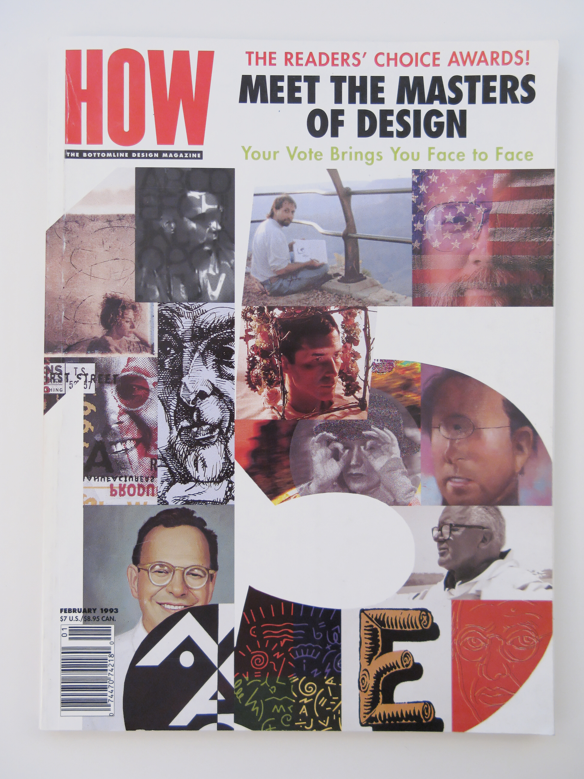
HOW (ISSN 0886-0483) is a bimonthly magazine for graphic designers. Launched in 1985, HOW is edited by Megan Lane Patrick. HOW is published by F+W Media of Cincinnati, Ohio.
Regular sections on business, creativity, design, and technology help designers, whether they work for a design firm, for an in-house design department or for themselves to become more inspired, more creative and more successful.
Currently, HOW publishes six issues a year and hosts six creative competitions in graphic design, logo design, promotion and marketing, interactive media and inhouse design.
The Original Text
By Neil Burns
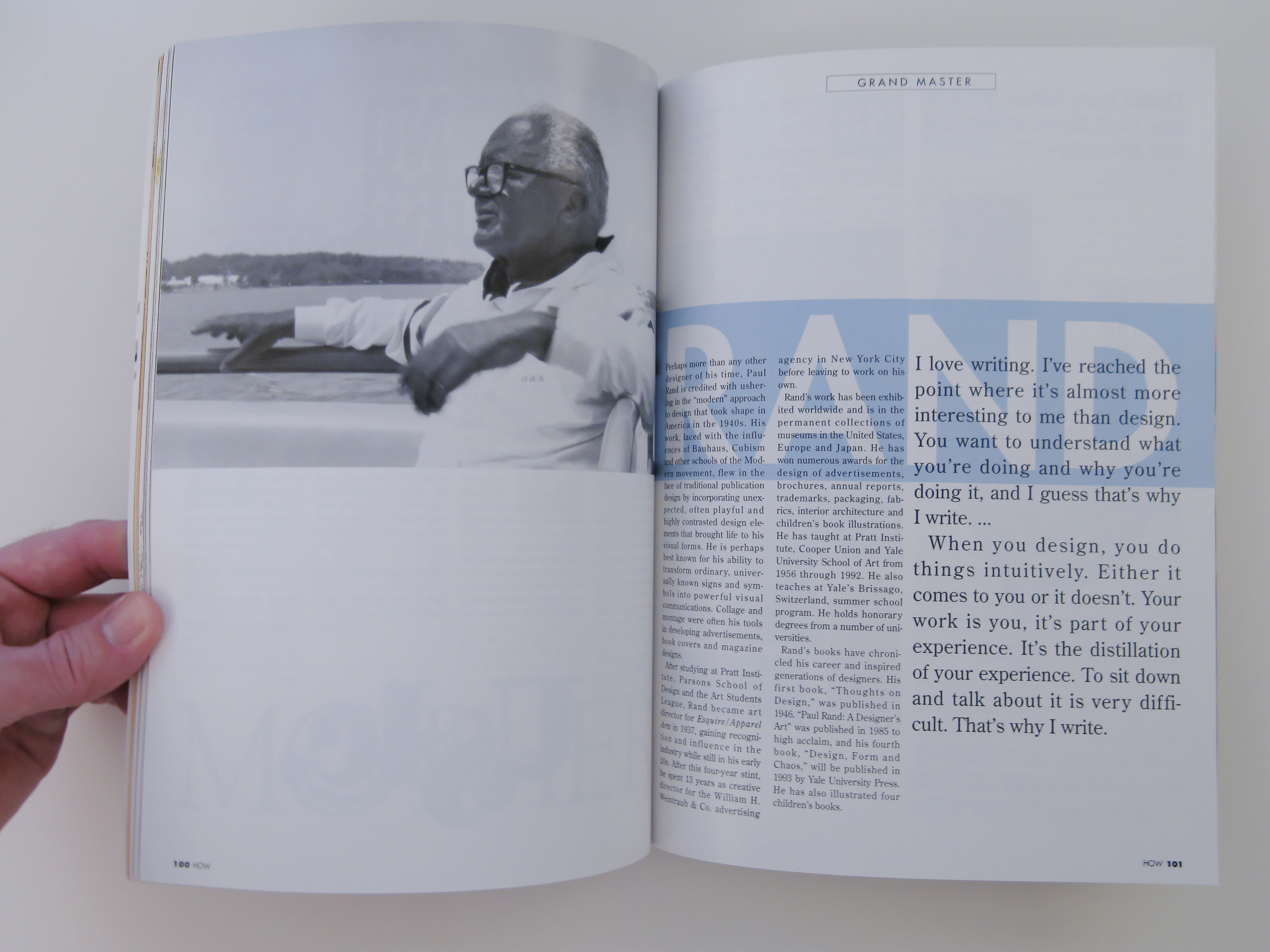
Perhaps more than any other designer of his time, Paul Rand is credited with ushering in the “modern” approach to design that took shape in America in the 1940s. His work, laced with the influences of Bauhaus, Cubism and other schools of the Modern movement, flew in the face of traditional publication design by incorporating unexpected, often playful and highly contrasted design elements that brought life to his visual forms. He is perhaps best known for his ability to transform ordinary, universally known signs and symbols into powerful visual communications. Collage and montage were often his tools in developing advertisements, book covers and magazine designs.
After studying at Pratt Institute, Parsons School of Design and the Art Students League, Rand became art director for Esquire/Apparel Arts in 1937, gaining recognition and influence in the industry while still in his early 20s. After this four-year stint, he spent 13 years as creative director for the William H. Weintraub & Co. advertising agency in New York City before leaving to work on his own.
Rand’s work has been exhibited worldwide and is in the permanents collections of museums in the United States, Europe and Japan. He has won numerous awards for the design of advertisements, brochures, annual reports, trademarks, packaging, fabrics, interior architecture and children’s book illustrations. He has taught at Pratt Institute, Cooper Union and Yale University School of Art from 1956 through 1992. He also teaches at Yale’s Brissago, Switzerland, summer school program. He holds honorary degrees from a number of universities.
Rand’s book have chronicled his career and inspired generations of designers. His first book, “Thoughts on Design,” was published in 1946. “Paul Rand: A Designer’s Art” was published in 1985 to high acclaim, and his fourth book, “Design, Form and Chaos,” will be published in 1993 by Yale University Pres. He has also illustrated four children’s books.
I love writing. I’ve reached the pointed where it’s almost more interesting to me than design. You want to understand what you’re doing and why you’re doing it, and I guess that’s why I write…
When you design, you do things intuitively. Either it comes to you or it doesn’t. Your work is you, it’s part of your experience. It’s the distillation of your experience. To sit down and talk about it is very difficult. That’s why I write.
(The rest of this article is Paul Rand’s own comments on selected pieces of work:)
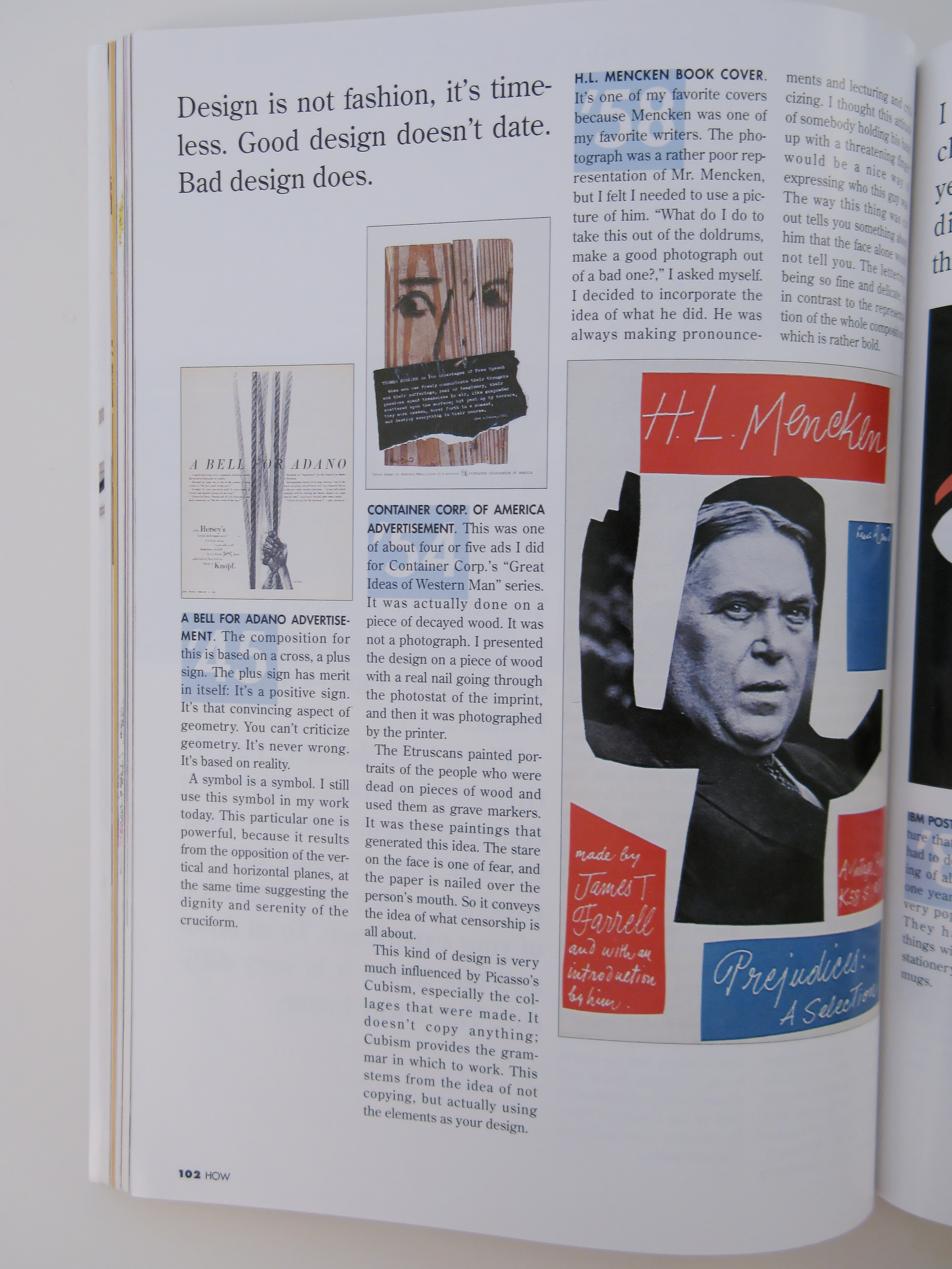
A Bell for Adano Advertisement
(1945)
The composition for this is based on cross, a plus sign. The plus sign has merit in itself: It’s a positive sign. It’s that convincing aspect of geometry. You can’t criticize geometry. It’s based on reality.
A symbol is a symbol. I still use this symbol in my work today. This particular one is powerful, because it results from the opposition of the vertical and horizontal planes, at the same time suggesting the dignity and serenity of the cruciform.
Container Corp. of America Advertisement
(1954)
This was one of about four or five ads I did for Container Corp.’s “Great Ideas of Western Man” series. It was actually done on a piece of decayed wood. It was not a photograph. I presented the design on a piece of wood with a real nail going through the photostat of the imprint, and then it was photographed by the printer.
The Etruscans painted portraits of people who were dead on pieces of wood and used them as grave markers. It was these paintings that generated this idea. The stare on the fae is one of fear, and the paper is nailed over the person’s mouth. So it convey the idea of what censorship is all about.
This kind of design is very much influenced by Picasso’s Cubism, especially the collages that were made. It doesn’t copy anything; Cubism provides the grammar in which to work. This stems from the idea of not copying, but actually using the elements as your design.
H.L. Mencken Book Cover
(1958)
It’s one of my favorite covers because Mencken was one of my favorite writers. The photograph was a rather poor representation of Mr. Mencken, but I felt I needed to use a picture of him. “What do I do to take this out of the doldrums, make a good photograph out of a bad one?,” I asked myself. I decided to incorporate the idea of what he did. He was always making pronouncements and lecturing and criticizing. I thought this attitude of somebody holding his hand up with a threatening finger would be a nice way of expressing who this guy was. The way this thing was cut out tells you something about him that the face alone would not tell you. The lettering, being so fine and delicate, is in contrast to the representation of the whole composition, which is rather bold.
IBM Poster
(1981)
It’s a rebus, a picture that stands for a word. I had to do a poster for a meeting of all IBM design people one year, so I did this. It’s a very popular thing at IBM. They have thousands of things with this rebus on it—stationery, sweaters, caps and mugs.
A single letter can say more than a thousand words. Graphic or visual puns make the images memorable. The B and I are letters that are also pictures. The m has no picture associated with it, so that made the rebus absolutely IBM—it couldn’t be anything but. I think this makes IBM seem more human.
NeXT logo
(1988)
When Steve Jobs called me in to do this, I refused because it was in conflict with my IBM business. (I’ve been IBM’s chief graphic design consultant for 36 years.) But he says to me, “Do you mind if I call IBM?” I said, “In a democracy you can do whatever you like.” Se he called, and the next day they said it was OK.
When the client calls me up and wants a job done, I make a date to meet the guy. But in the meantime, my head starts churning, and I start making a lot of sketches. I had about seven or eight different ideas before I went to meet with them. I went to the briefing, and Mr. Jobs had his whole staff sitting on the floor while he was describing the company. As he was standing there describing this computer—this box—I thought “That’s not a bad idea”.
So I did the cube. When I presented the design a few weeks later, his reaction was immediate: He said, “Do you mind if I put my arms around you?”
For some reason I’ve had more reactions and printed publicity on this one than anything.
Design is not fashion, it’s timeless. Good design doesn’t date. Bad design does.
I don’t think my work has changed much at ll over the years. I could show you things I did 40 years ago that you’d think I did today.
I picked these because they were the simplest things that would register most quickly.


